

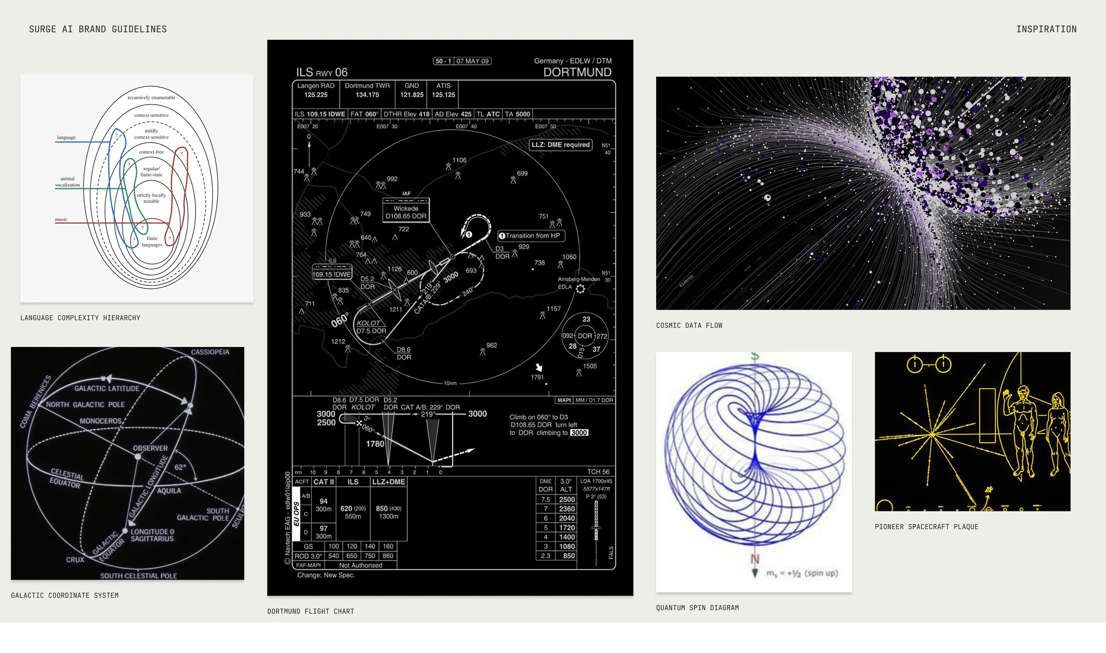
From day one, Surge needed more than a brand that looked good. They needed design that built credibility, earned trust, and scaled with them as they grew. They needed a design partner that ensures they stand out in the crowded world of AI infrastructure.
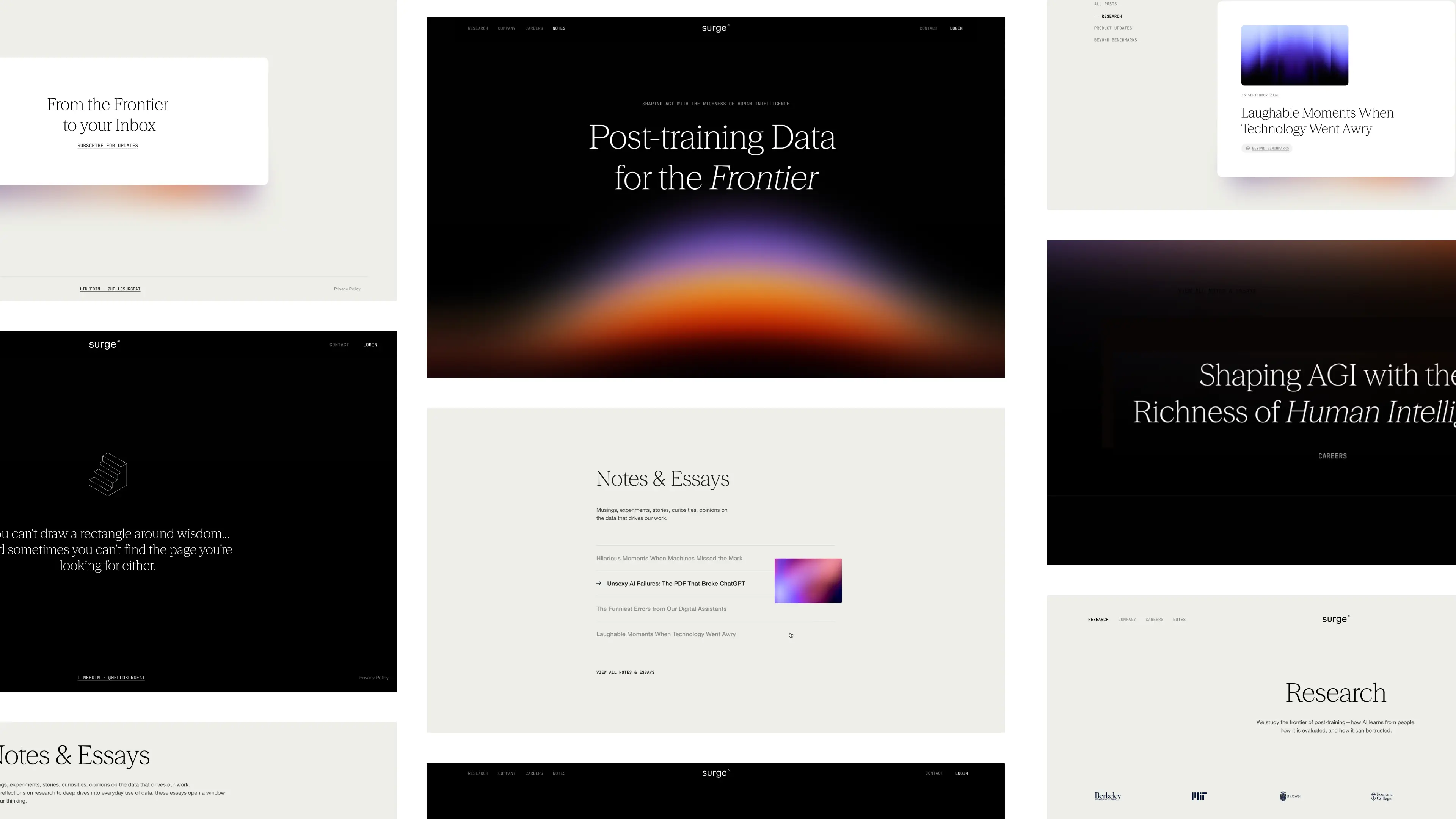
They chose Konpo. More than a vendor, we became their plug-and-play design team: senior talent embedded alongside leadership, shaping everything from their first identity to their website, product, and systems. At every stage, Surge found in Konpo a partner they could depend on.

.webp)



.webp)
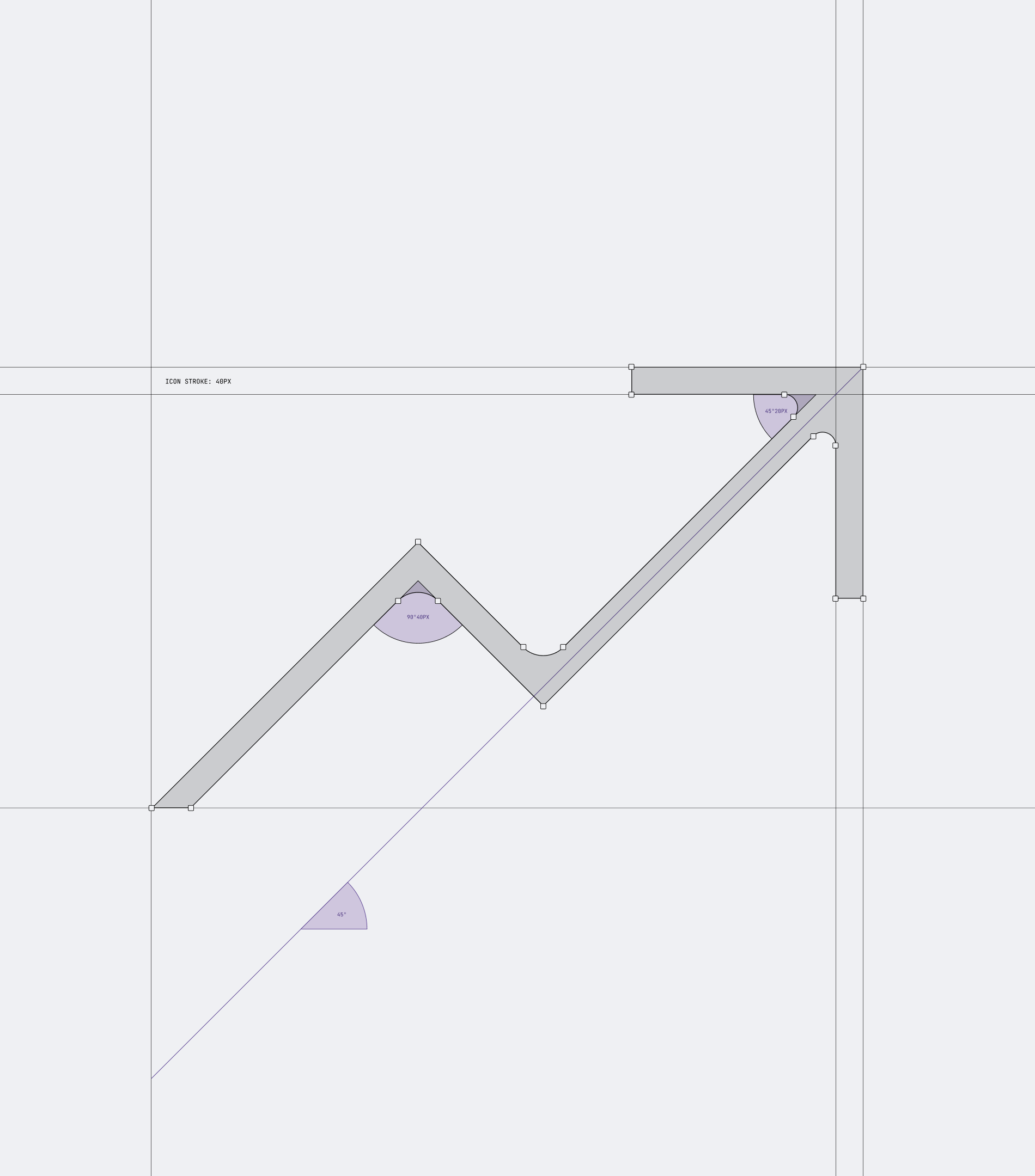


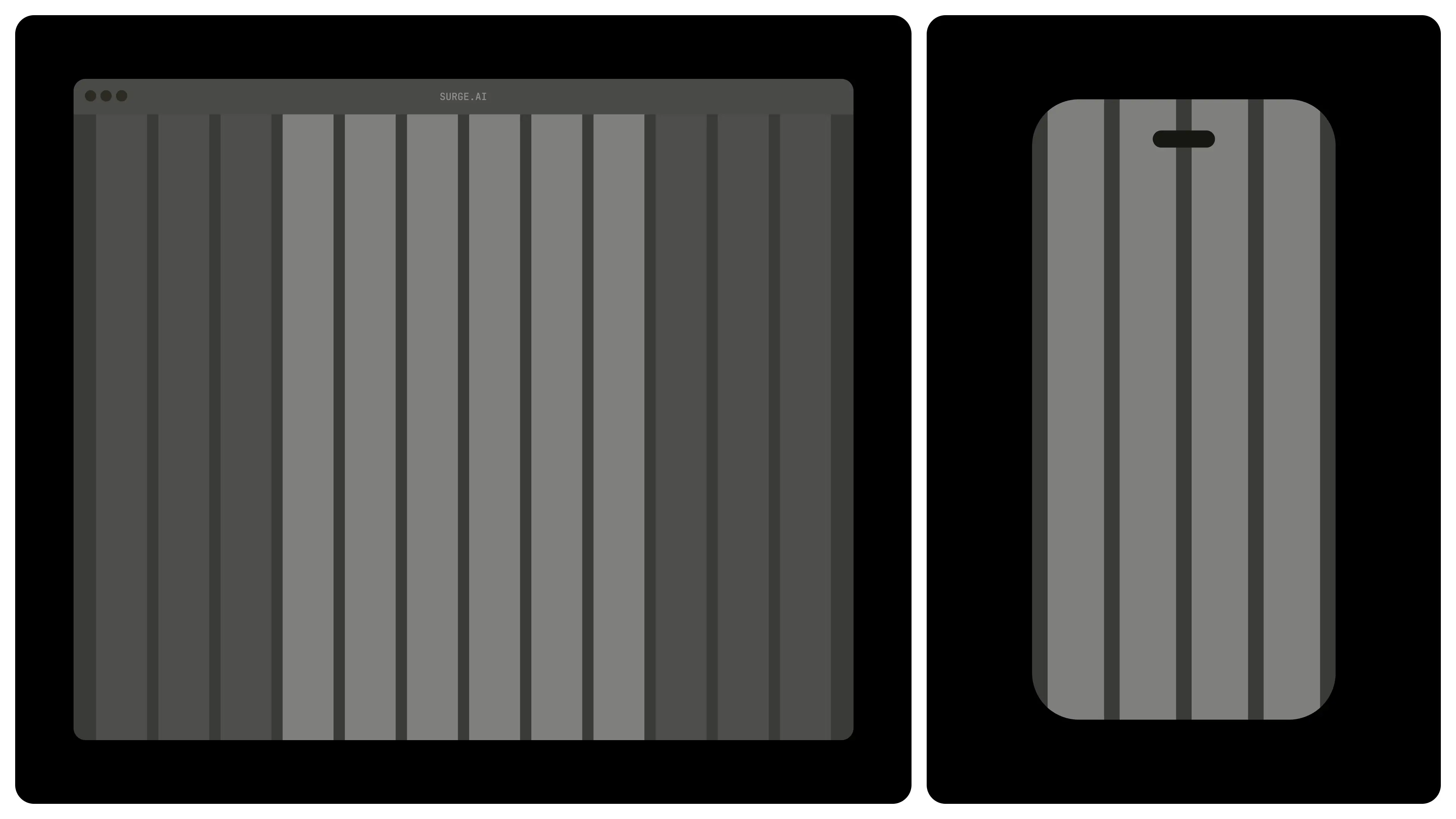
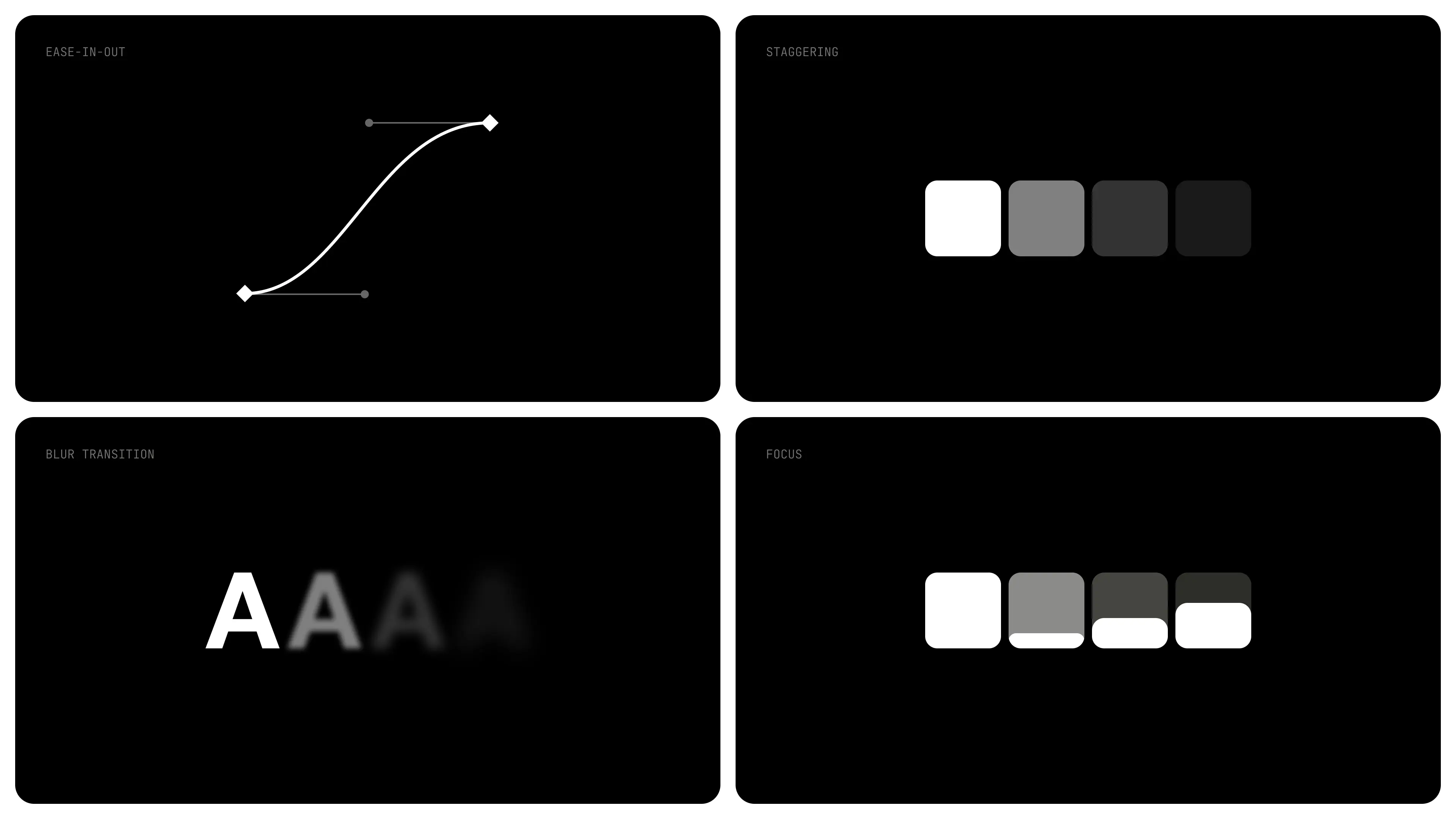
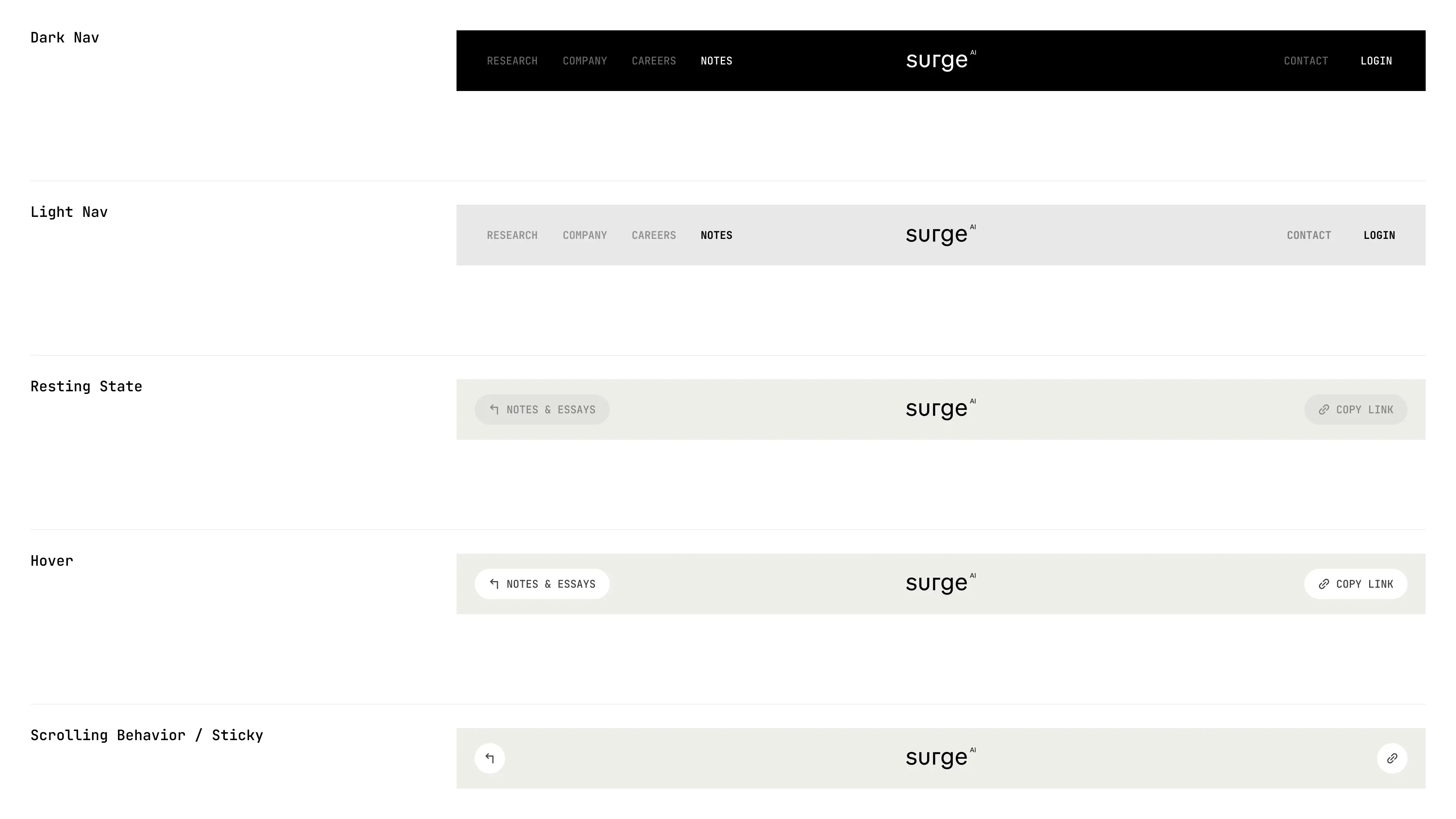
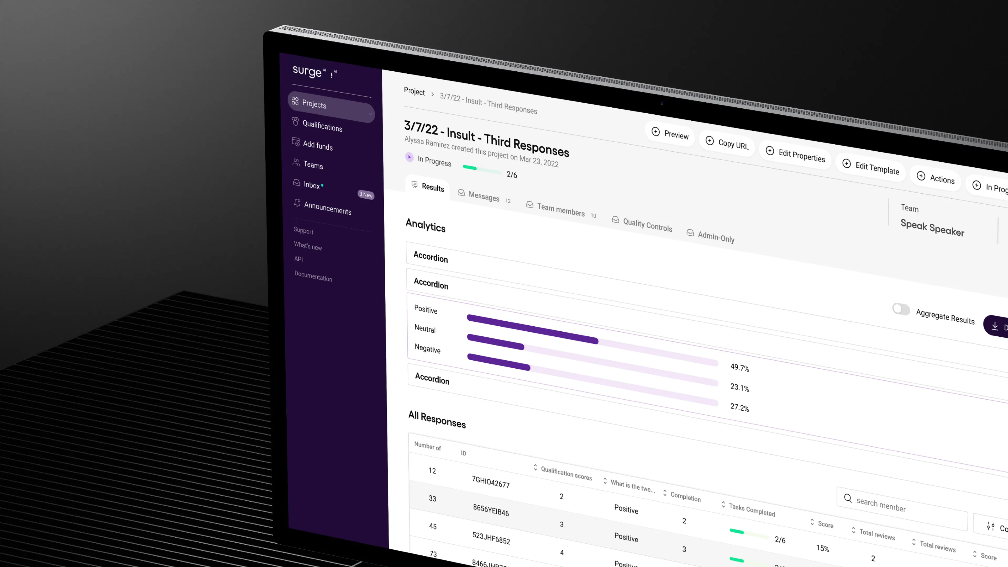
Our collaboration has become a long-term partnership that helped Surge grow from early explorations to a brand adopted by the leading AI and technology companies and a product internationally recognized and awarded.
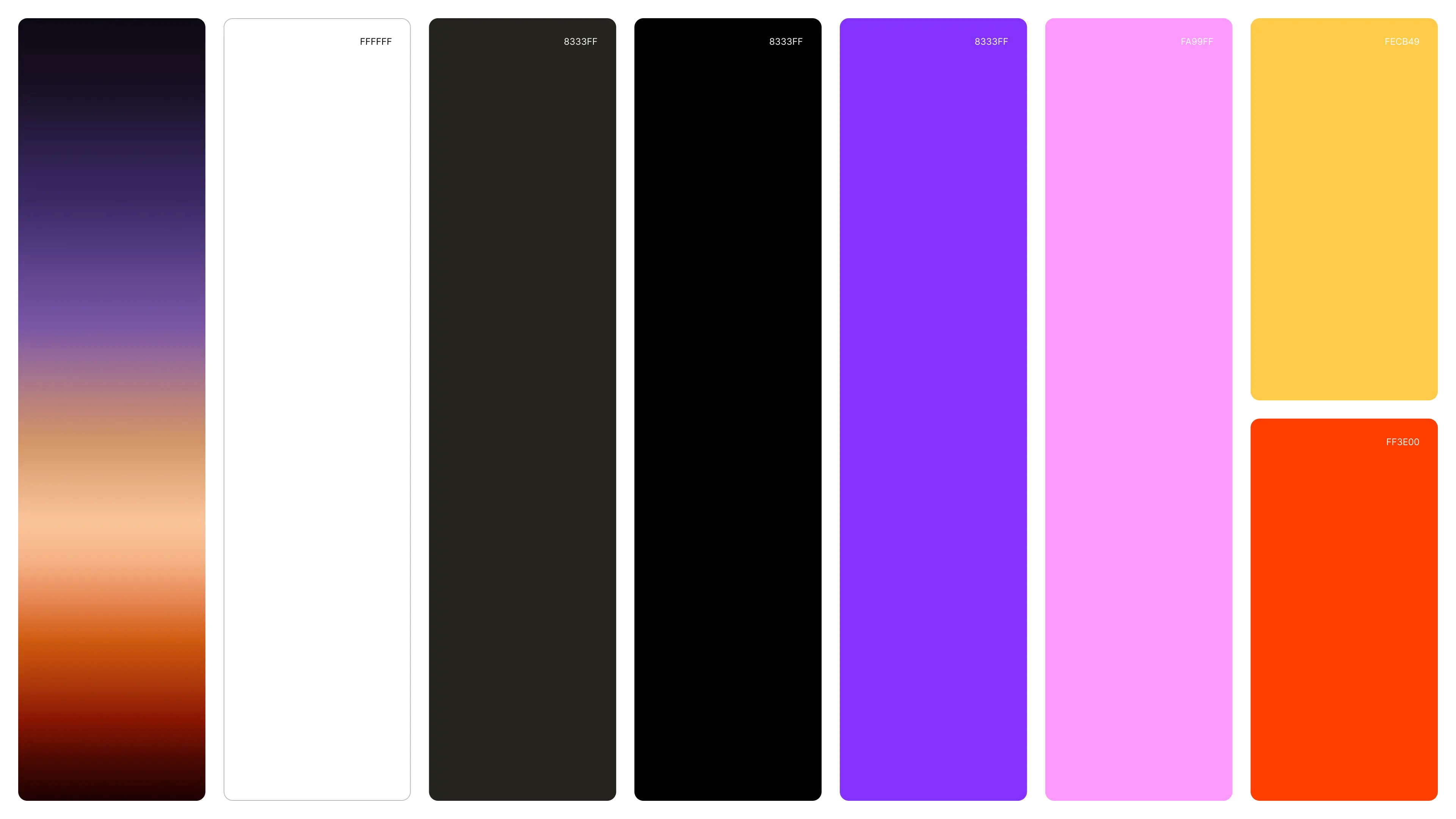
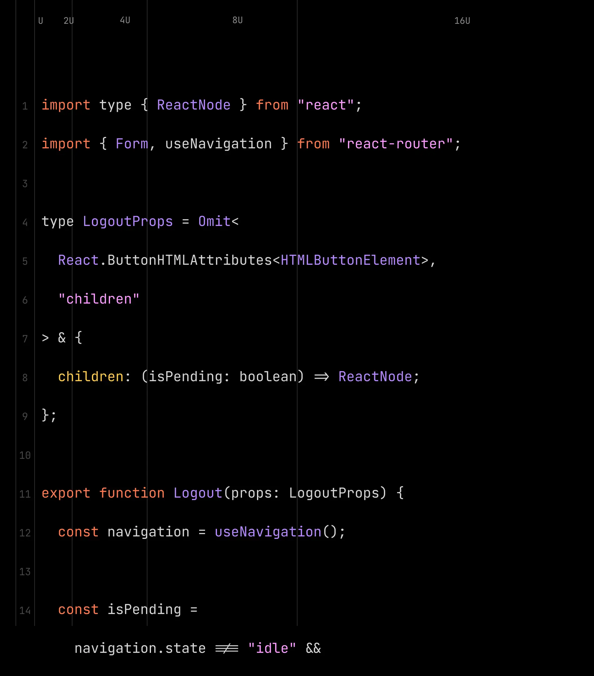
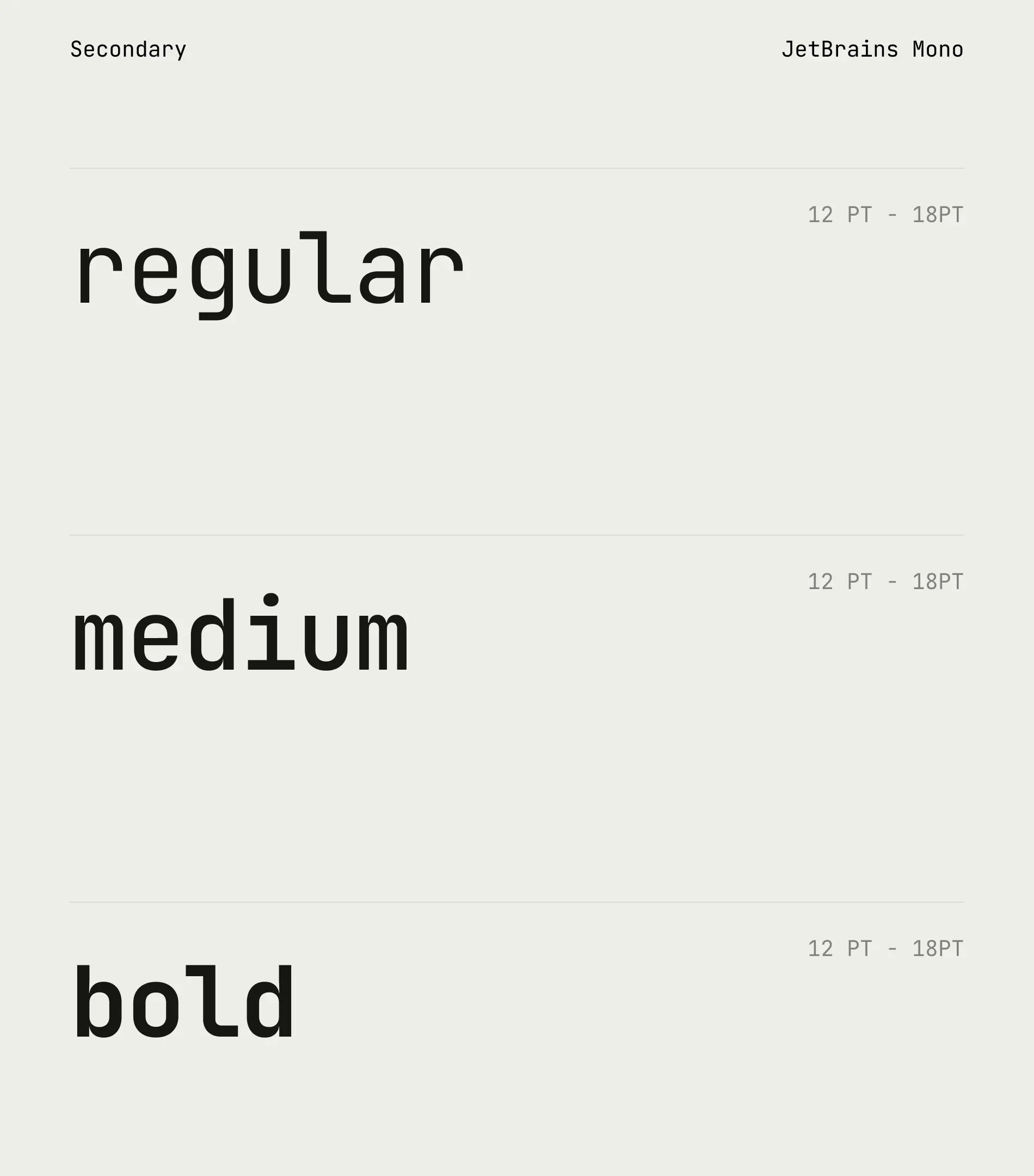
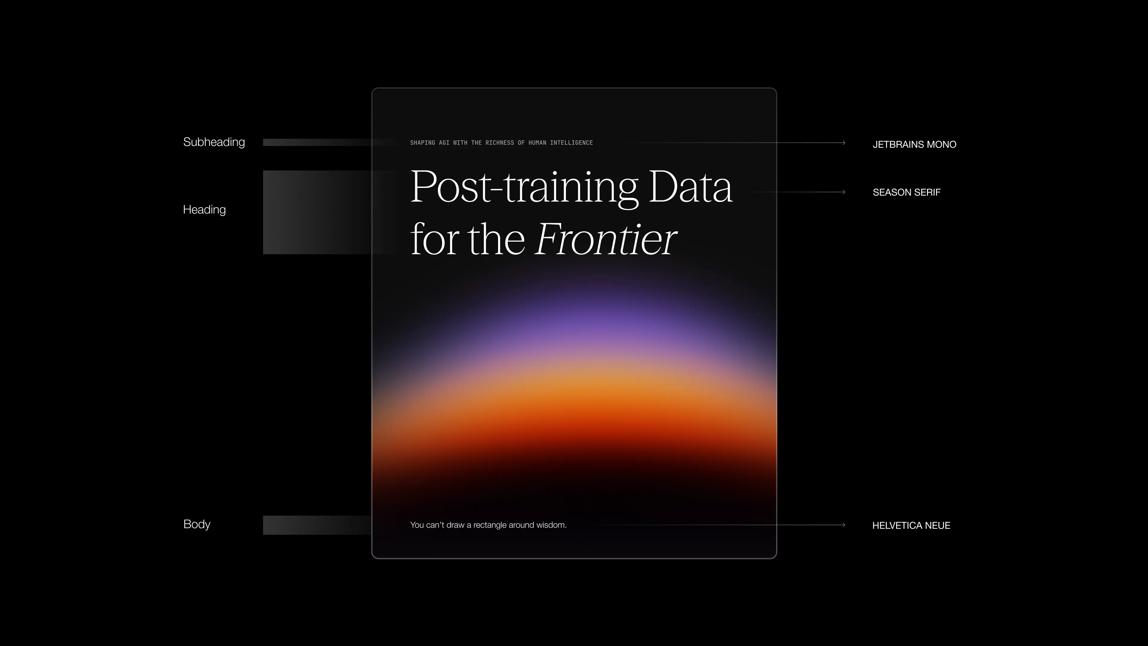
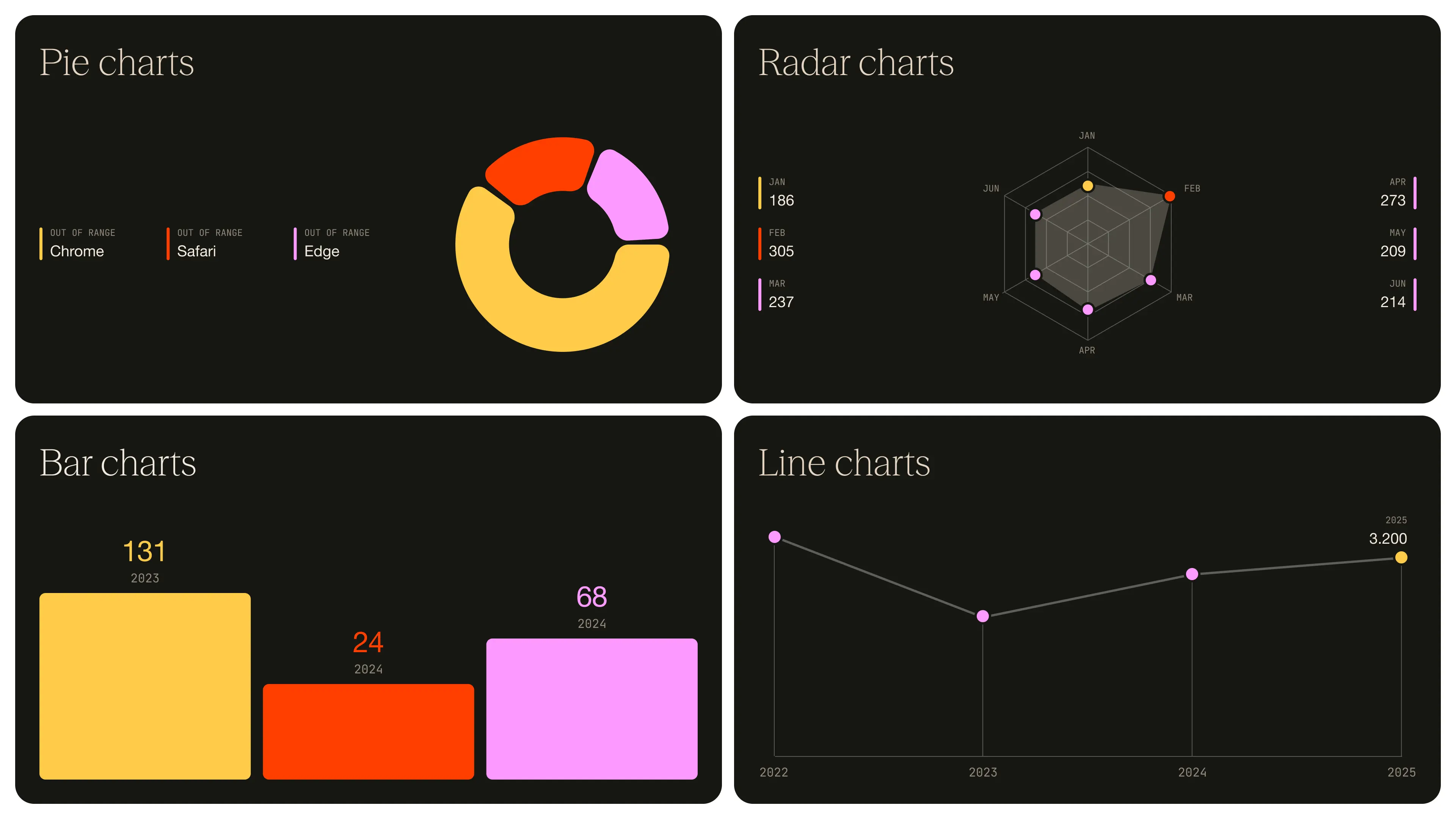
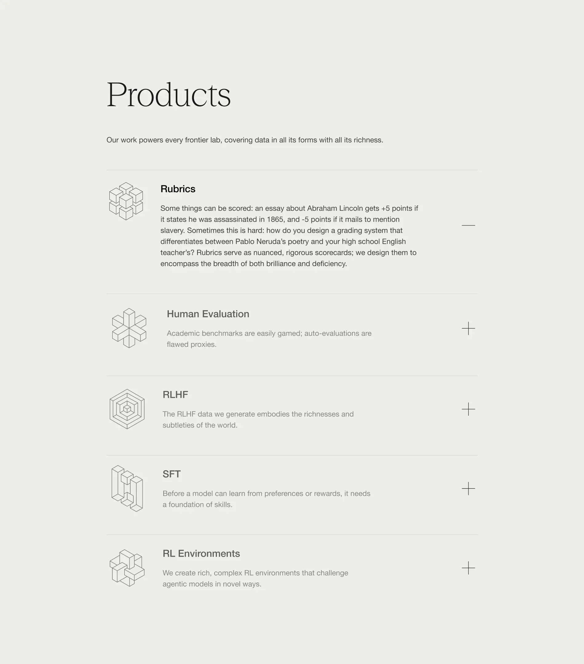
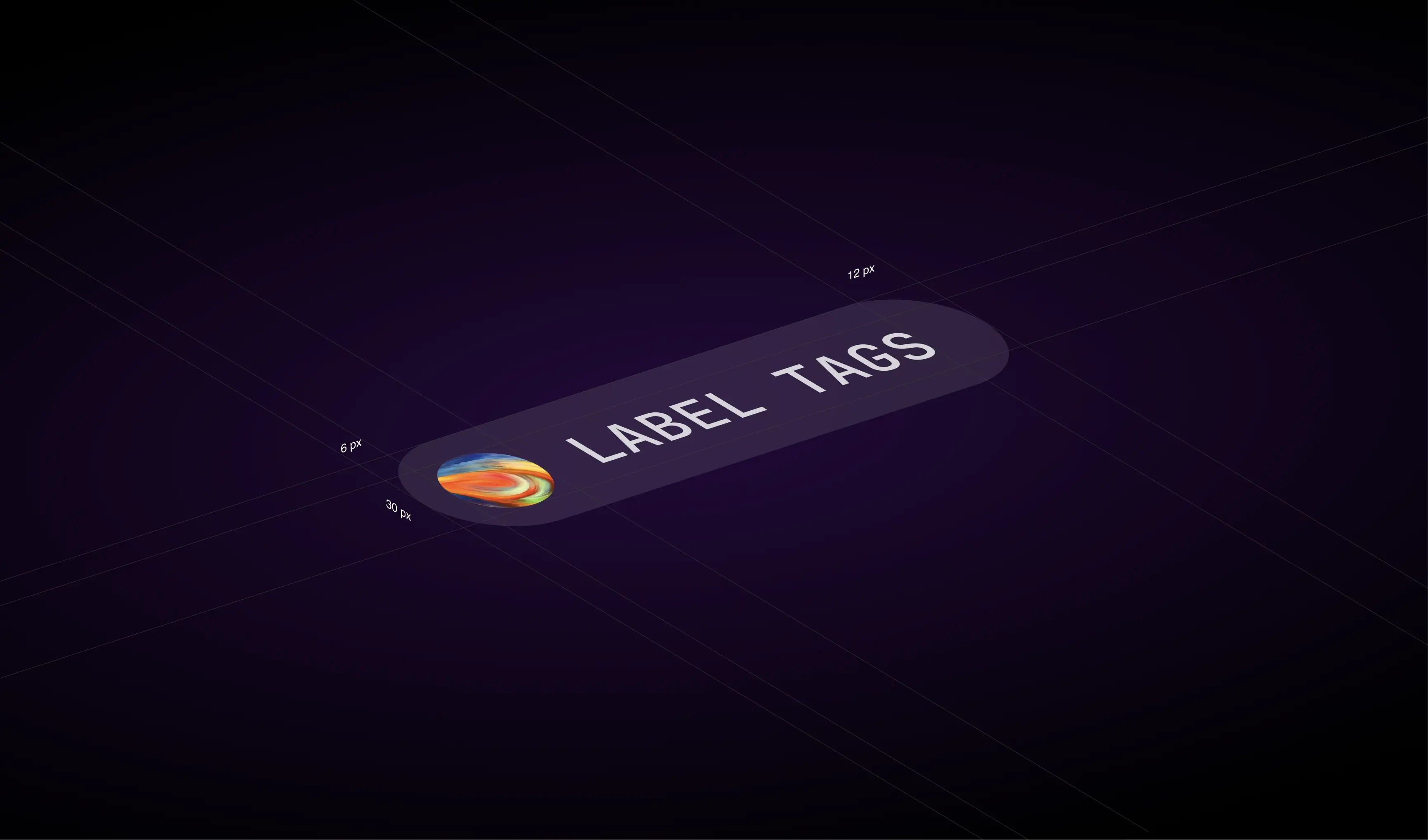
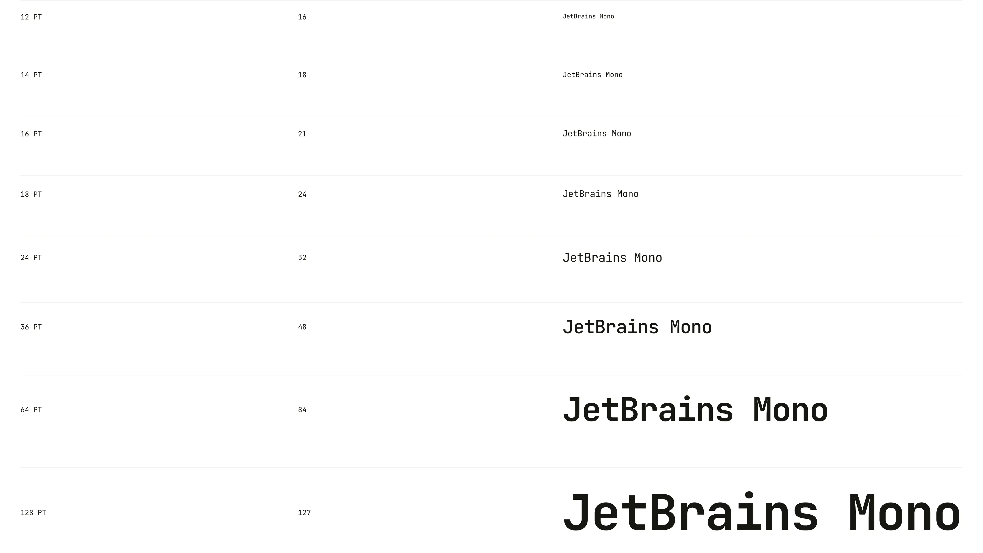
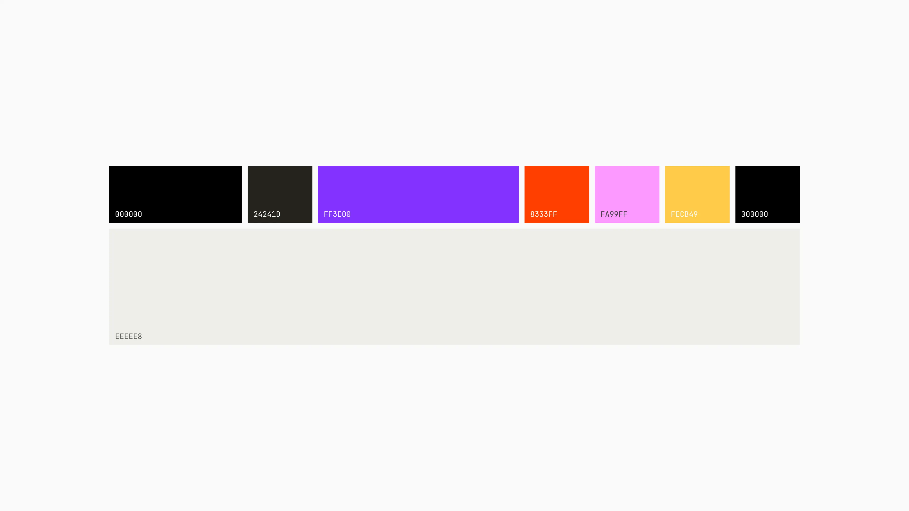
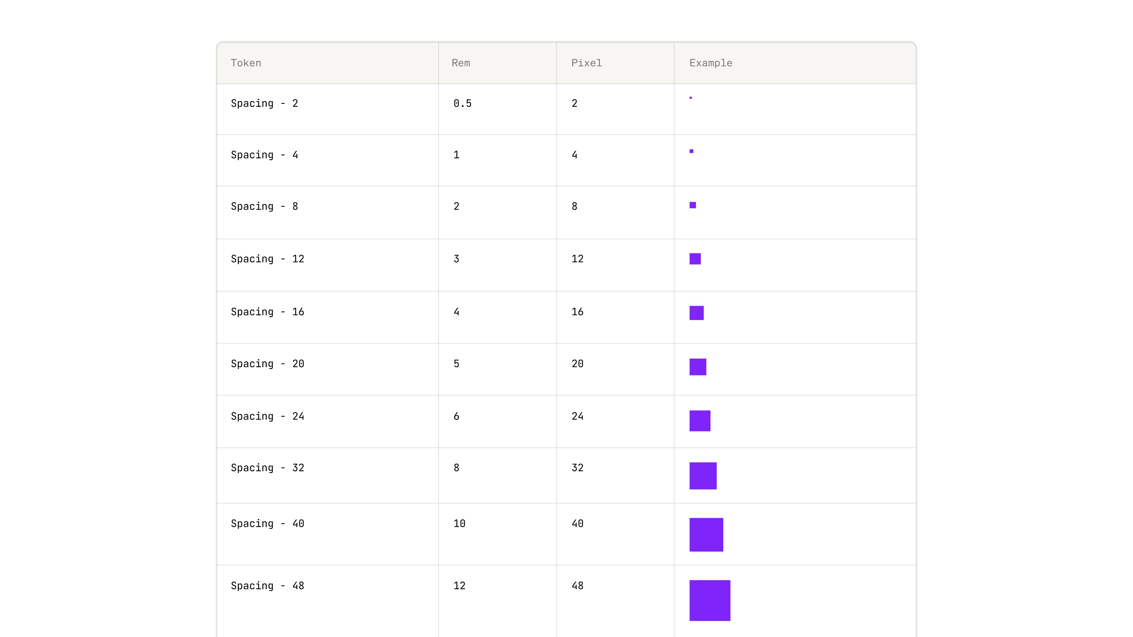
We built a bold, distinctive identity in an industry defined by sameness, designed a product experience that balanced delight with enterprise-grade usability, and crafted a design system to keep them consistent as they scaled.
As Surge now looks to fetch a valuation of over $15 billion in its first capital raise, we’re leading phase two of their branding. The goal: to build a brand that not only wins attention and trust, but one that matches the ambition and credibility of a company operating at that scale.
- Founder - Edwin Chen
- Year - 2025
- Industry - Artificial Intelligence
- Scope - Brand · Site · Systems
- Website - www.surgehq.ai

ComPsych needed a rebrand built to win. Younger competitors with sharper, design-driven branding were pulling attention away from the world’s largest provider of employee assistance programs (EAPs), a company supporting over 130 million people across 190 countries. They turned to Konpo to make sure their brand matched their scale and credibility. The mission: win back market share, turn reputation into loyalty, and defend their position at the top.
.webp)
.webp)
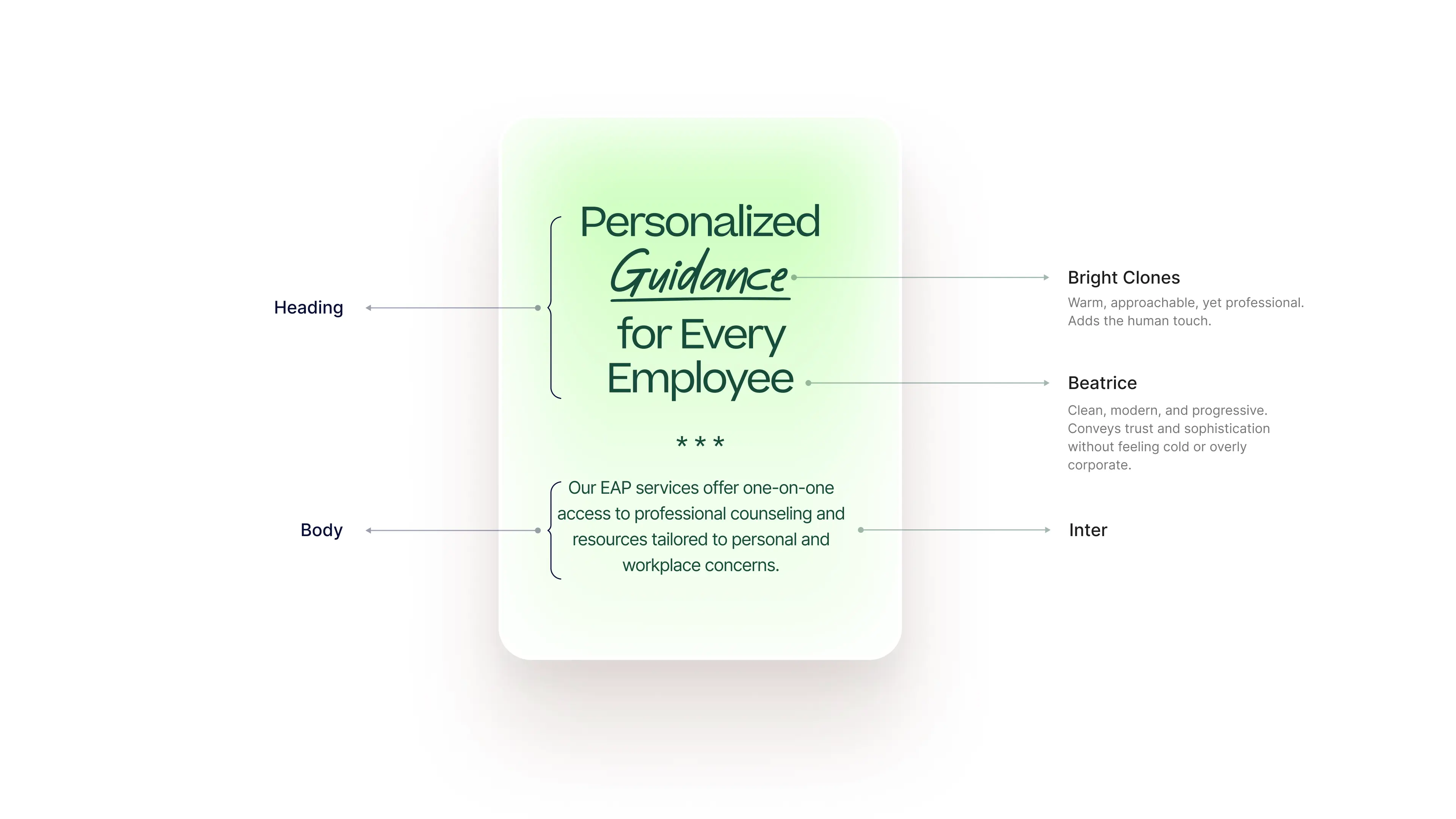
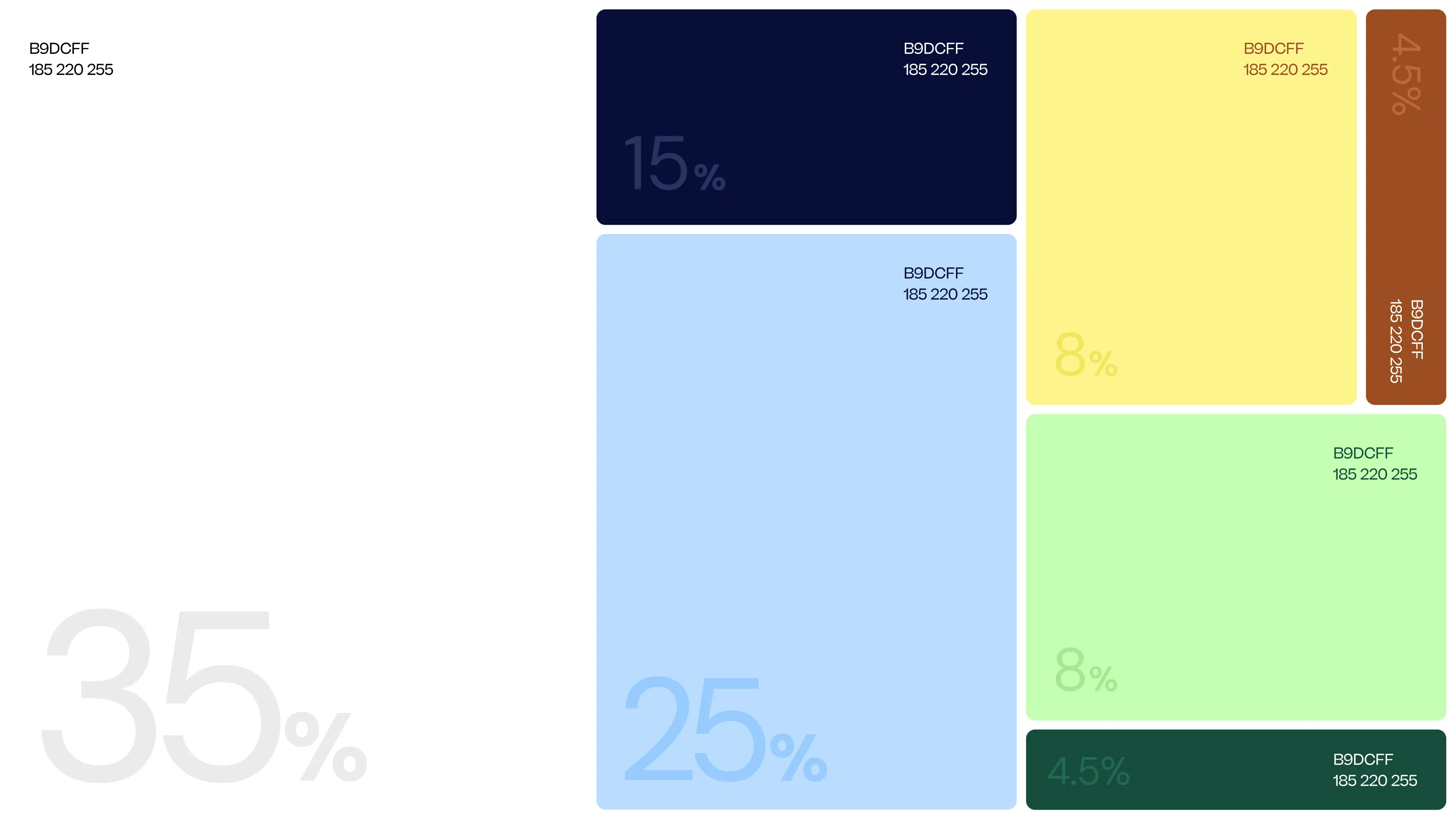

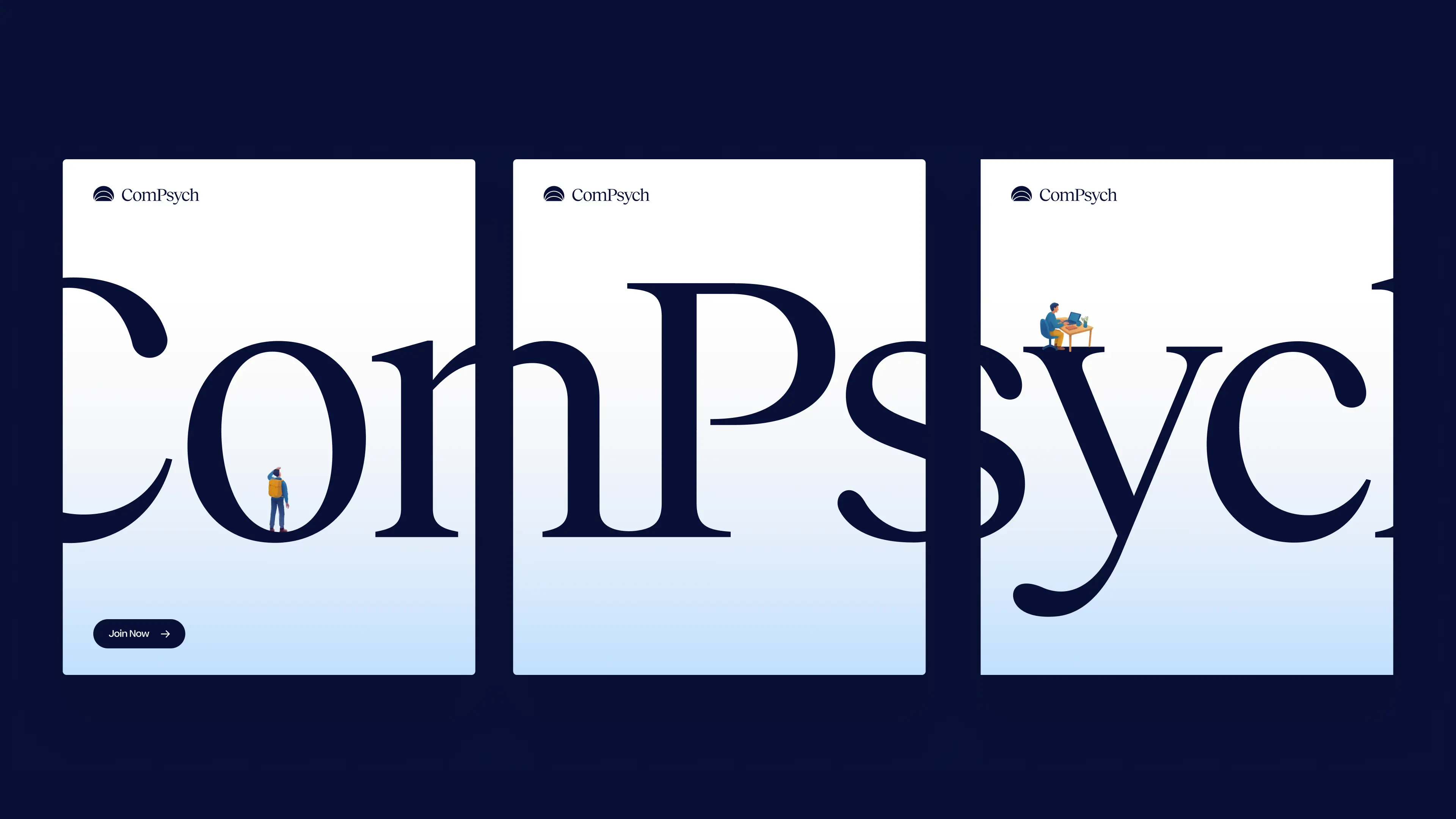
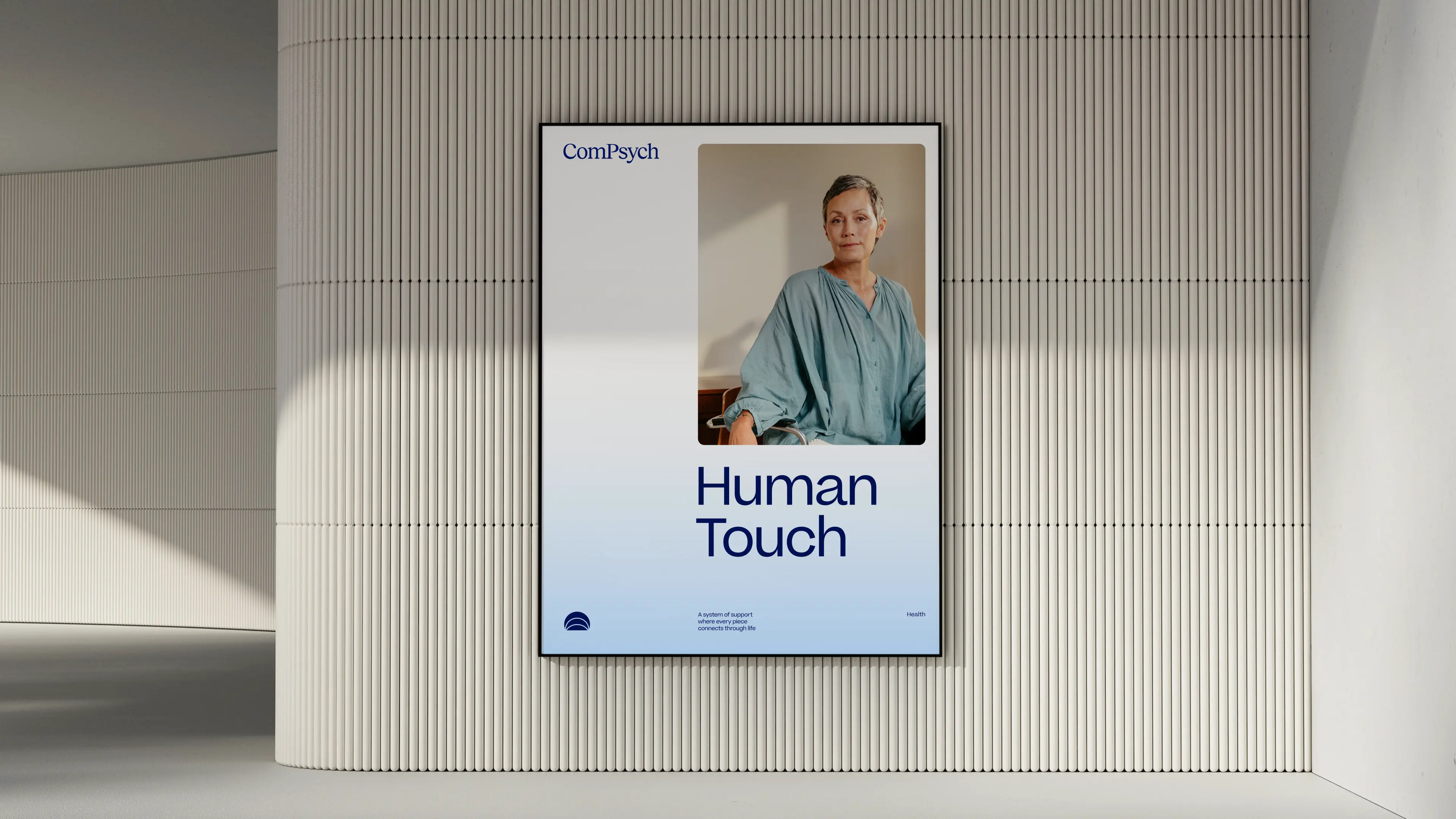

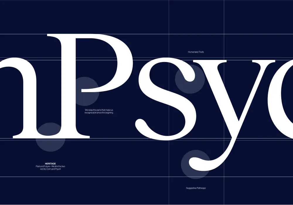
Every element of the ComPsych rebrand was built to show the strength of a category leader, but for today’s market and tomorrow’s. The new logo centers on a glowing core, with expanding ripples signalling growth, support, and scale. Their signature blue was sharpened with a modern palette designed to stand out with confidence, not noise. But what’s a rebrand without discipline to execute it? We built a dedicated brand hub that gave ComPsych everything, from logos to illustrations to voice, to apply their new identity consistently across 75,000+ organizations worldwide. And we delivered it beyond our original scope. The result: a brand that doesn’t just keep up with the competition, but takes back the lead. With a stronger identity and a system to sustain it, ComPsych now has the edge to defend its dominance and keep winning in a design-driven market.
- Industry - Employee Assistance Program (EAP)
- Scope - Brand
- Brand Hub - compsych.konpo.co
- Website - compsych.com

amp Fitness set out to launch its AI-powered strength training system with leadership and talent from Apple, DraftKings, Meta, Nike, and Spotify — people who held the highest design standards. To stand out in a crowded fitness space, they needed a design partner who could move as fast as they did and deliver world-class quality. That’s where Konpo came in. As their plug-and-play design studio, we worked elbow-to-elbow with Amp’s leadership to marry hardware and software into a seamless consumer experience. From product design to scalable design systems, we turned their ambitious vision into award-winning, user-loved reality. When the standards are highest, the right design partner makes all the difference.
.webp)
%201.webp)
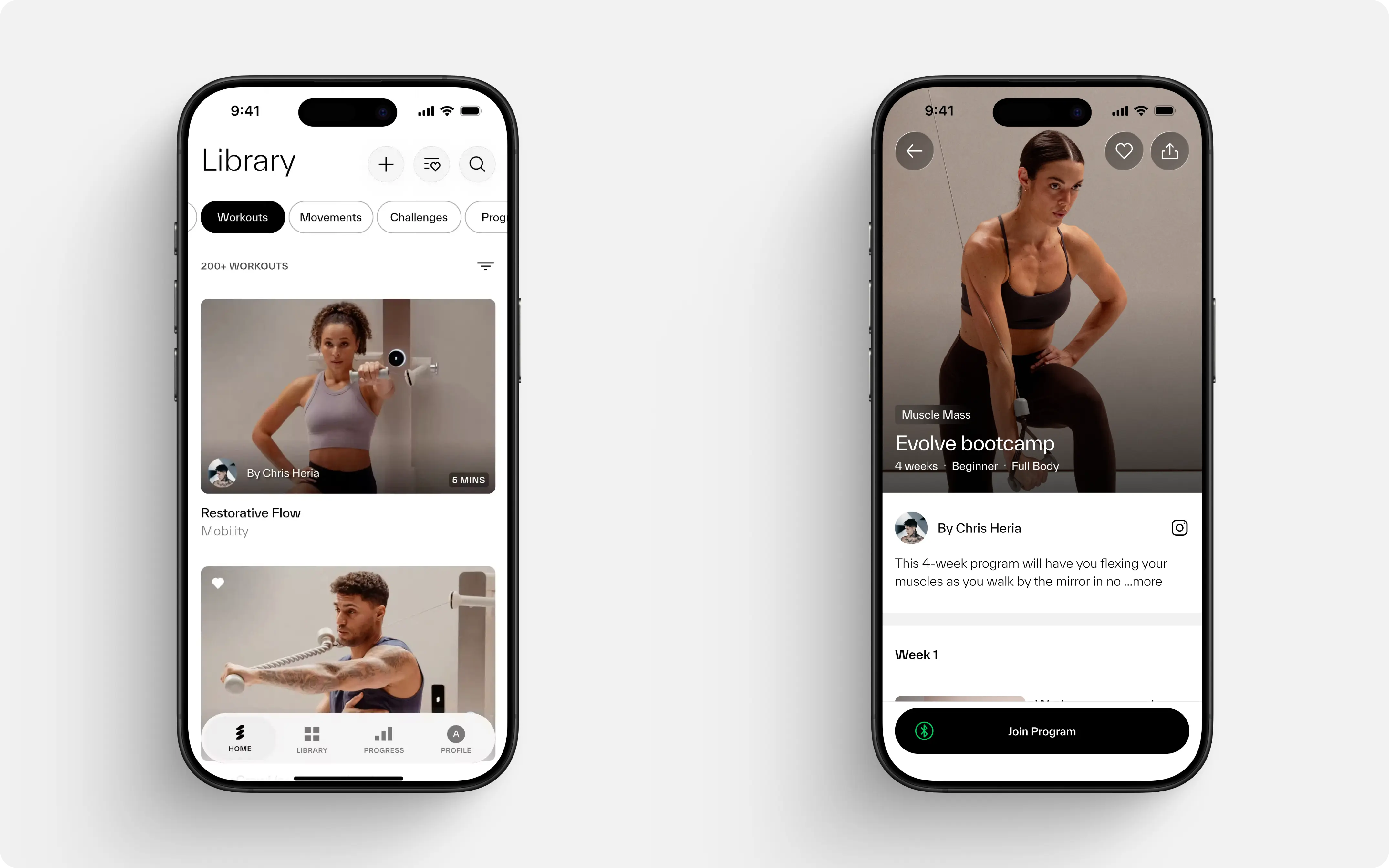
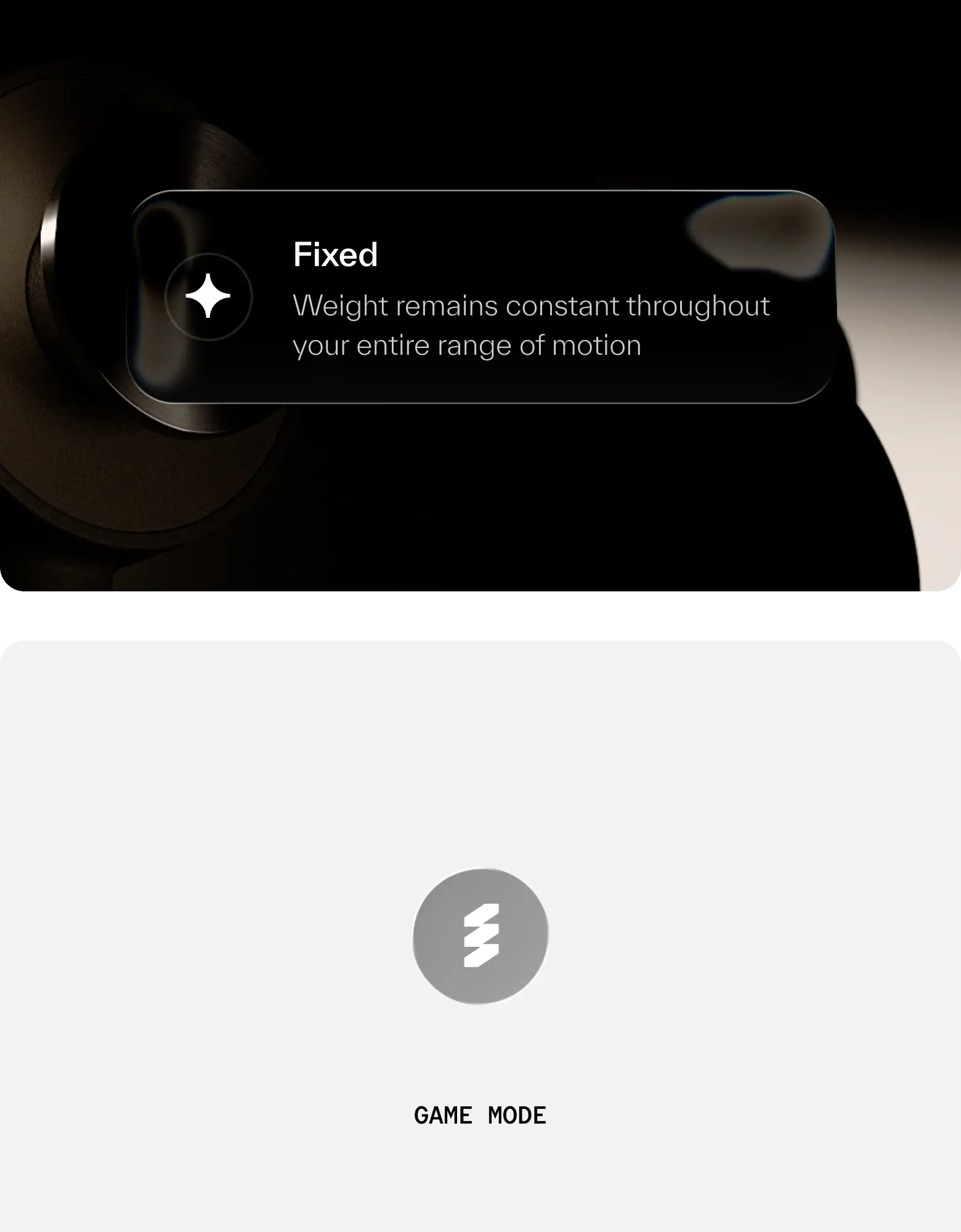
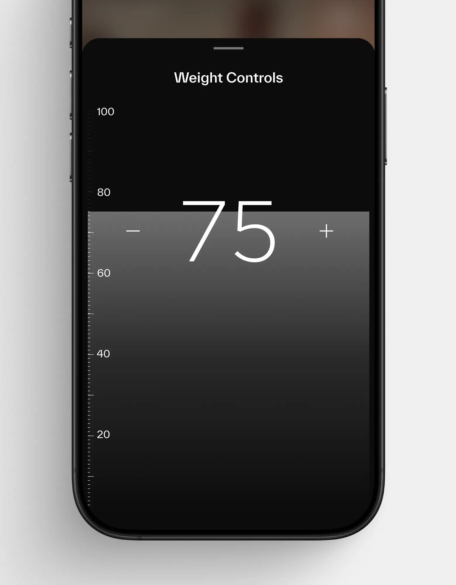
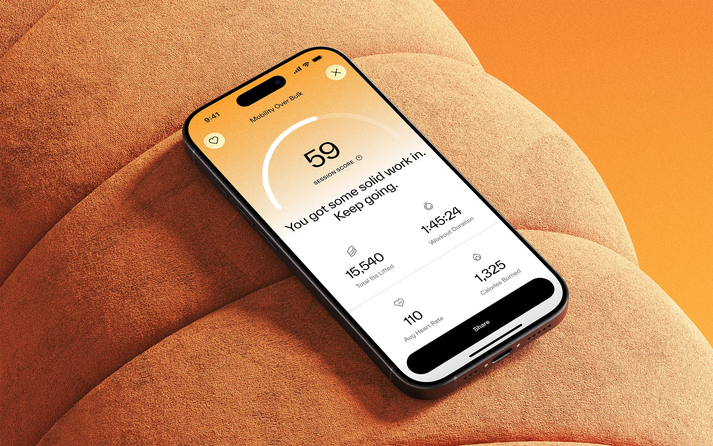

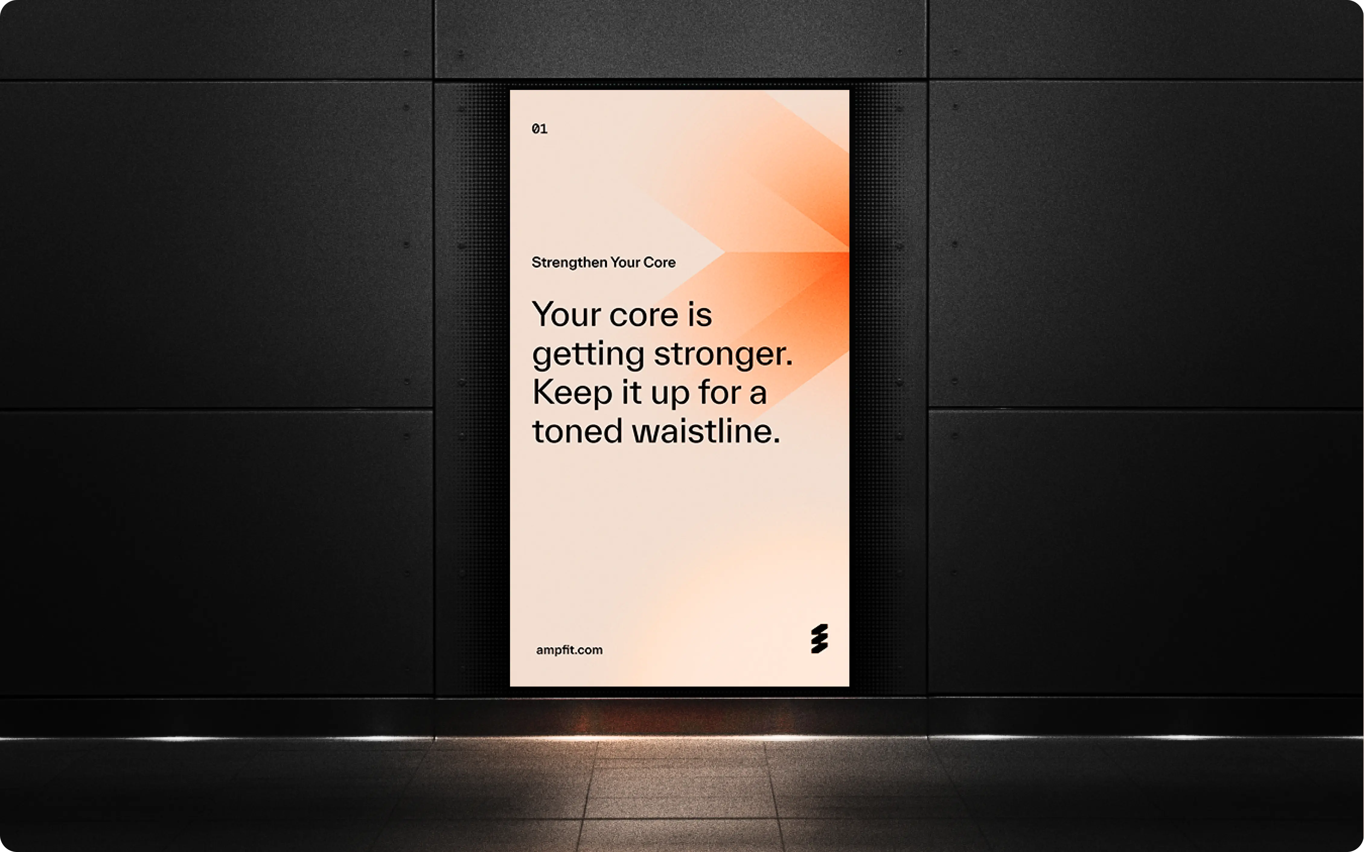
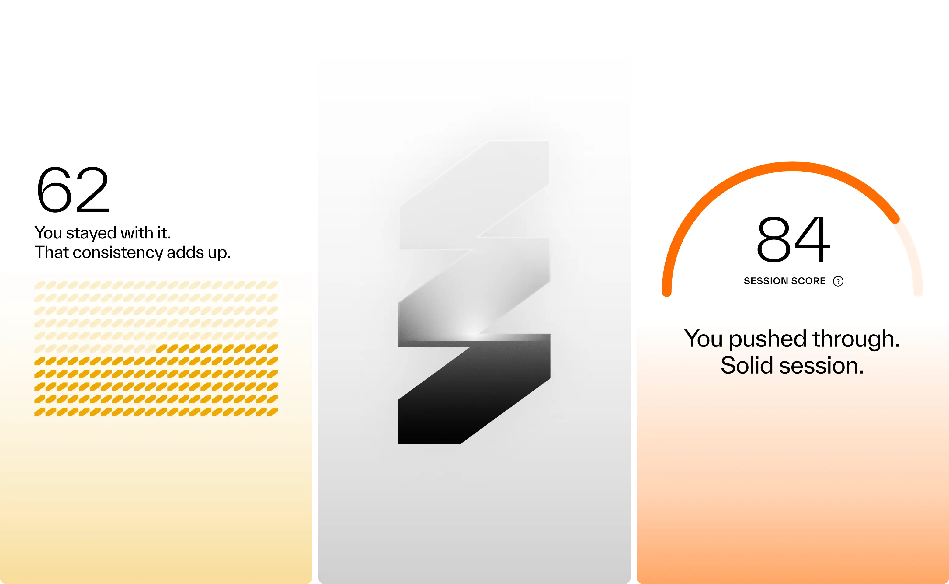

Results so far: 40,000 users, multiple awards, and a sleek wall-mounted system paired with a companion app. Working with amp meant translating adaptive resistance hardware, smart coaching, and modular accessories into a cohesive consumer experience. Add to that a team backed by Sports Science PhDs and leaders from Apple, Meta, and Nike, and the expectations were clear: nothing short of excellence would do. Rising to that challenge not only delivered results for amp, but pushed Konpo to sharpen our own systems and raise the bar. Challenge accepted. Mission accomplished.
- Founder - Shalom Meckenzie
- Year - 2024
- Industry - Fitness · Artificial Intelligence
- Scope - Brand · Product · Systems
- Website - www.ampfit.com
Case Studies
Some of our blood, sweat and (happy) tears.
Coachable
Shaping the future of tech careers, with Coachable.

System One
Elevating live entertainment through design
.webp)
Clinical Ink
Designing the Future of Clinical Trials

Nantucket Foundation
Interactive Maps for the island of Nantucket.
.webp)
ComPsych
World’s Largest EAP Provider Gets Its Edge Back

Vectron Biosolutions
Bold Design for a Biotech Leader
.webp)
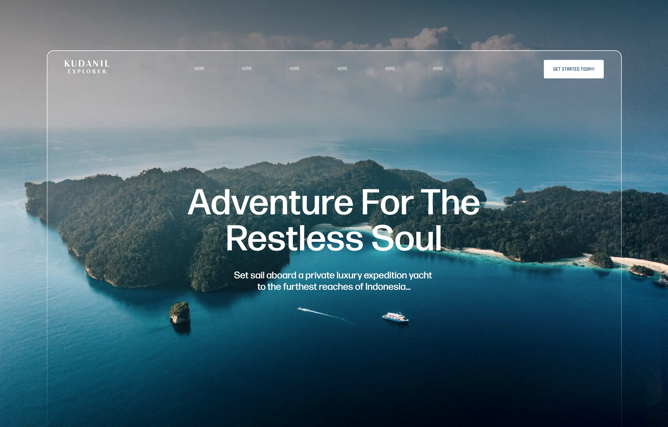
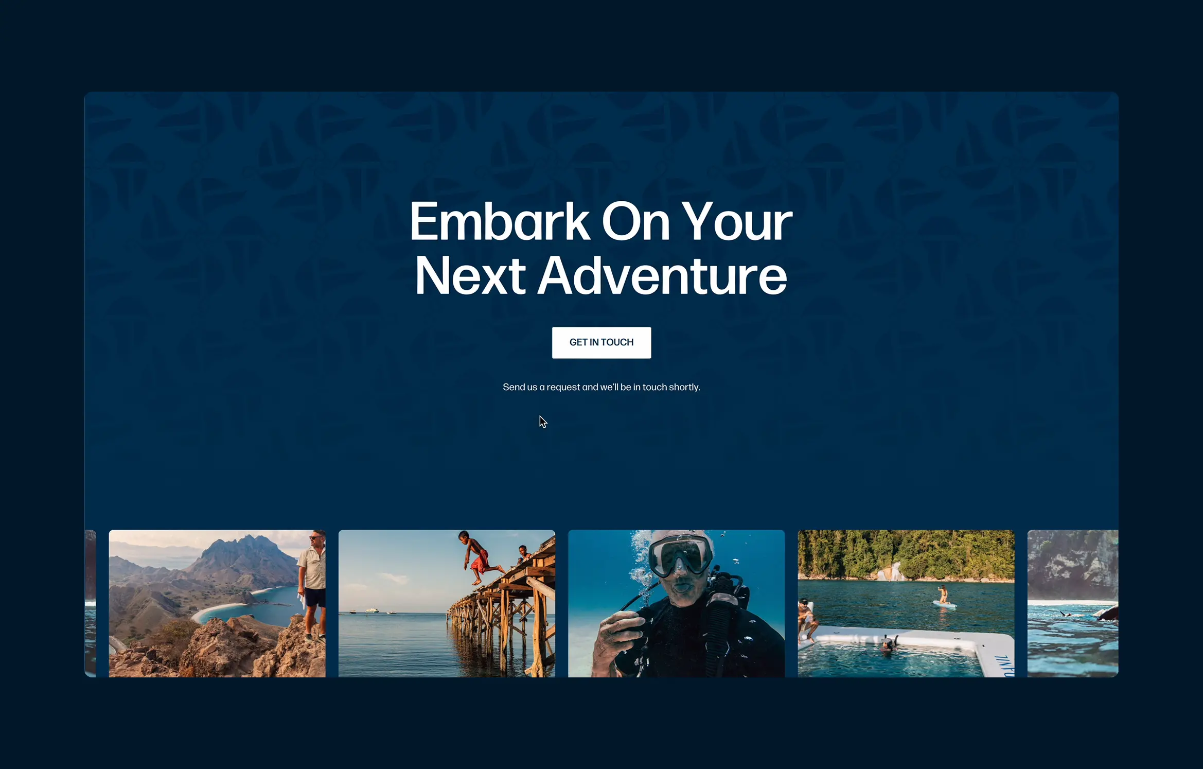
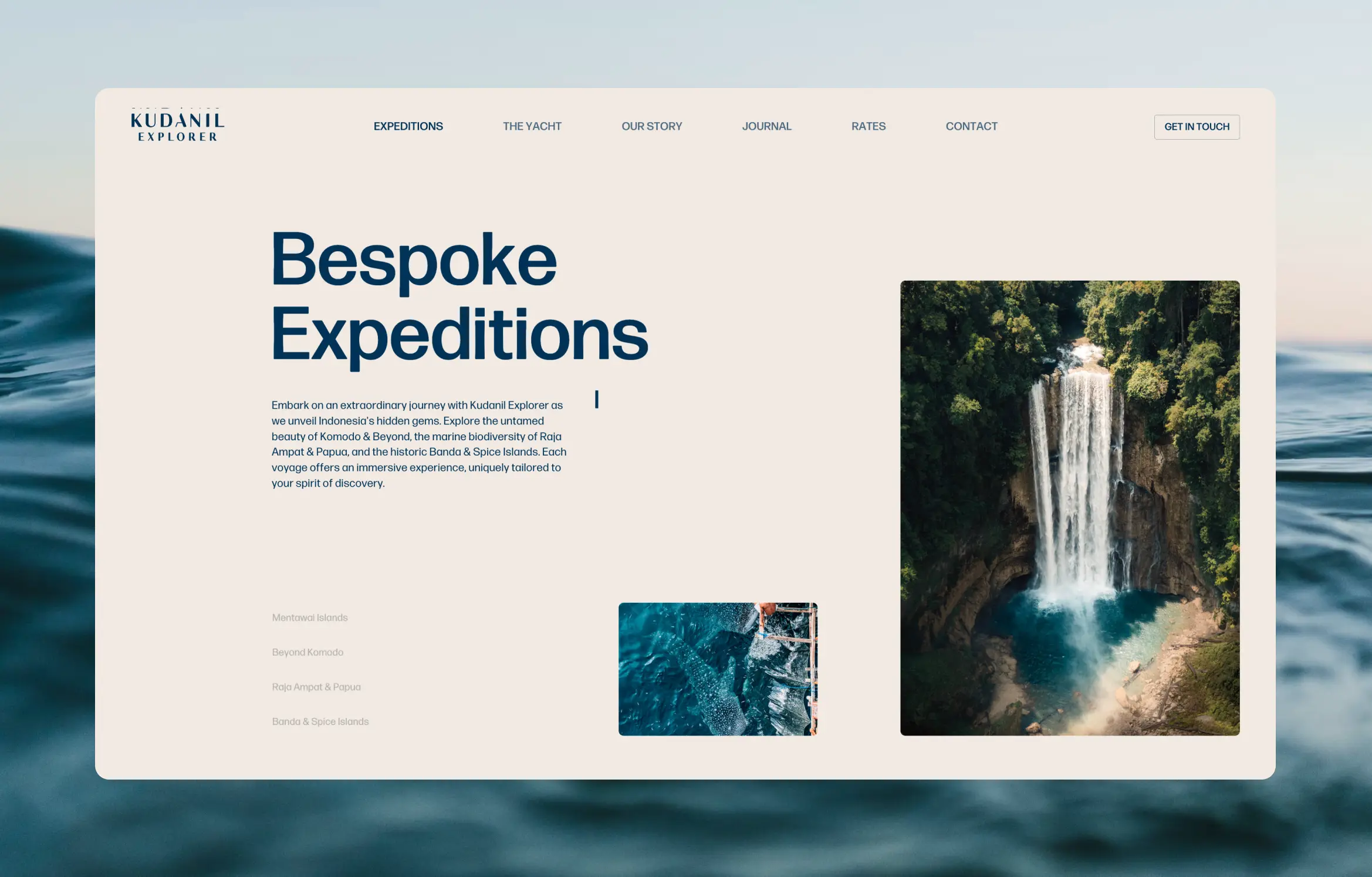
A digital home for Kudanil Explorer, Indonesia’s leading private expedition yacht. Designed to showcase the country’s raw beauty and the refined adventure that defines Kudanil’s journeys.
Kudanil Explorer leads private luxury expeditions across Indonesia’s farthest islands, from Papua to Sumatra. Konpo was tasked with designing a website that captures that dual spirit of elegance and exploration.The goal: let Indonesia’s landscapes and Kudanil’s craftsmanship speak for themselves. We stripped away clutter, letting full-bleed imagery, subtle motion, and intuitive flow guide the story. The infinite scroll mirrors a voyage at sea, revealing new scenes with every scroll.
A highlight is The Yacht page, a seamless digital tour that lets guests explore the vessel’s decks through clean hovers and architectural precision.The result is a site that feels like the Kudanil experience itself: calm, immersive, and built for discovery.
Led by successful entrepreneurs and supported by a team of tech- and fitness-obsessed product and design enthusiasts from Apple, DraftKings, Meta, Nike, and Spotify—along with Sports Science PhDs who have worked with Stanford D1, NBA, NFL, and Olympic athletes—amp is transforming modern fitness through AI-powered, interactive workouts that seamlessly sync with users' lives.
We worked with amp to design the software that will power your next workout
We partnered up with Nantucket Foundation that aim at bringing the allure of Nantucket's hidden trails to your fingertips. The challenge at hand: crafting an app that not only navigates the island's wild beauty but also captures the essence of every adventurer's spirit.
The scope encompassed redefining how users experience the island's enchanting and preserved trails. We designed and developed an iOS and Android app, ensuring seamless navigation along its trails, community-uploaded photos and clear filters so everyone can find what they like.
This turned into the compass for every Nantucket visit, offering not just navigation but a tailored adventure experience. Our deliverables include an intuitive interactive map, a revamped interface for easy exploration, and a collaborative platform for sharing and celebrating island escapades.
Possible Ventures, formerly known as Inventures Collective, has embarked on a transformative journey reflected in their rebrand. This case study delves into Konpo's collaboration, which included redefining their brand identity and crafting an impactful web presence to align with their mission.
Konpo undertook the challenge of rebranding Possible Ventures and seamlessly transitioning their digital landscape to Webflow. This involved a strategic redesign, emphasizing the global reach and diverse portfolio of this forward-thinking investment firm.
The outcome was a visually compelling website that serves as a reference point for three key audiences: founders exploring investment, investors seeking portfolio depth, and fellow VCs recognizing Possible Ventures' expertise and global network.
Design for Singapore’s Best Telco
Asia's first fully digital telco and consumer company reached out to us to design their new B2B SaaS website. We translated their edgy consumer branding into a trustworthy corporate offering.
We worked with them to redefine several of their marketing websites for a B2B approach in a way that stayed true to their crazy branding style but remained sober enough for their enterprise clients. We went through the motions of research, wireframes and visual design, culminating in a reliable design system.
We delivered a coherent and meticulously crafted pixel perfect website design and design system that was ready for developers. The team was delighted with the final result, which retained the essence of their brand while presenting a professional and reliable image for their largest enterprise customers..
Konpo Studio partnered with Koto to enhance their digital presence in the fertility sector, focusing on a brand refresh and improving user experience. Our goal was to make fertility information more accessible and engaging for users.
We revamped Koto's branding and applied it to a new website, prioritizing a user-friendly experience. Our work extended to developing a Ghost Blog to further support individuals on their fertility journey, ensuring seamless interaction and accessibility.
Our collaboration resulted in a significant uplift in user engagement and website traffic. The new branding and website have received positive feedback for their empathetic approach and ease of use. Deliverables included a comprehensive design system, an intuitive booking platform, blog and a user-centric website, collectively enhancing Koto's online presence and support for their community.
In the world of High-Frequency Trading (HFT), White Light is a trailblazer, providing market liquidity with cutting-edge technology and advanced Quantitative Trading strategies. Konpo rebranded and redesigned their digital identity, encapsulating the essence of their technological prowess.
Konpo revamped White Light's brand identity and website, using Webflow to create a visually striking platform that reflects their fast-paced, competitive spirit in the HFT industry.
The collaboration resulted in a visually compelling brand identity and a user-friendly website, showcasing White Light's commitment to excellence in HFT. The deliverables go beyond aesthetics, providing a digital space that mirrors their technological edge.




.webp)
.webp)
.webp)
.webp)

.webp)






.webp)
.webp)
.webp)
.webp)


.webp)


.jpg)
.webp)


.webp)