


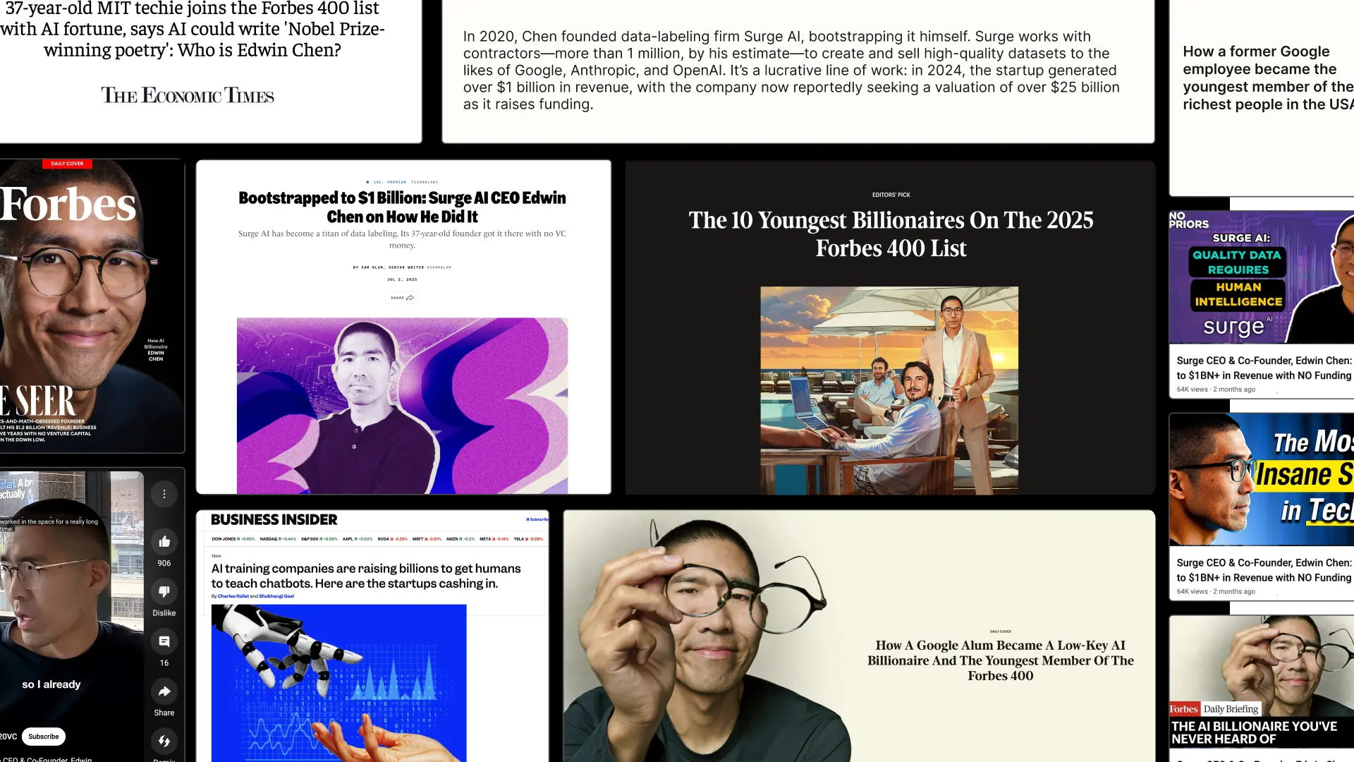
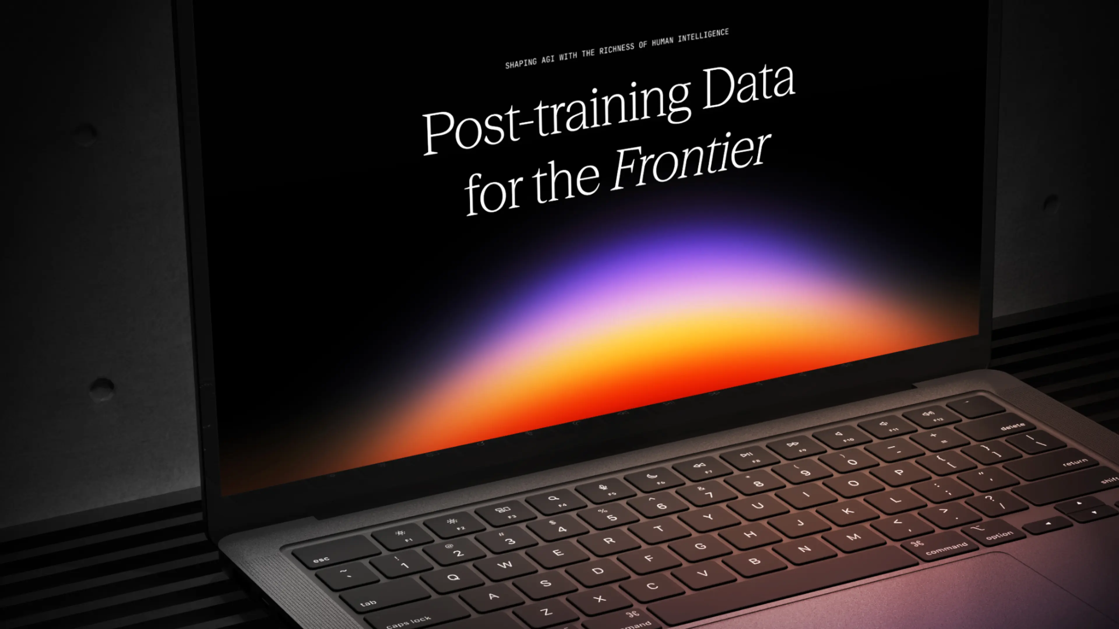
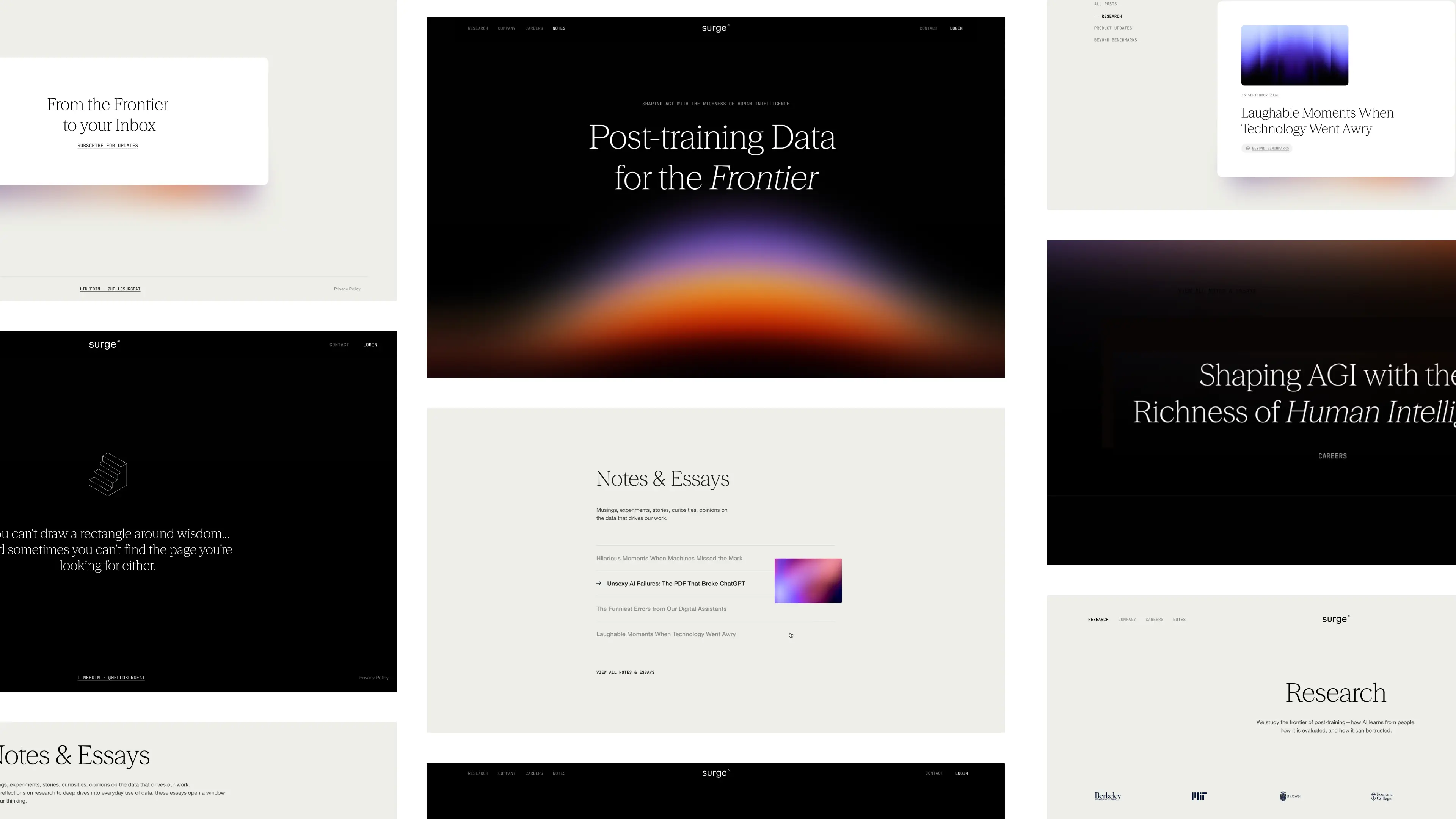
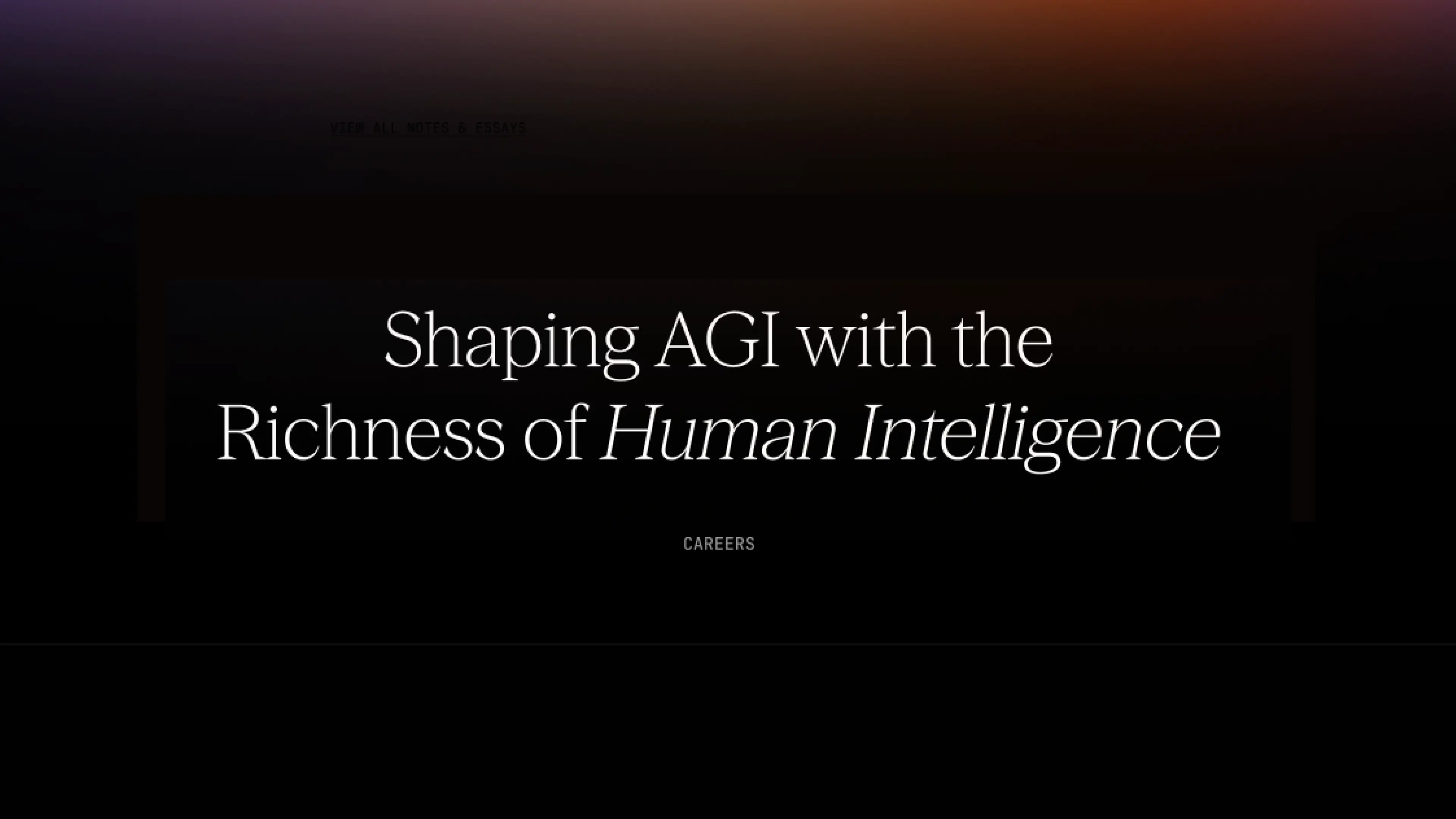
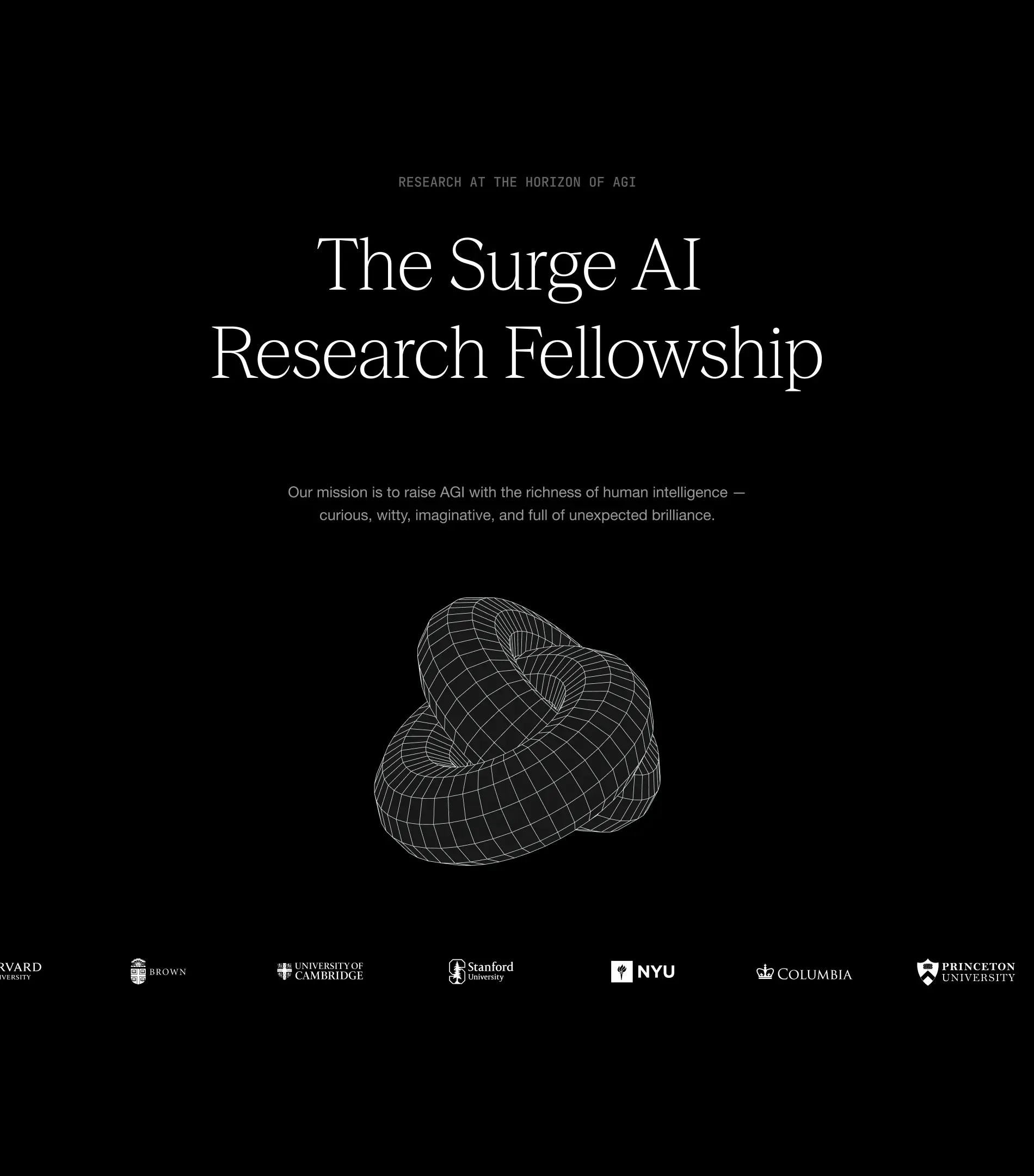
From day one, Surge needed more than a brand that looked good. They needed design that built credibility, earned trust, and scaled with them as they grew. They needed a design partner that ensures they stand out in the crowded world of AI infrastructure.
They chose Konpo. More than a vendor, we became their plug-and-play design team: senior talent embedded alongside leadership, shaping everything from their first identity to their website, product, and systems. At every stage, Surge found in Konpo a partner they could depend on.
.webp)
.webp)


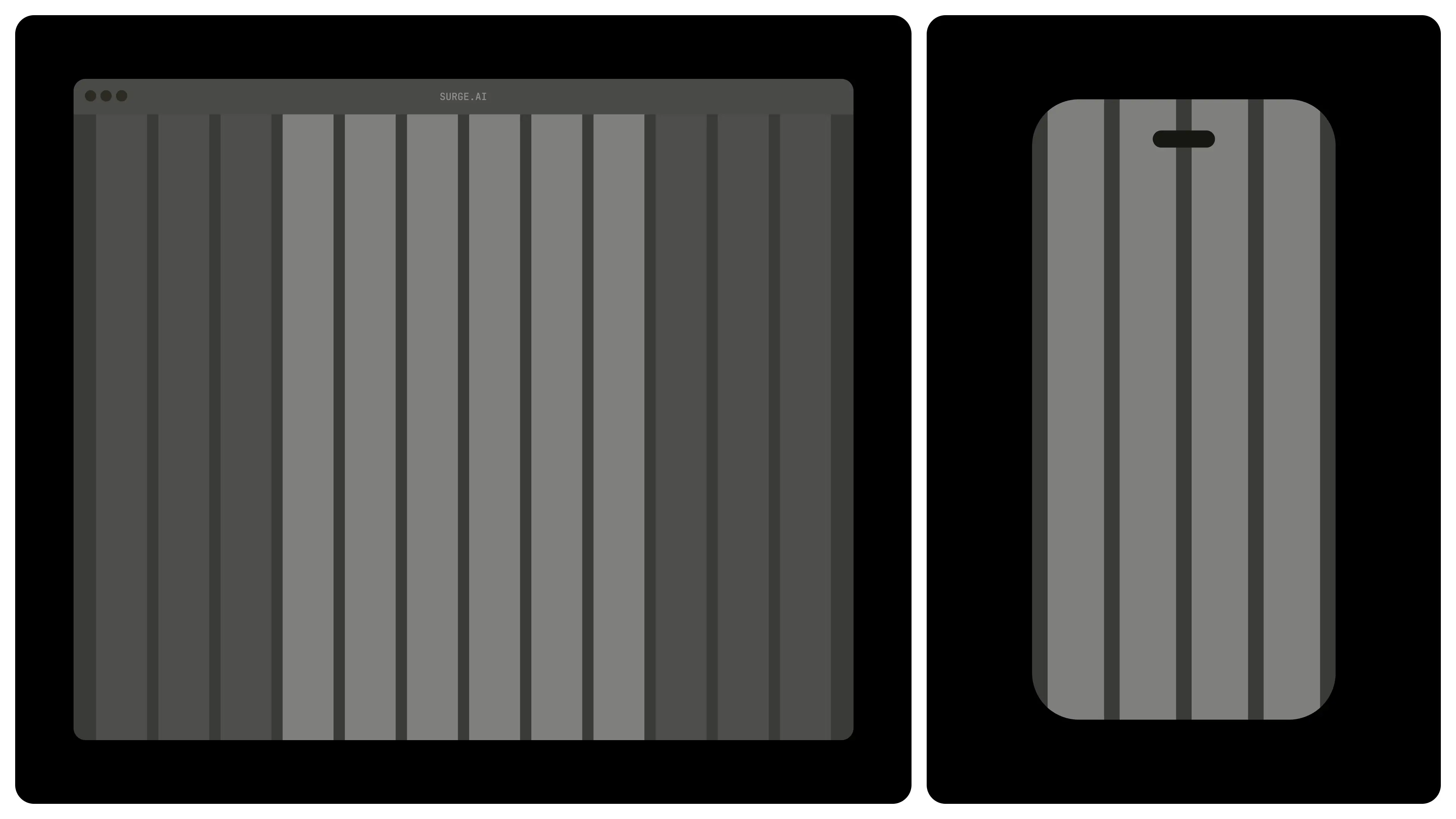
Our collaboration has become a long-term partnership that helped Surge grow from early explorations to a brand adopted by the leading AI and technology companies and a product internationally recognized and awarded.
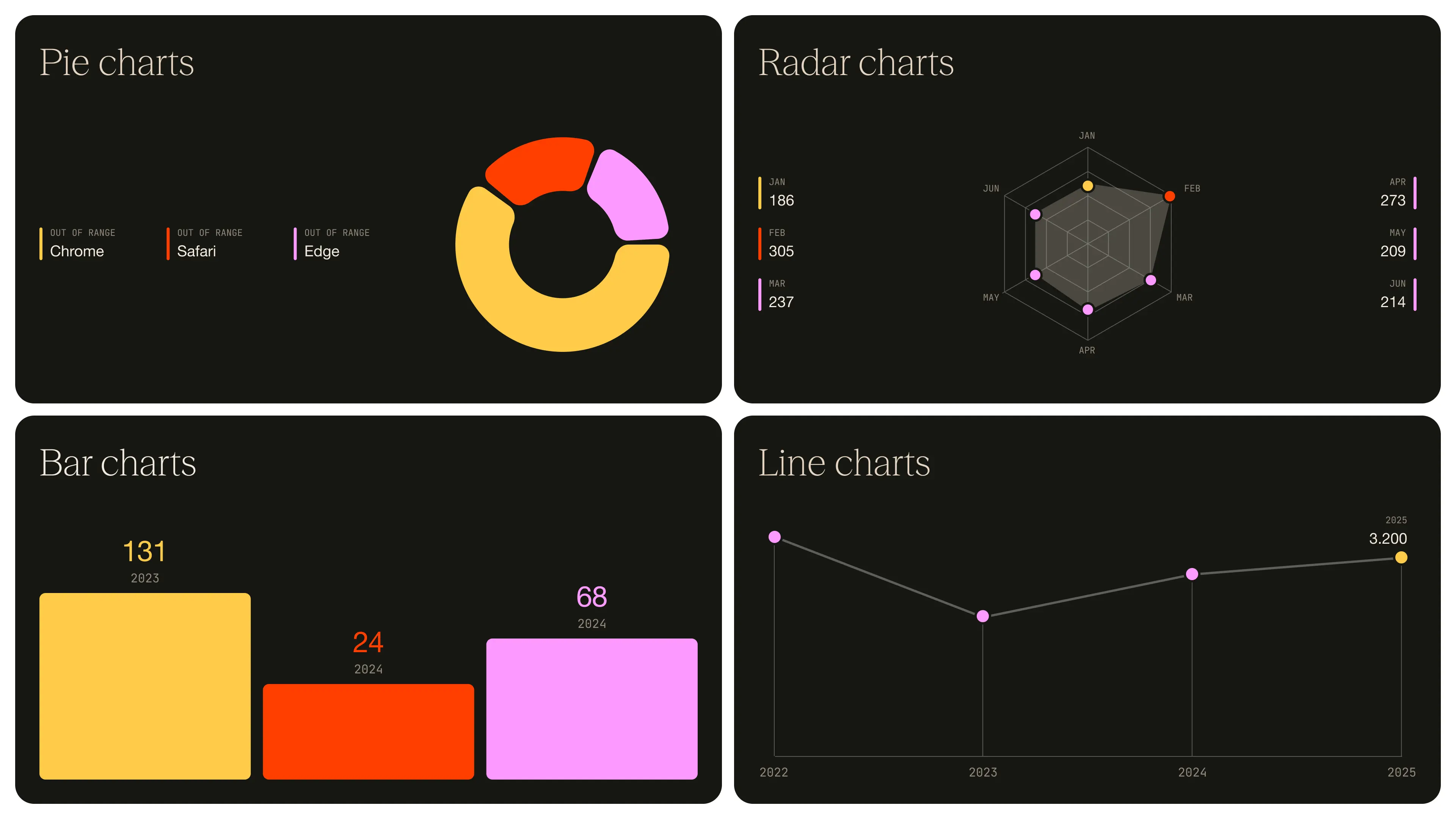
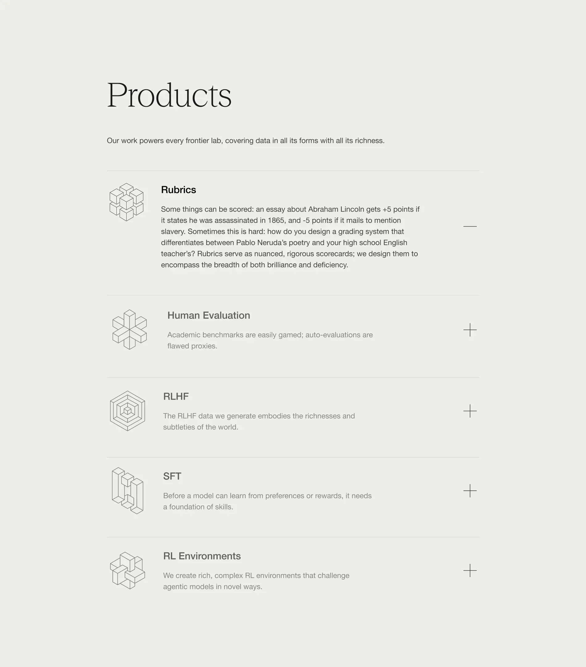
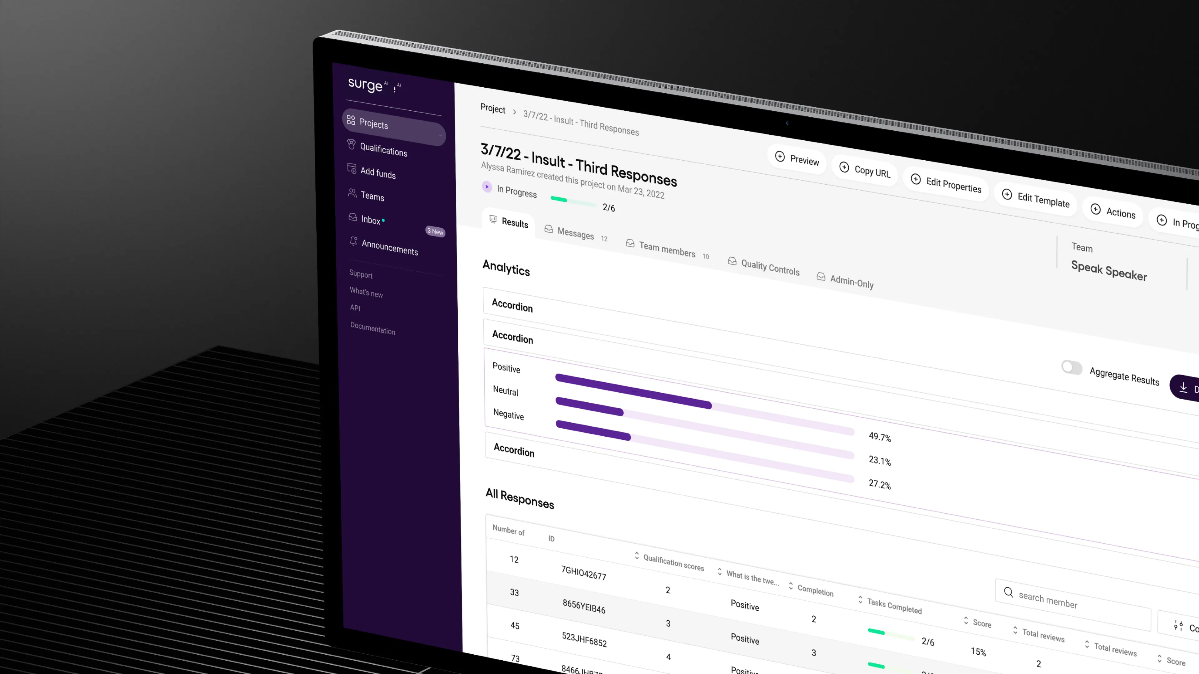
We built a bold, distinctive identity in an industry defined by sameness, designed a product experience that balanced delight with enterprise-grade usability, and crafted a design system to keep them consistent as they scaled.
As Surge now looks to fetch a valuation of over $15 billion in its first capital raise, we’re leading phase two of their branding. The goal: to build a brand that not only wins attention and trust, but one that matches the ambition and credibility of a company operating at that scale.
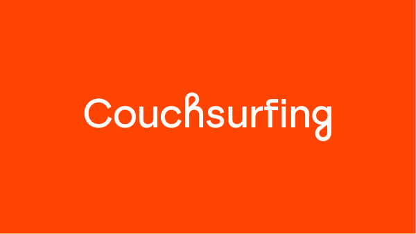
- Founder - Edwin Chen
- Year - 2025
- Industry - Artificial Intelligence
- Scope - Brand · Site · Systems
- Website - www.surgehq.ai

ComPsych needed a rebrand built to win. Younger competitors with sharper, design-driven branding were pulling attention away from the world’s largest provider of employee assistance programs (EAPs), a company supporting over 130 million people across 190 countries. They turned to Konpo to make sure their brand matched their scale and credibility. The mission: win back market share, turn reputation into loyalty, and defend their position at the top.
.webp)
.webp)
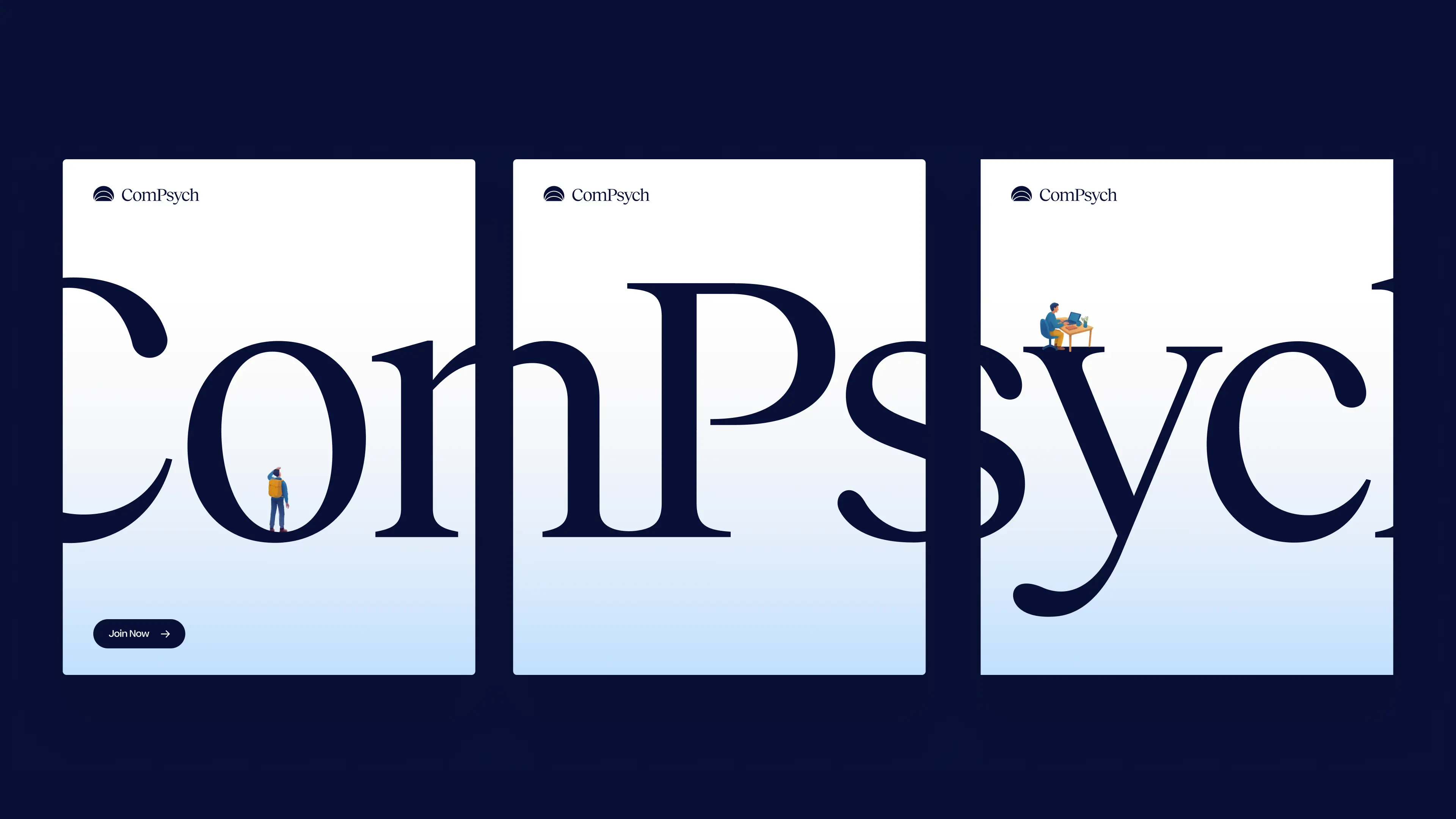
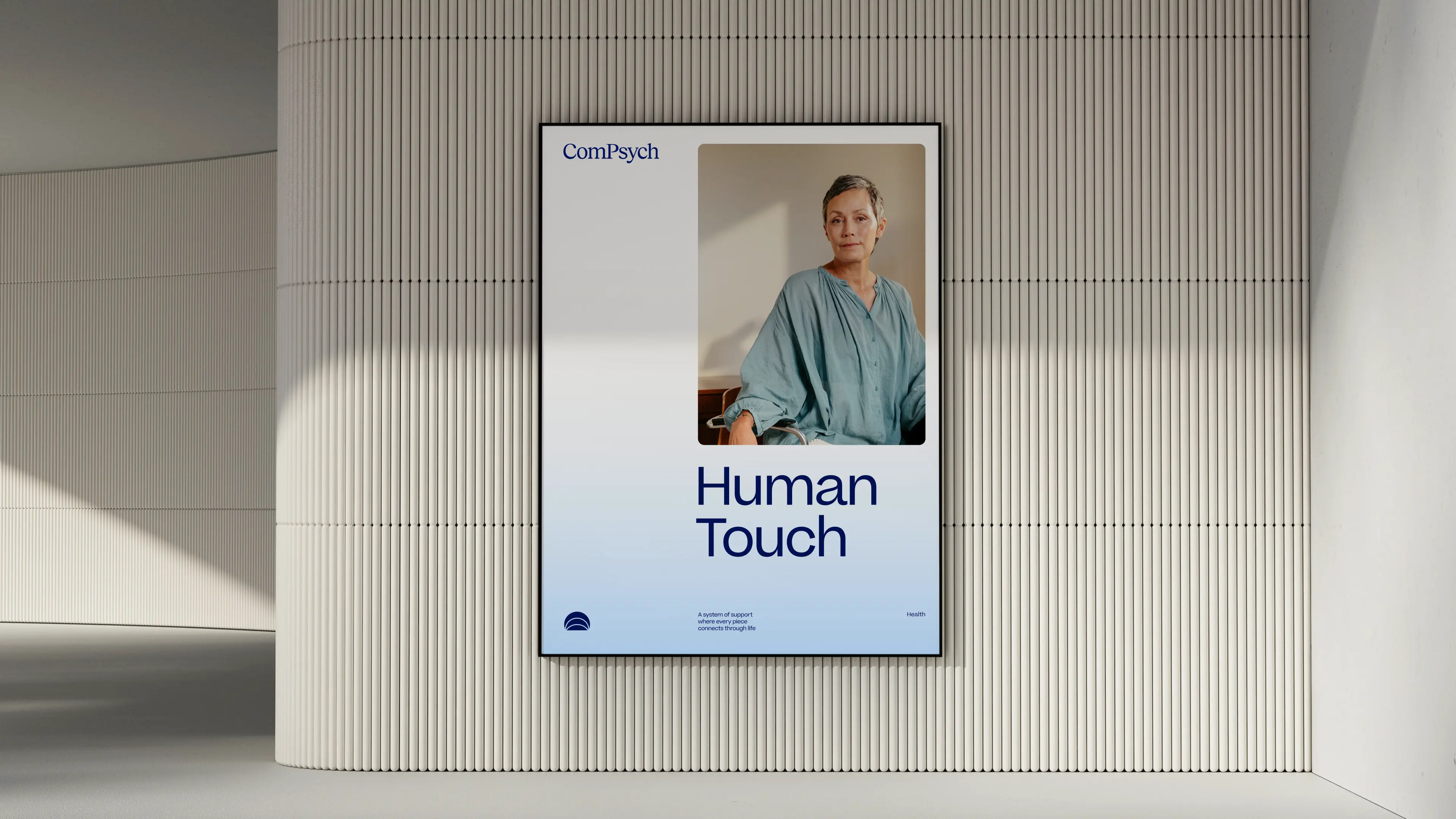
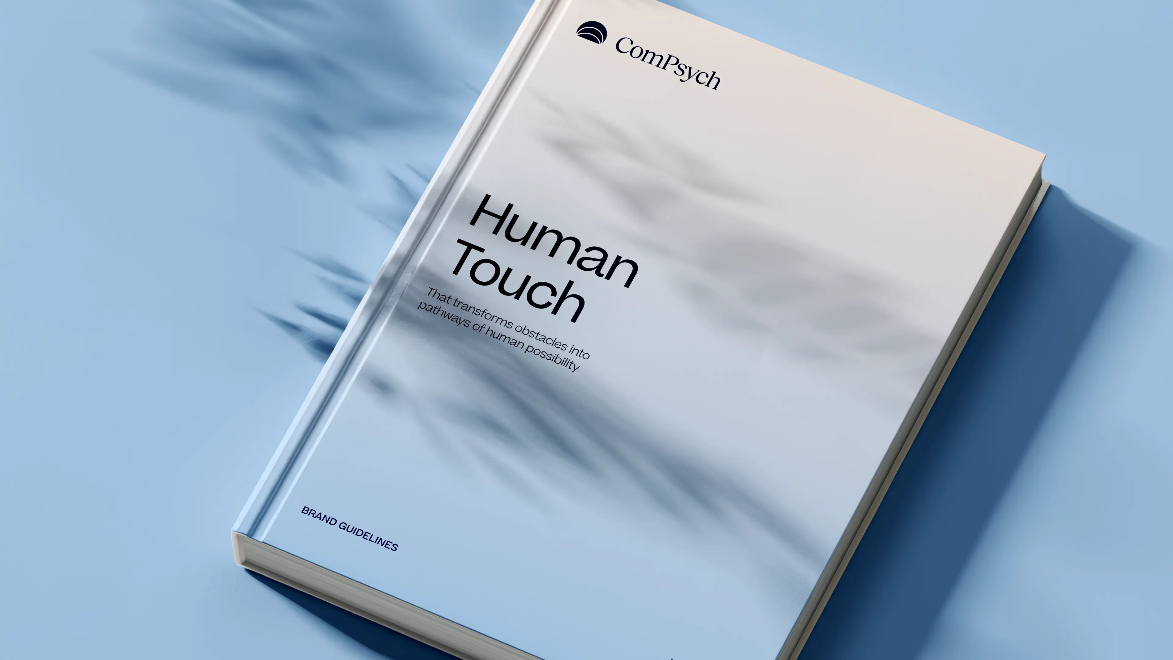
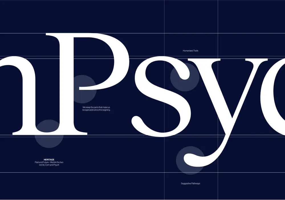
Every element of the ComPsych rebrand was built to show the strength of a category leader, but for today’s market and tomorrow’s. The new logo centers on a glowing core, with expanding ripples signalling growth, support, and scale. Their signature blue was sharpened with a modern palette designed to stand out with confidence, not noise. But what’s a rebrand without discipline to execute it? We built a dedicated brand hub that gave ComPsych everything, from logos to illustrations to voice, to apply their new identity consistently across 75,000+ organizations worldwide. And we delivered it beyond our original scope. The result: a brand that doesn’t just keep up with the competition, but takes back the lead. With a stronger identity and a system to sustain it, ComPsych now has the edge to defend its dominance and keep winning in a design-driven market.
- Industry - Employee Assistance Program (EAP)
- Scope - Brand
- Brand Hub - compsych.konpo.co
- Website - compsych.com
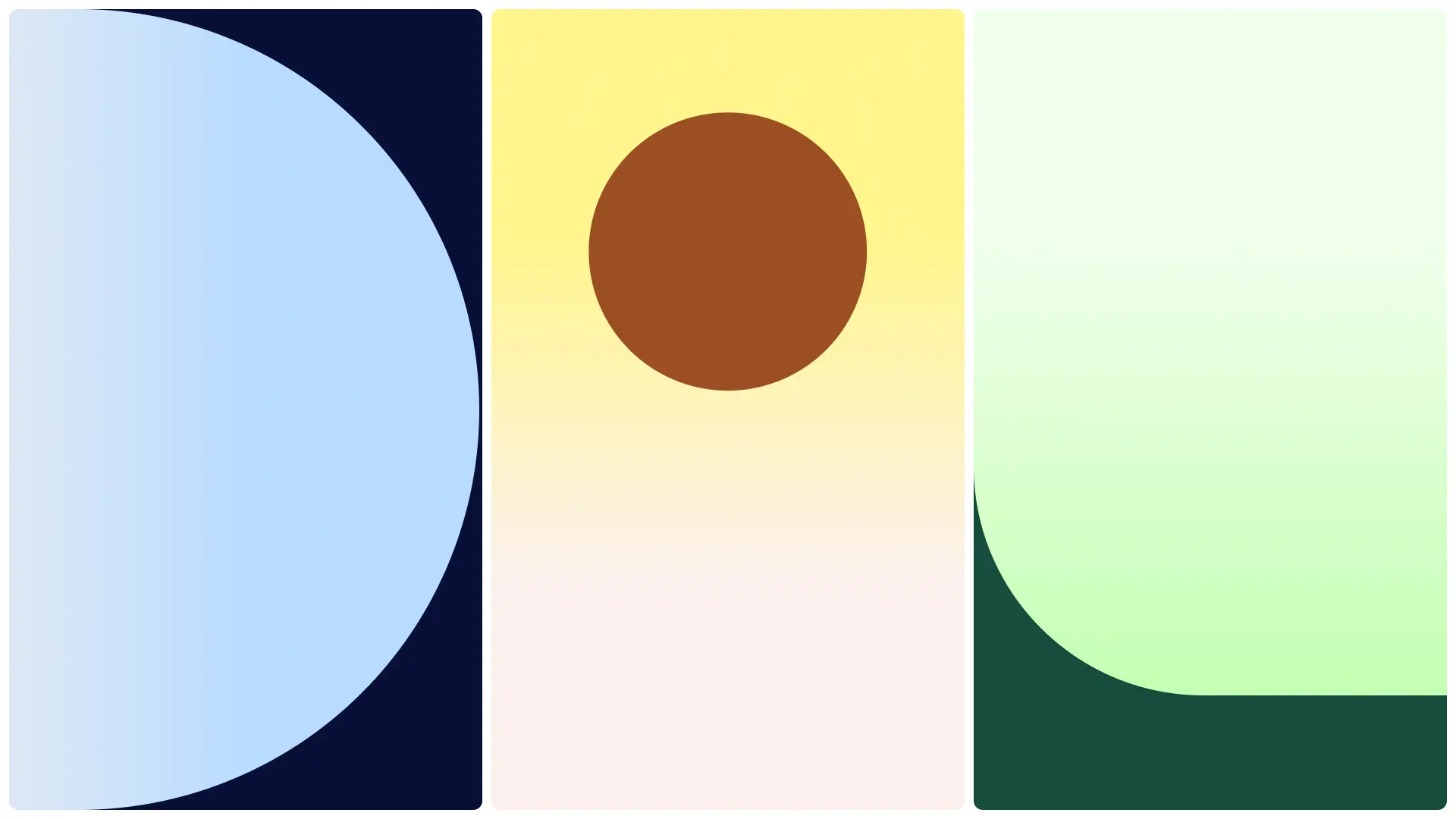
amp Fitness set out to launch its AI-powered strength training system with leadership and talent from Apple, DraftKings, Meta, Nike, and Spotify — people who held the highest design standards. To stand out in a crowded fitness space, they needed a design partner who could move as fast as they did and deliver world-class quality. That’s where Konpo came in. As their plug-and-play design studio, we worked elbow-to-elbow with Amp’s leadership to marry hardware and software into a seamless consumer experience. From product design to scalable design systems, we turned their ambitious vision into award-winning, user-loved reality. When the standards are highest, the right design partner makes all the difference.
.webp)
%201.webp)
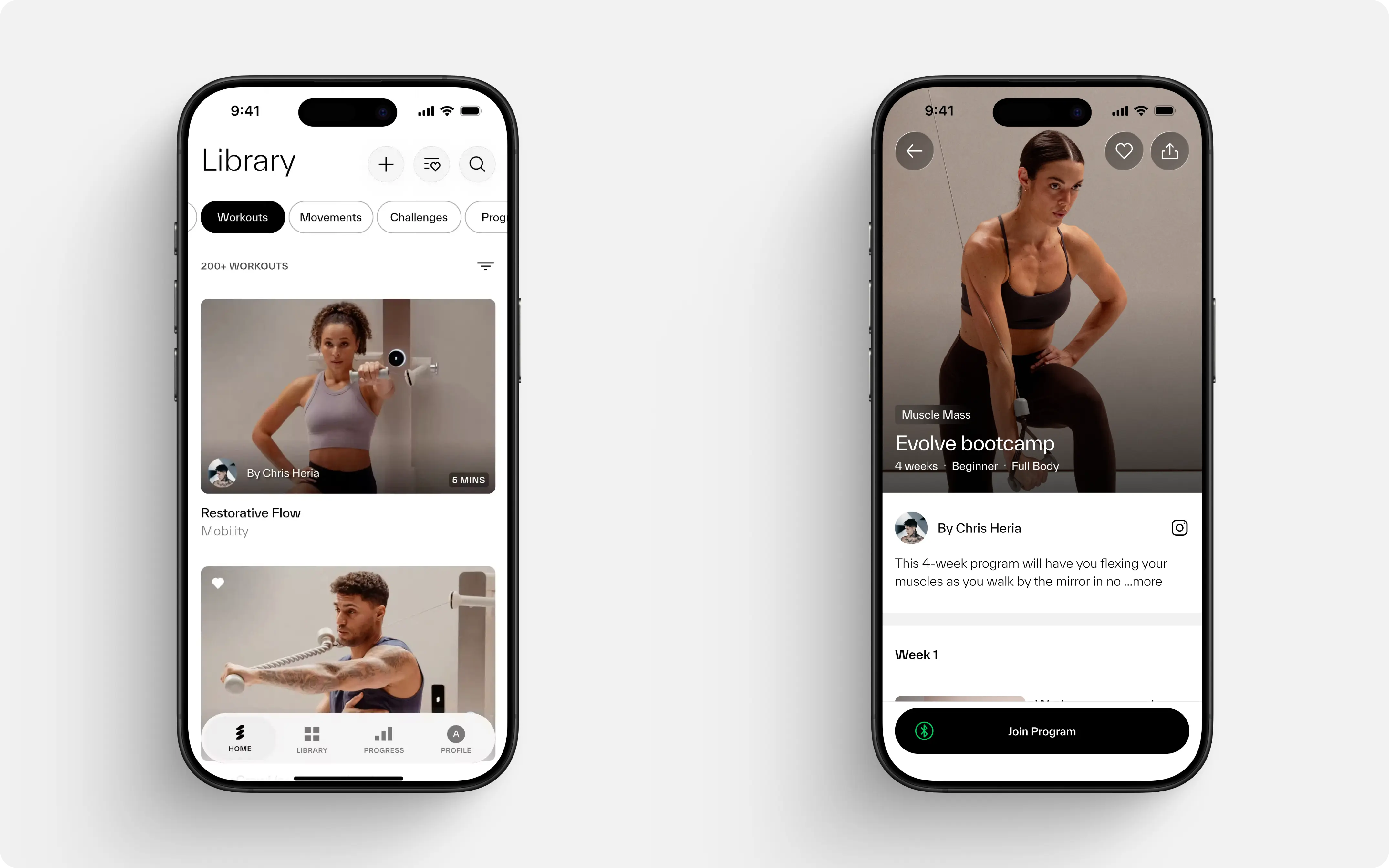
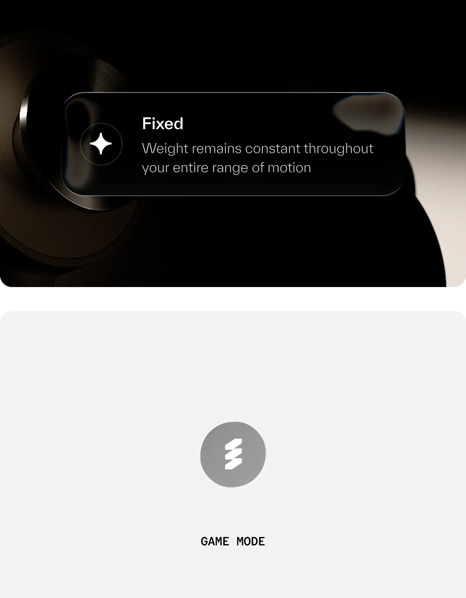
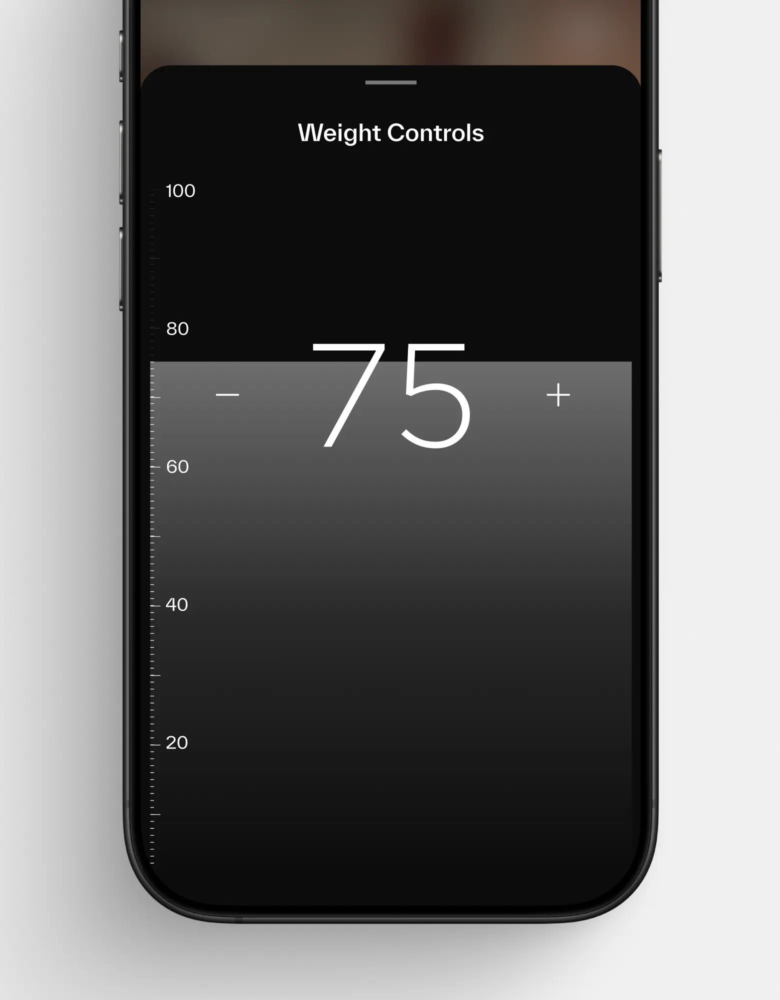
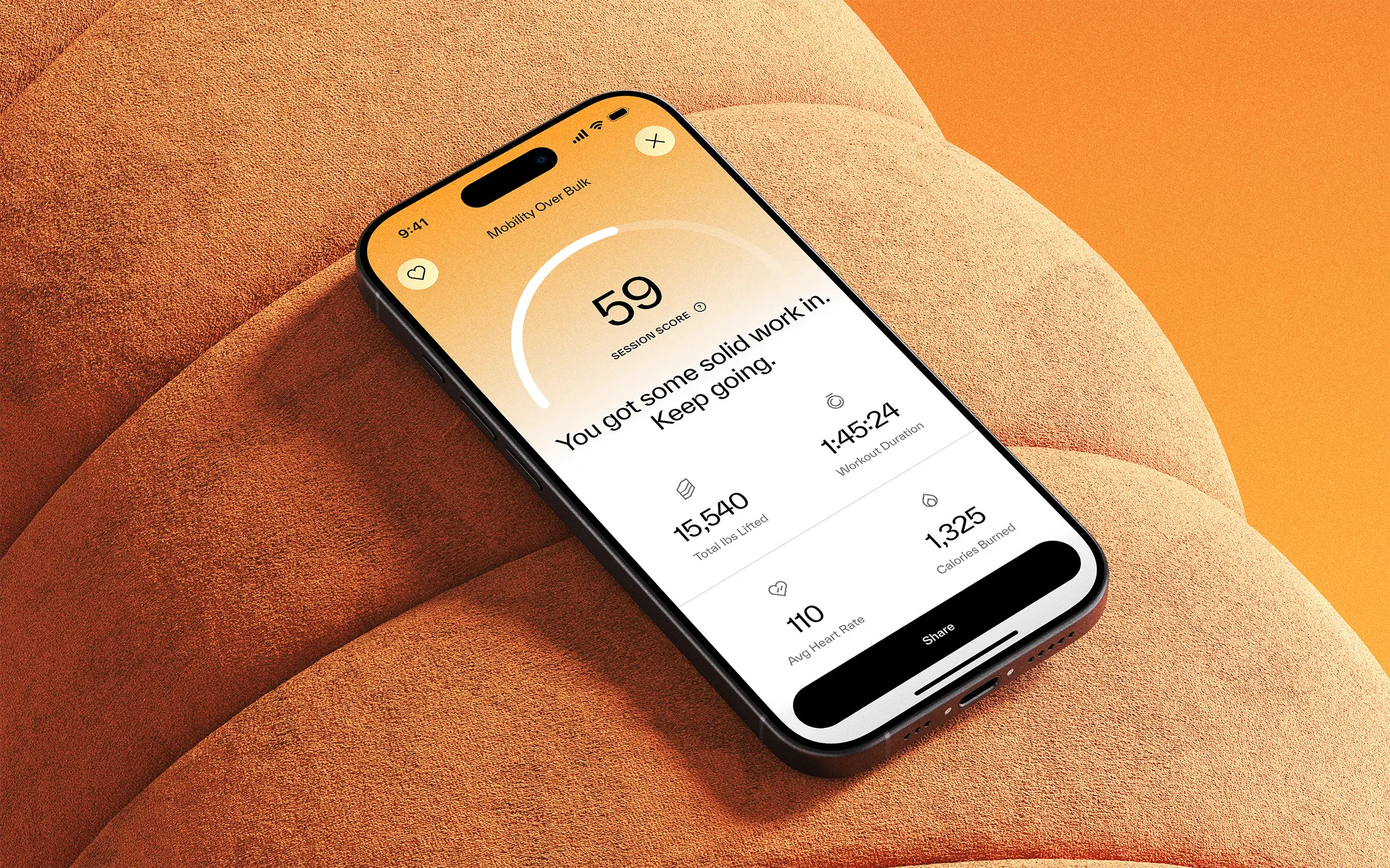
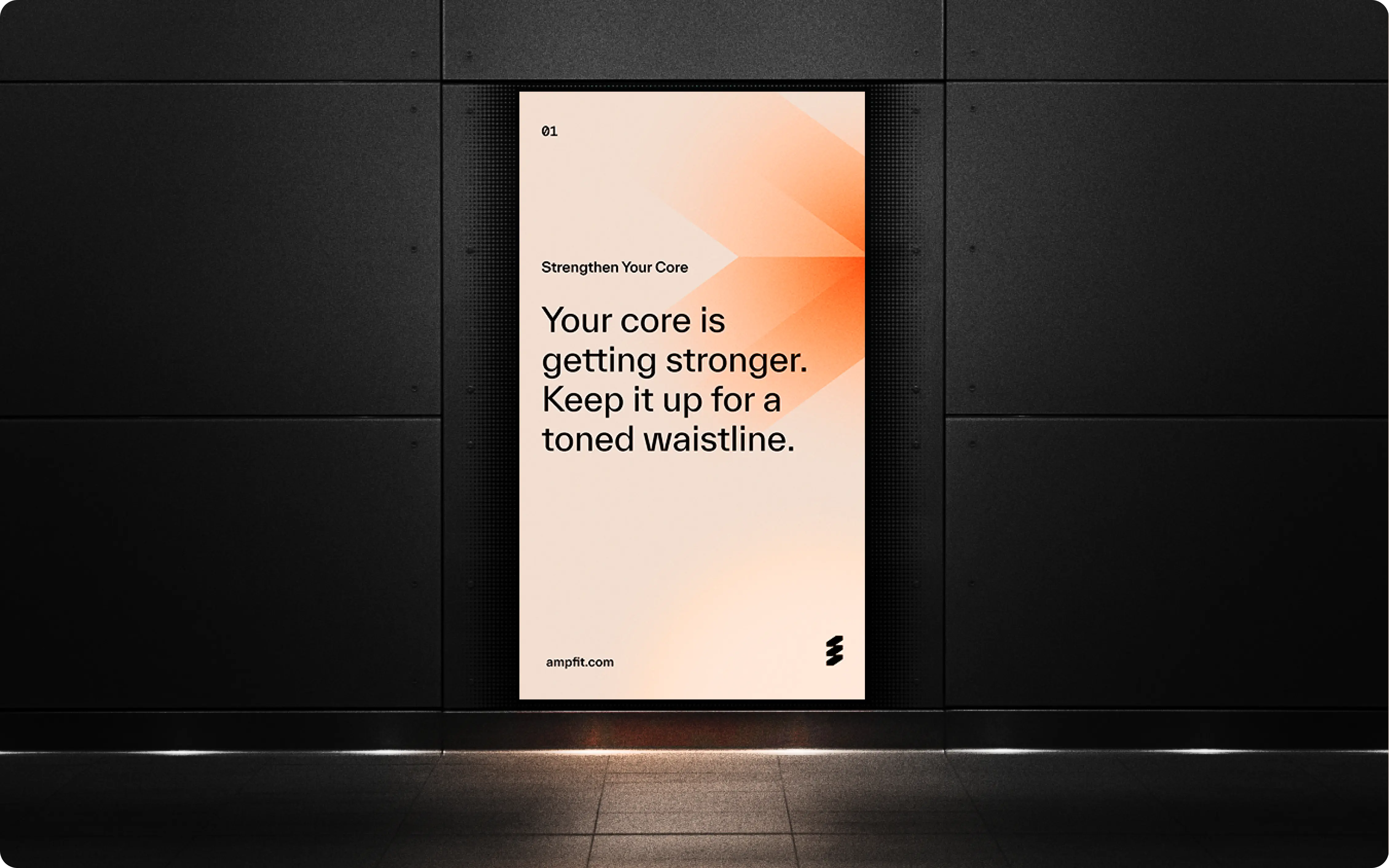
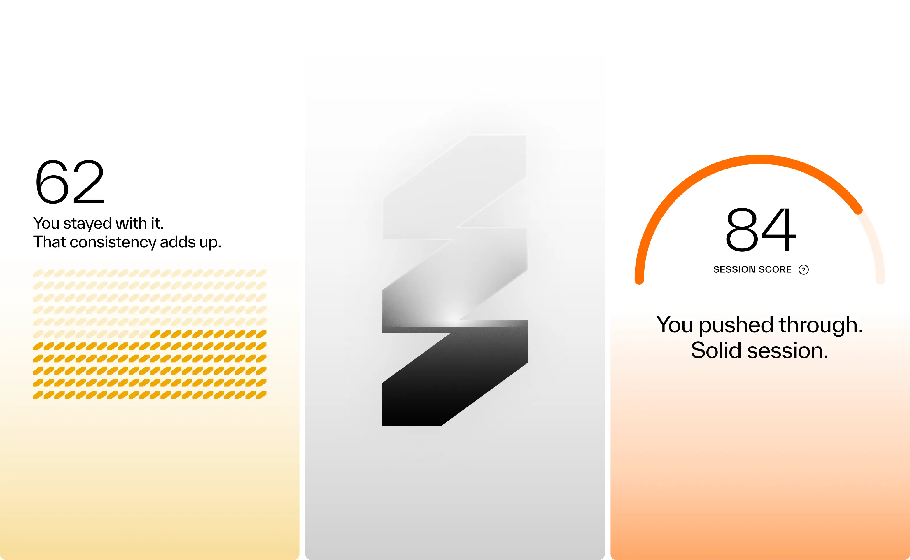

Results so far: 40,000 users, multiple awards, and a sleek wall-mounted system paired with a companion app. Working with amp meant translating adaptive resistance hardware, smart coaching, and modular accessories into a cohesive consumer experience. Add to that a team backed by Sports Science PhDs and leaders from Apple, Meta, and Nike, and the expectations were clear: nothing short of excellence would do. Rising to that challenge not only delivered results for amp, but pushed Konpo to sharpen our own systems and raise the bar. Challenge accepted. Mission accomplished.
- Founder - Shalom Meckenzie
- Year - 2024
- Industry - Fitness · Artificial Intelligence
- Scope - Brand · Product · Systems
- Website - www.ampfit.com
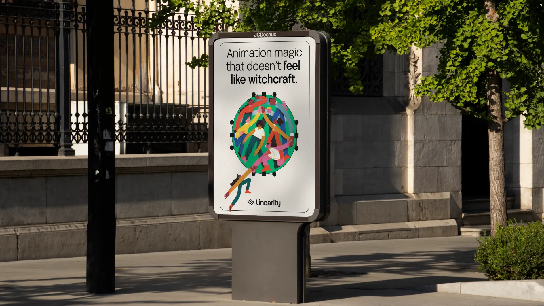
Designing Award-Winning Design Software.


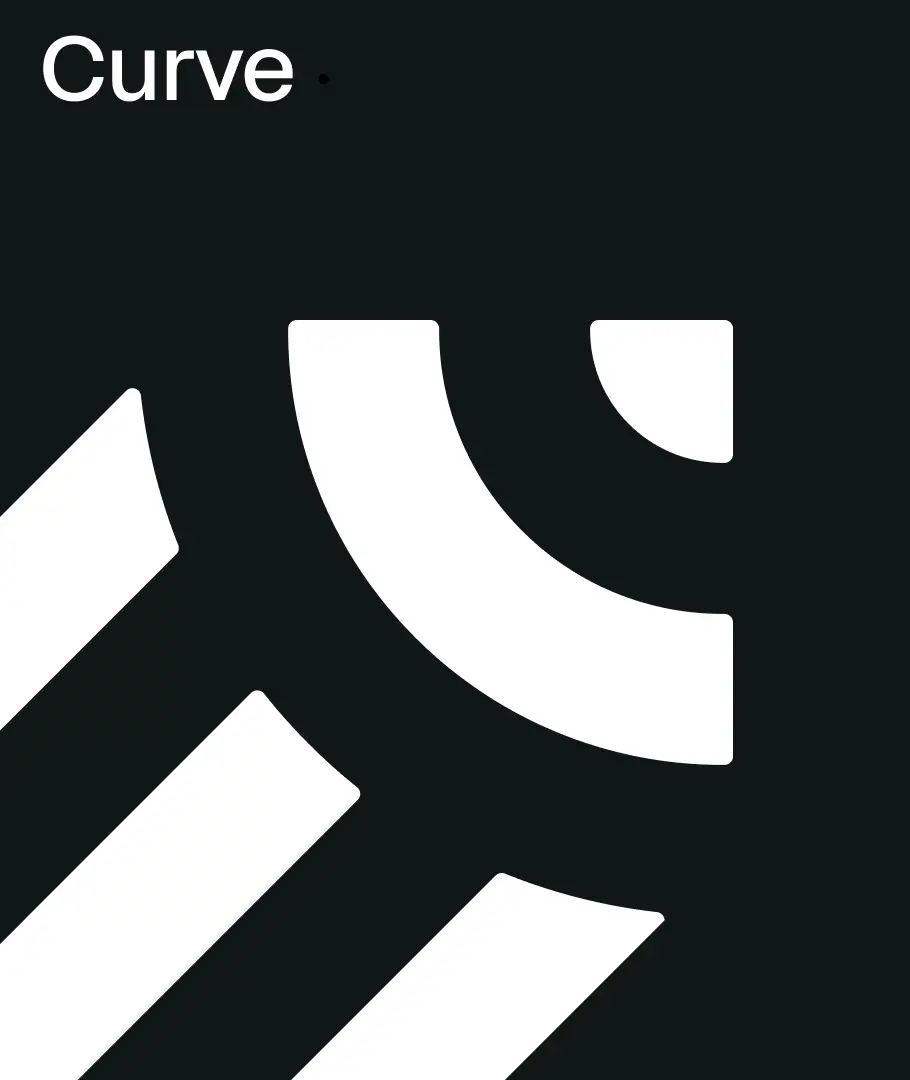
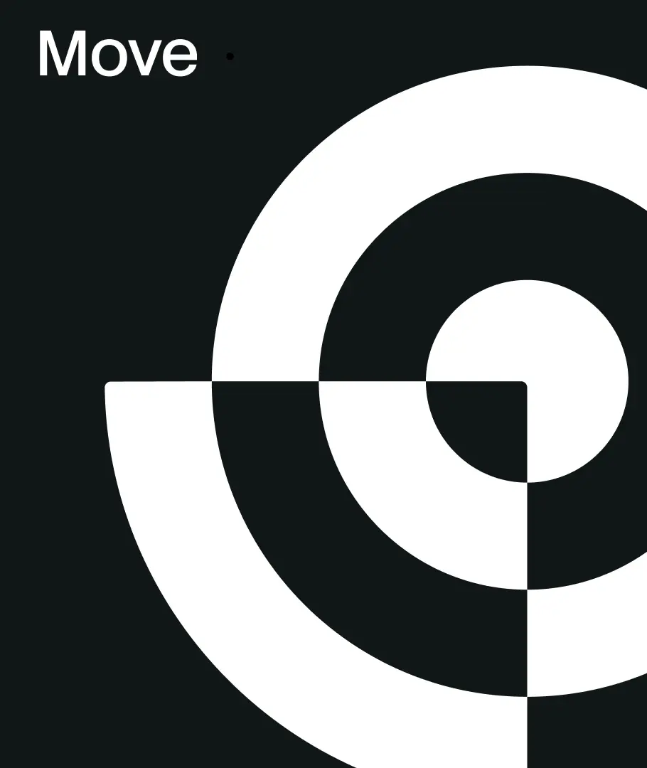
Vectornator had already earned the trust of millions of designers and teams at companies like Disney, Marvel, BBC, and Apple. As the product evolved into Linearity, with tools like Curve and Move, the platform expanded its capabilities while continuing to serve a creative community of illustrators, designers, and motion creators. The website, however, had gradually shifted toward a more marketing-driven B2B narrative. The challenge was to bring the focus back to the people actually using the tools—showing the product in action and speaking directly to the creative community behind it.
Linearity entrusted Konpo with its brand rebirth, setting up the foundation to scale and launch several product lines. Imagine a visually captivating website turbocharged with a brand-new Design System, designed to convert and host millions of visitors.
Konpo’s challenge was to move the visual communication from illustrators and freelance designers to being the go-to hub for enterprise-level design exploration.
The results? A visually captivating interface that mirrors the software's innovation. The new brand identity resonated with the target audience, leading to improved brand recognition and recall.
Konpo’s efforts received recognition within the industry, winning Best Design Awwwards for its excellence in design. The product is also achieving a consistent +4.6-star rating in the App Store.
Reconnecting the Brand With Its Creative Audience
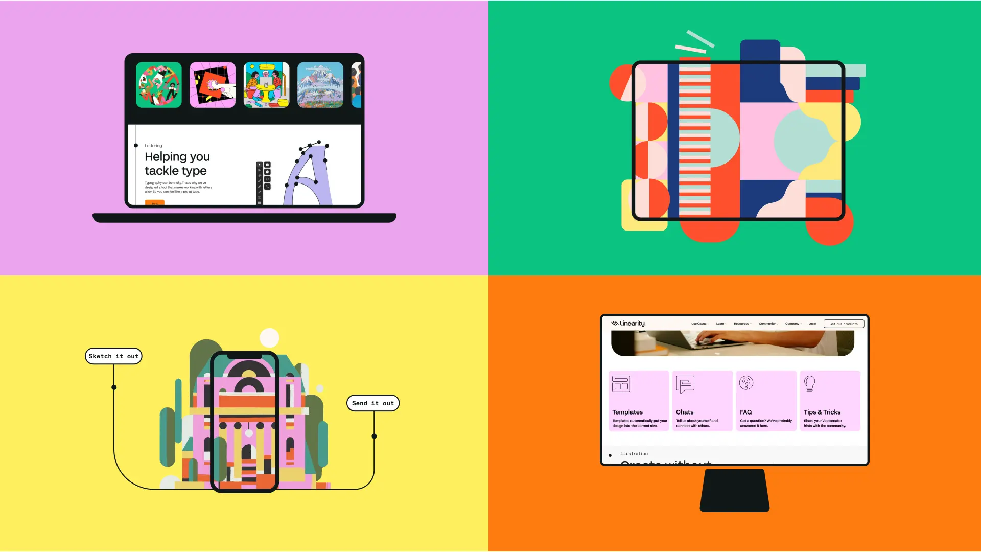
Linearity partnered with Konpo to redesign its website and realign the product’s online presence with the people who use it every day. Over time, the site had adopted a more corporate, marketing-led tone that didn’t fully reflect the creative workflows of illustrators, designers, and motion creators working with Curve and Move. The goal was to shift the focus back to the product experience, showing what the tools enable, how they work, and why they matter to the creative community. The challenge was to simplify the narrative, highlight real creative use cases, and create a digital experience that feels closer to the tools themselves.
Reconnecting the Brand With Its Creative Audience
Linearity partnered with Konpo to redesign its website and realign the product’s online presence with the people who use it every day. Over time, the site had adopted a more corporate, marketing-led tone that didn’t fully reflect the creative workflows of illustrators, designers, and motion creators working with Curve and Move. The goal was to shift the focus back to the product experience, showing what the tools enable, how they work, and why they matter to the creative community. The challenge was to simplify the narrative, highlight real creative use cases, and create a digital experience that feels closer to the tools themselves.
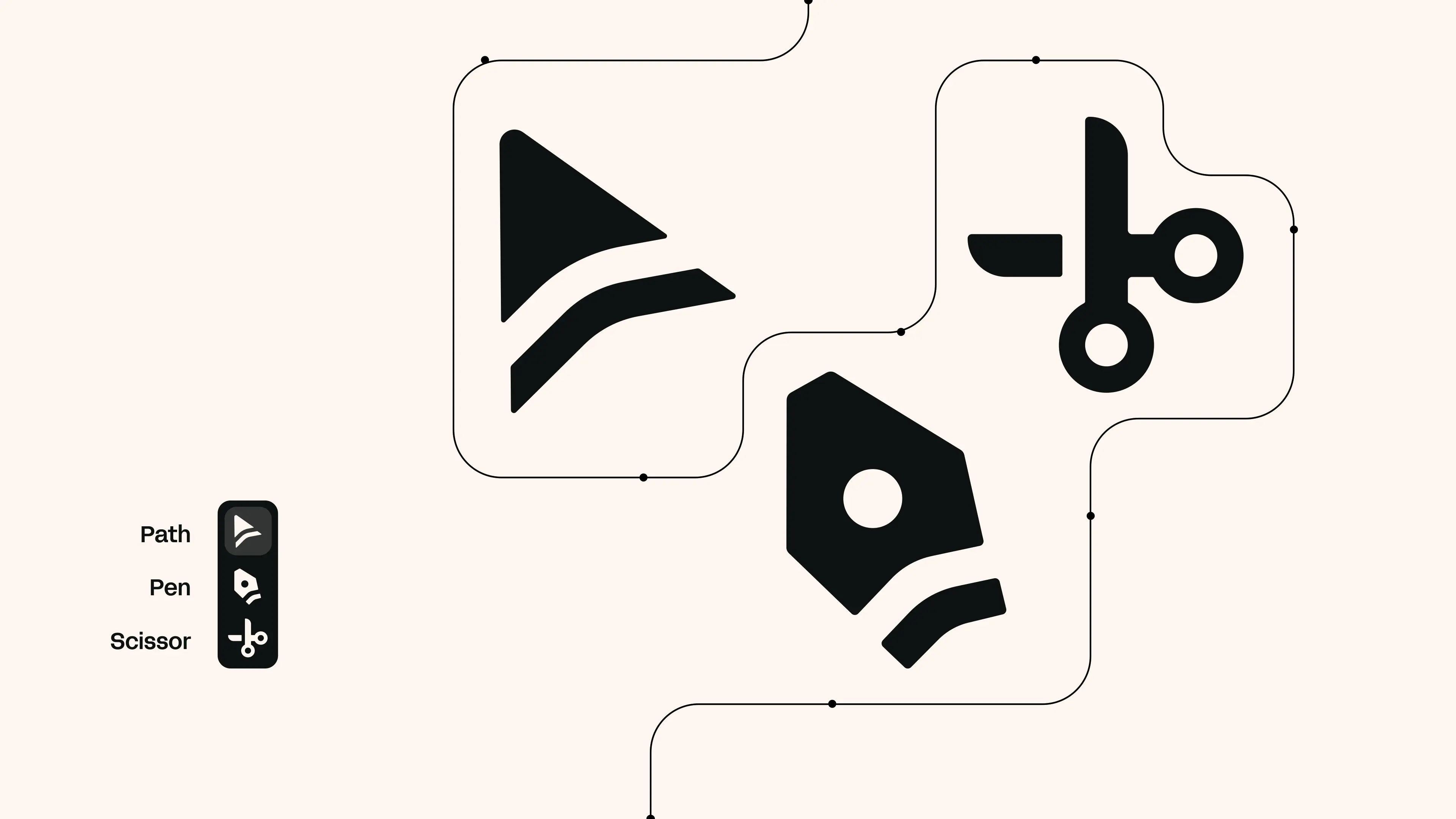
Designing for the Creative Workflow
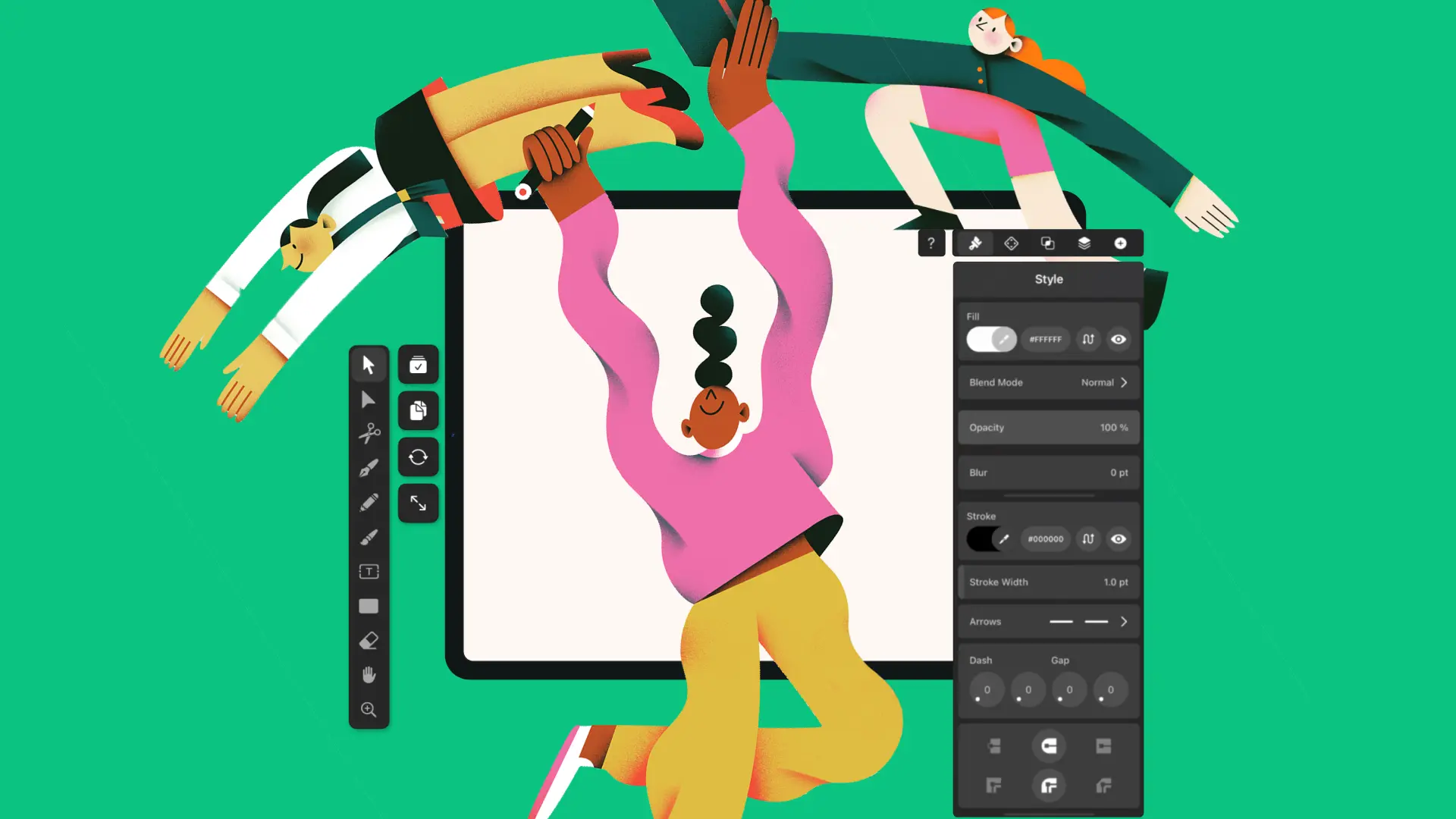
We focused on presenting the tools through the lens of the people using them. Instead of broad marketing messaging, the structure highlights real workflows across illustration, vector design, and motion. User journeys were redesigned to surface key capabilities of Curve and Move, while messaging was simplified to be direct and product-focused. Motion and interaction patterns help guide attention and demonstrate features in context, making the experience clearer and more intuitive for creative users.
Designing for the Creative Workflow
We focused on presenting the tools through the lens of the people using them. Instead of broad marketing messaging, the structure highlights real workflows across illustration, vector design, and motion. User journeys were redesigned to surface key capabilities of Curve and Move, while messaging was simplified to be direct and product-focused. Motion and interaction patterns help guide attention and demonstrate features in context, making the experience clearer and more intuitive for creative users.
Working With Another Agency
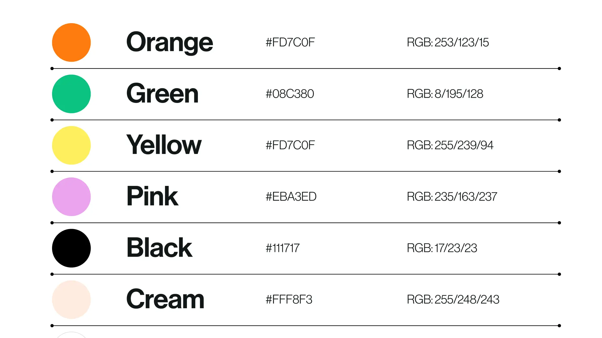
Linearity’s identity, created by Koto, is bold, fresh, and energetic. Rather than redefining it, our role was to understand it and carry it through the website in a way that feels natural and consistent. We often work alongside in-house teams or other agencies, and when the foundation is strong, it allows us to focus on how the brand behaves in a digital environment—how it moves, how it scales, and how it supports the product experience.
Working With Another Agency
Linearity’s identity, created by Koto, is bold, fresh, and energetic. Rather than redefining it, our role was to understand it and carry it through the website in a way that feels natural and consistent. We often work alongside in-house teams or other agencies, and when the foundation is strong, it allows us to focus on how the brand behaves in a digital environment—how it moves, how it scales, and how it supports the product experience.
.webp)

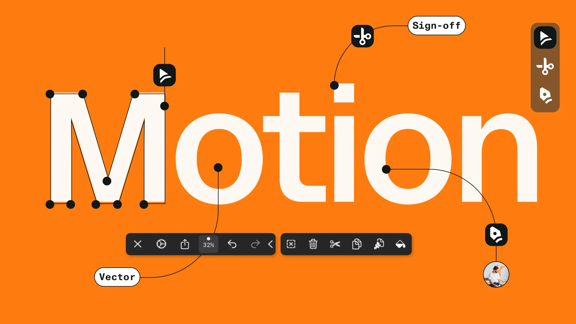
Putting the Tools at the Center
The redesign places the product experience at the core of the website. Curve and Move are presented through real examples, clear feature explanations, and visual demonstrations that reflect how creators actually use them. Subtle motion and hover interactions guide exploration and bring the interface to life. Layered visuals add depth while maintaining strong performance, and the layout system adapts smoothly across devices. The result is a site that feels closer to the product itself: visual, clear, and built around creative work.
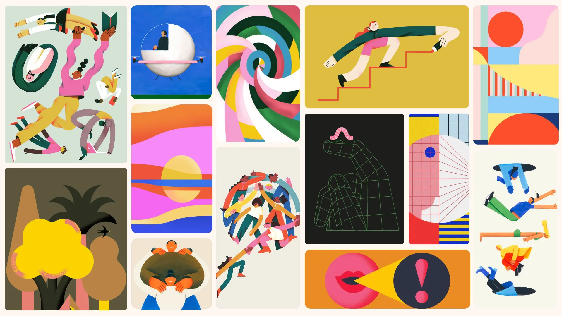
A Website That Speaks to Creators Again
The new website reconnects Linearity with its core audience of illustrators, designers, and motion creators. By focusing on real workflows and the capabilities of Curve and Move, the experience communicates the product more clearly while reflecting the creativity of the community using it. The result is a digital presence that feels aligned with the tools themselves, practical, visual, and built for creators.


Konpo for us is like our internal design team. Every single design they made for us is amazing. We're super happy to work with them and would not replace them with anyone else. They simply go the extra mile.


.webp)

.webp)

.webp)


.jpg)
.webp)


.webp)
.webp)

.webp)