


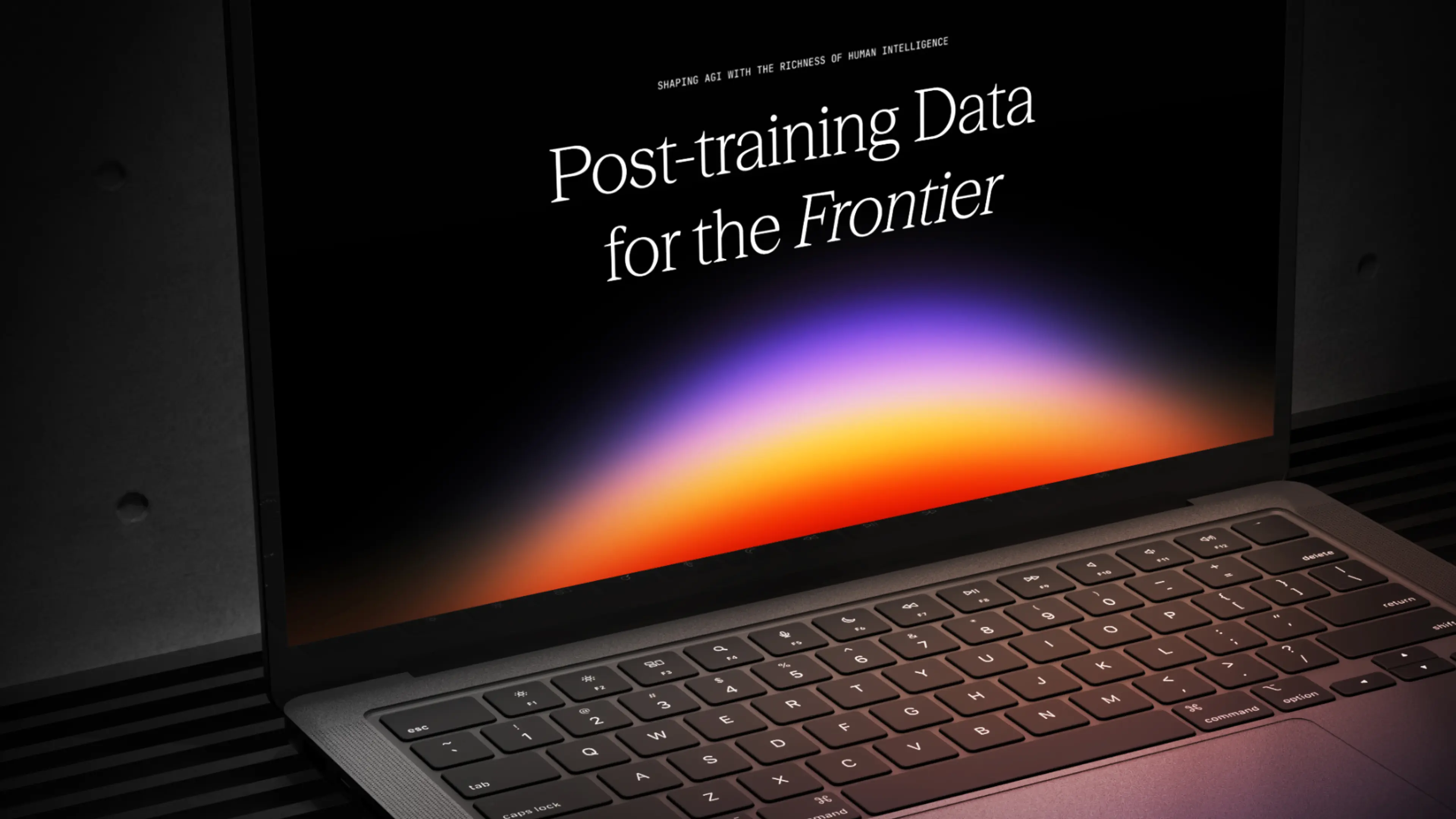
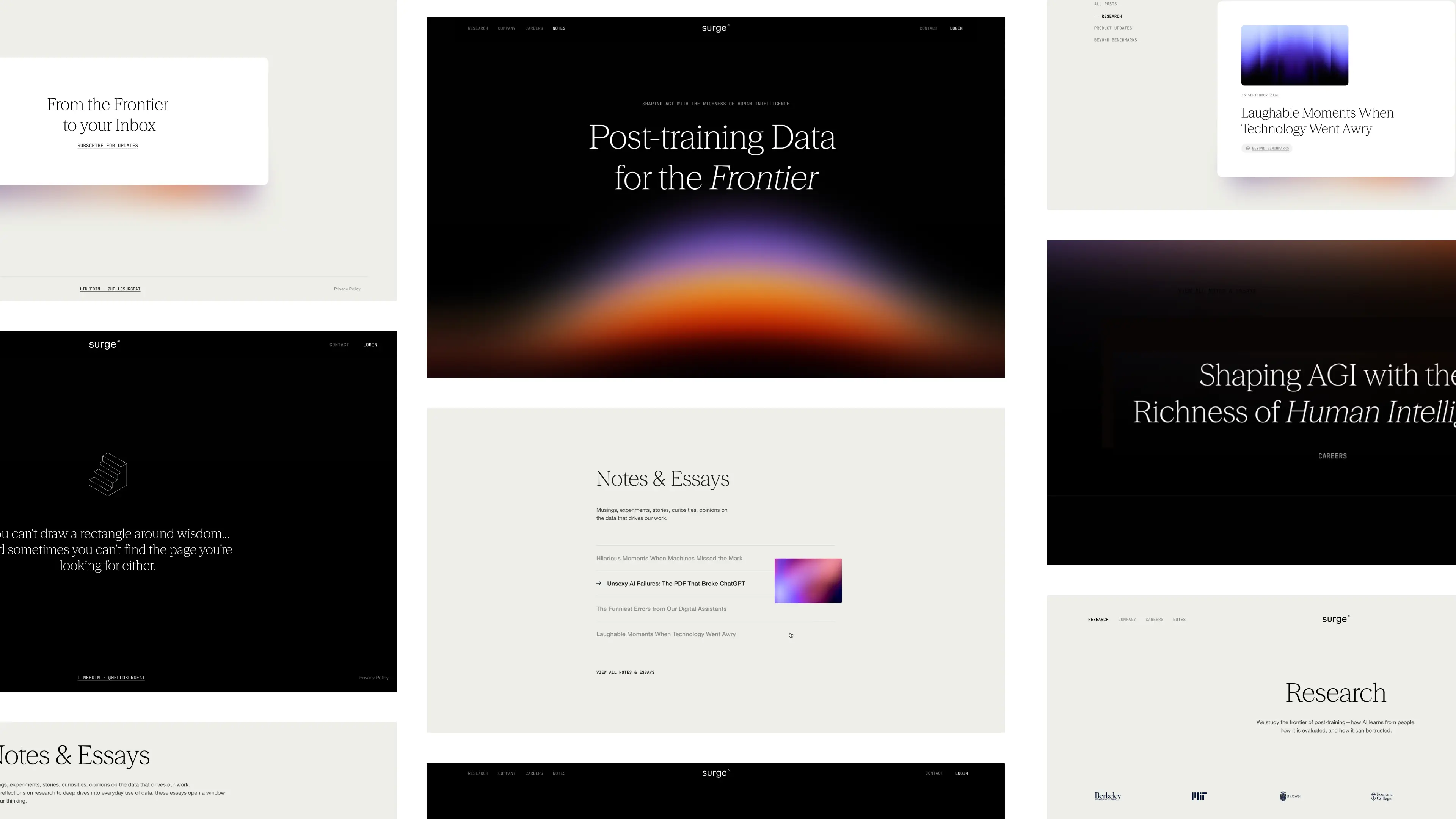
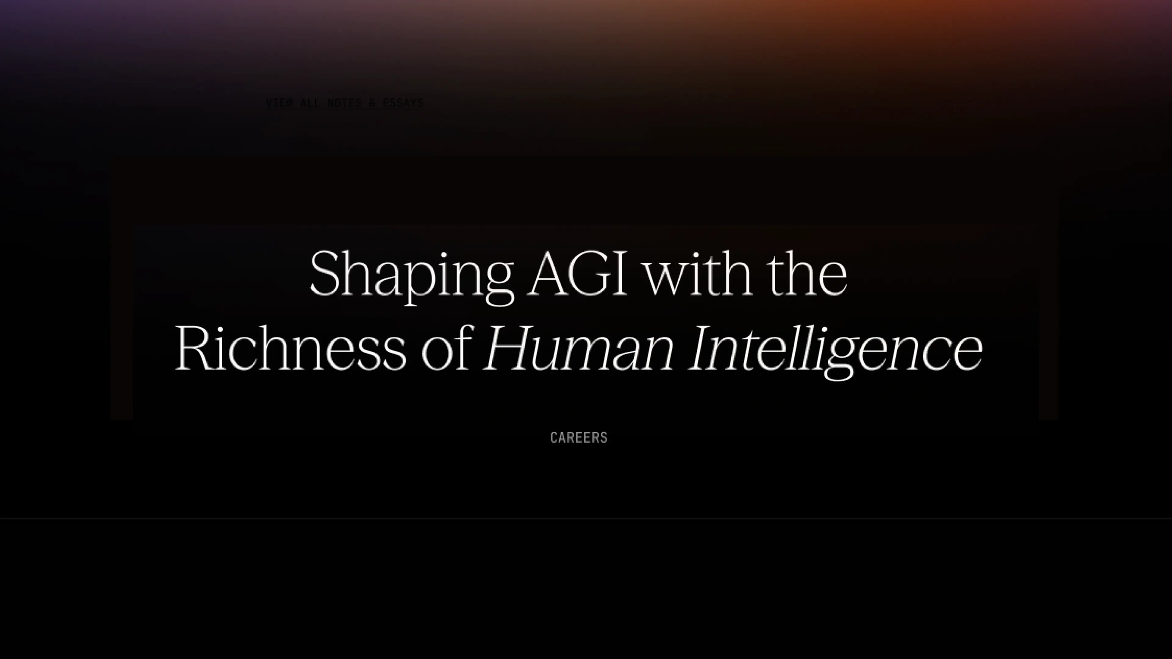
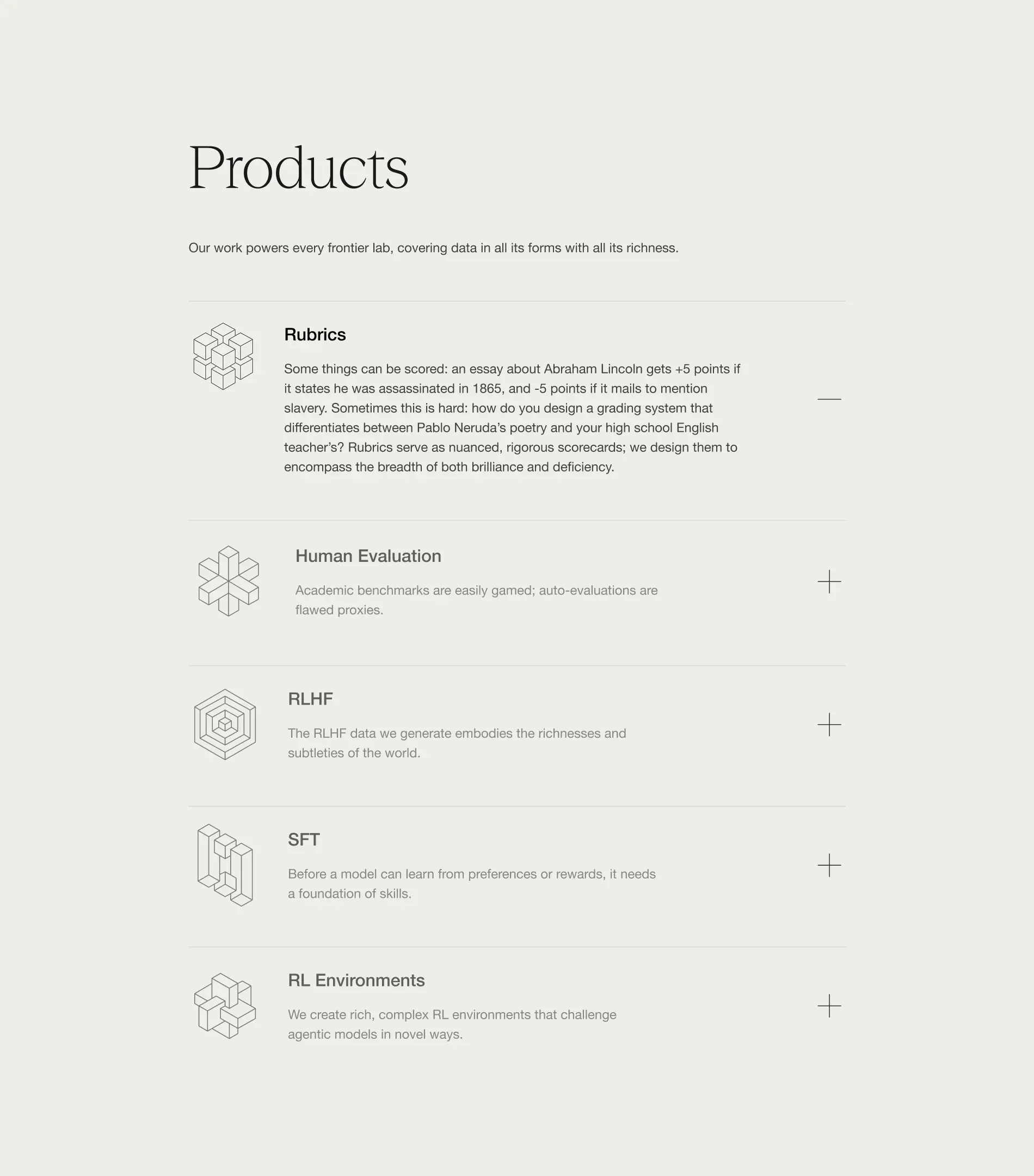
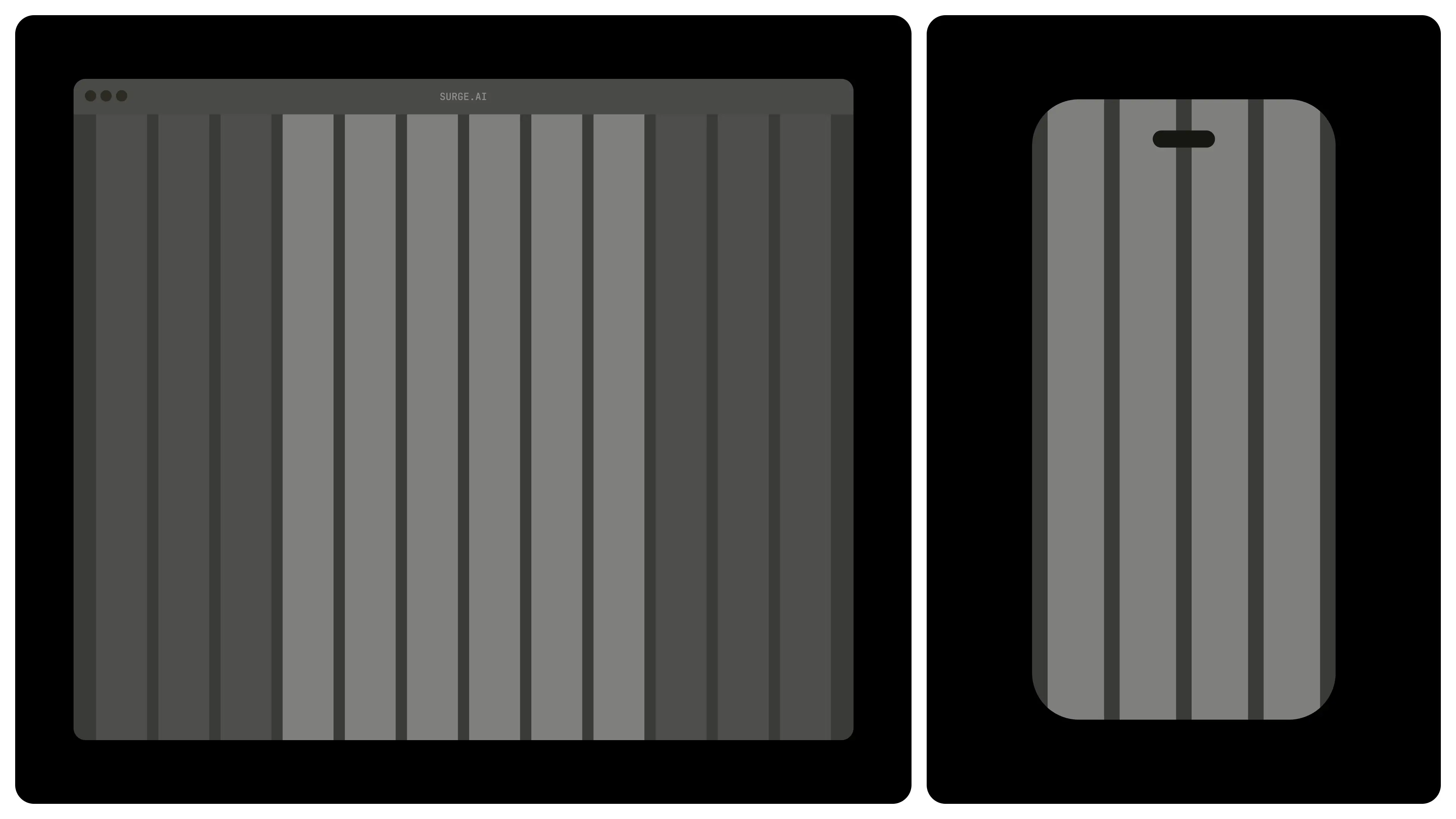
From day one, Surge needed more than a brand that looked good. They needed design that built credibility, earned trust, and scaled with them as they grew. They needed a design partner that ensures they stand out in the crowded world of AI infrastructure.
They chose Konpo. More than a vendor, we became their plug-and-play design team: senior talent embedded alongside leadership, shaping everything from their first identity to their website, product, and systems. At every stage, Surge found in Konpo a partner they could depend on.
.webp)
.webp)


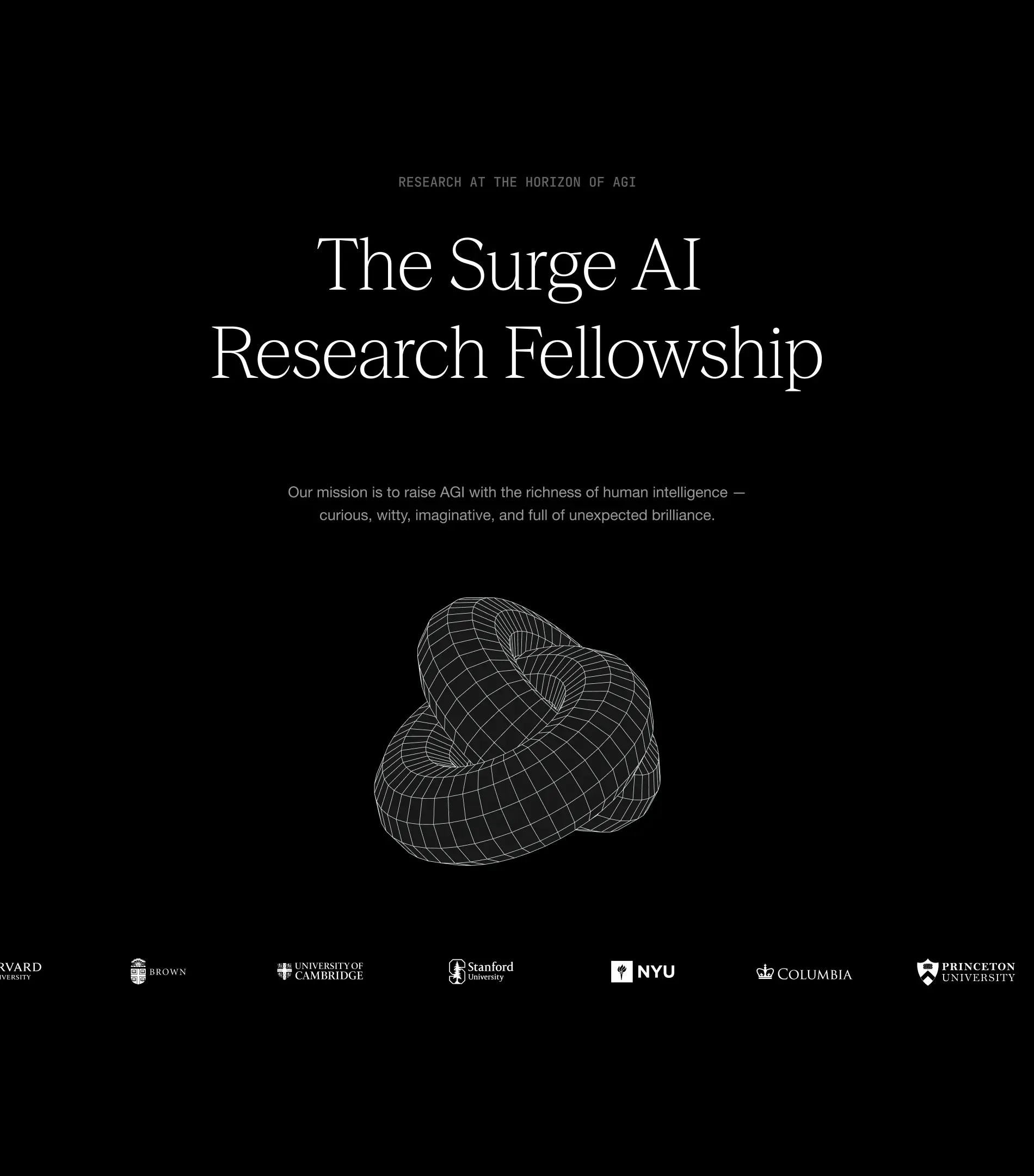
Our collaboration has become a long-term partnership that helped Surge grow from early explorations to a brand adopted by the leading AI and technology companies and a product internationally recognized and awarded.
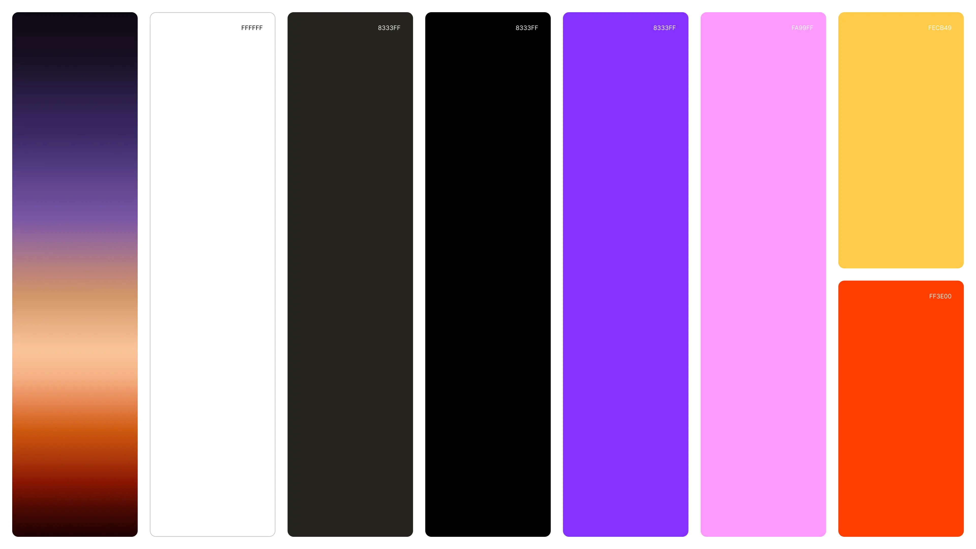
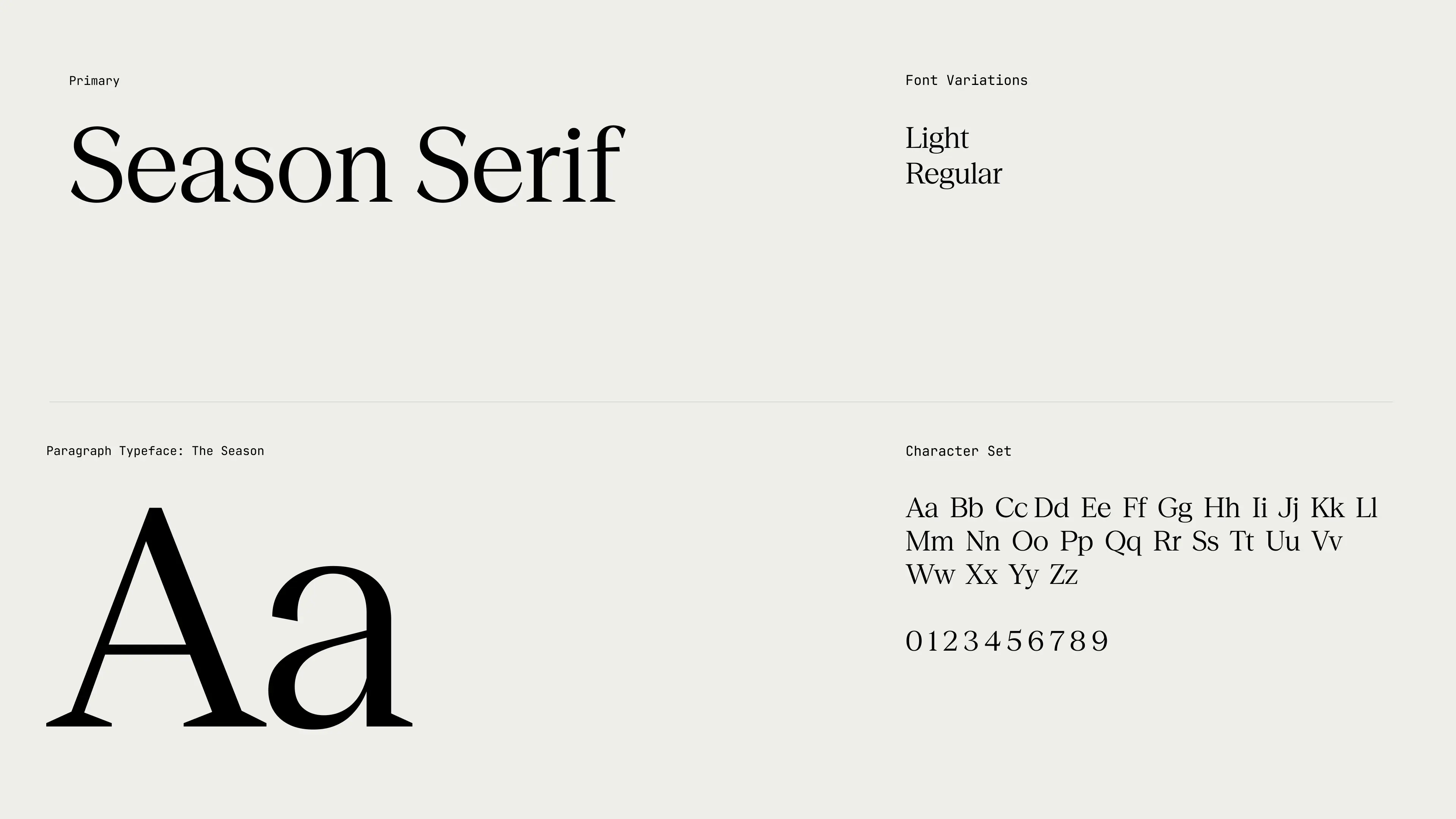
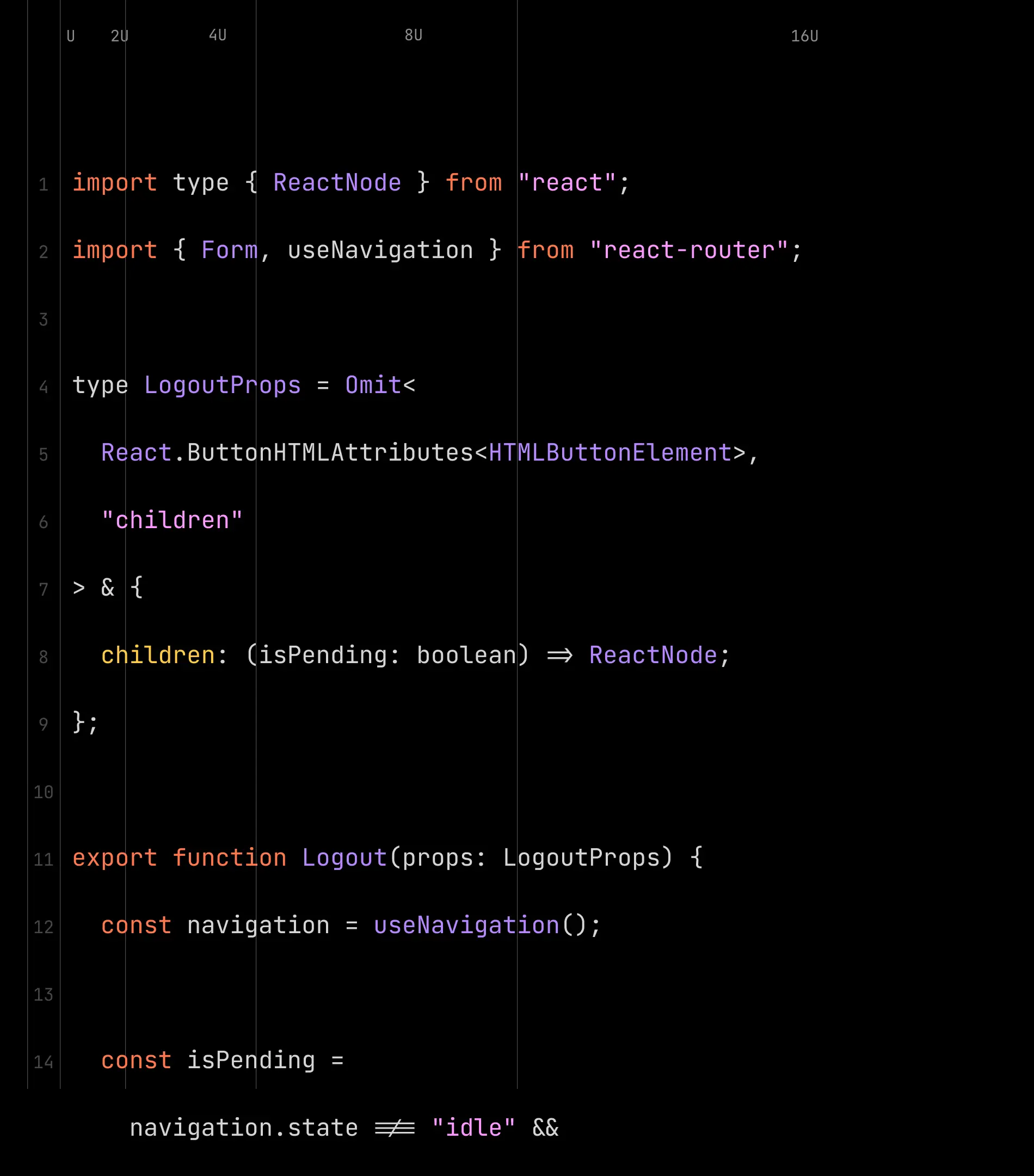
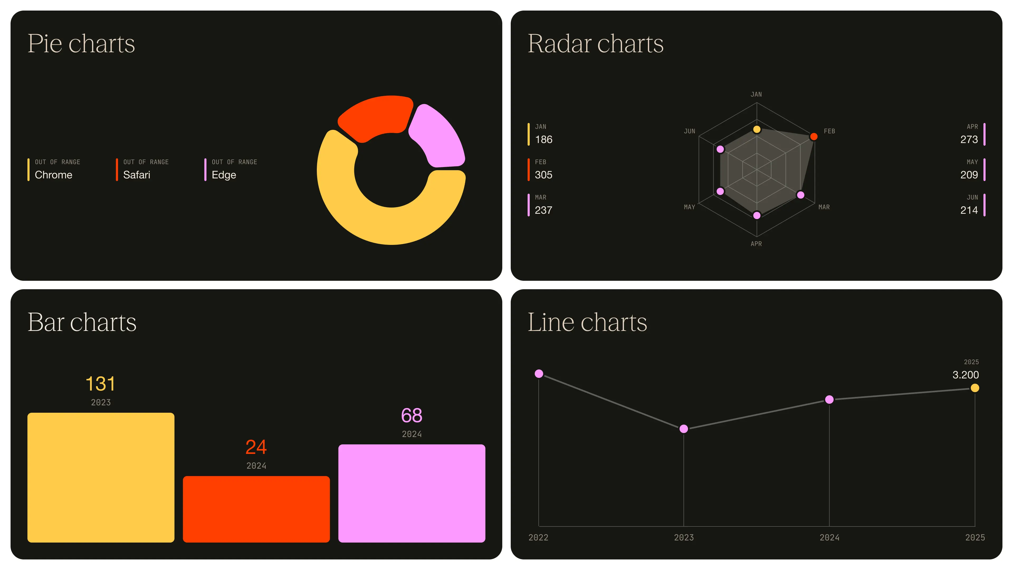
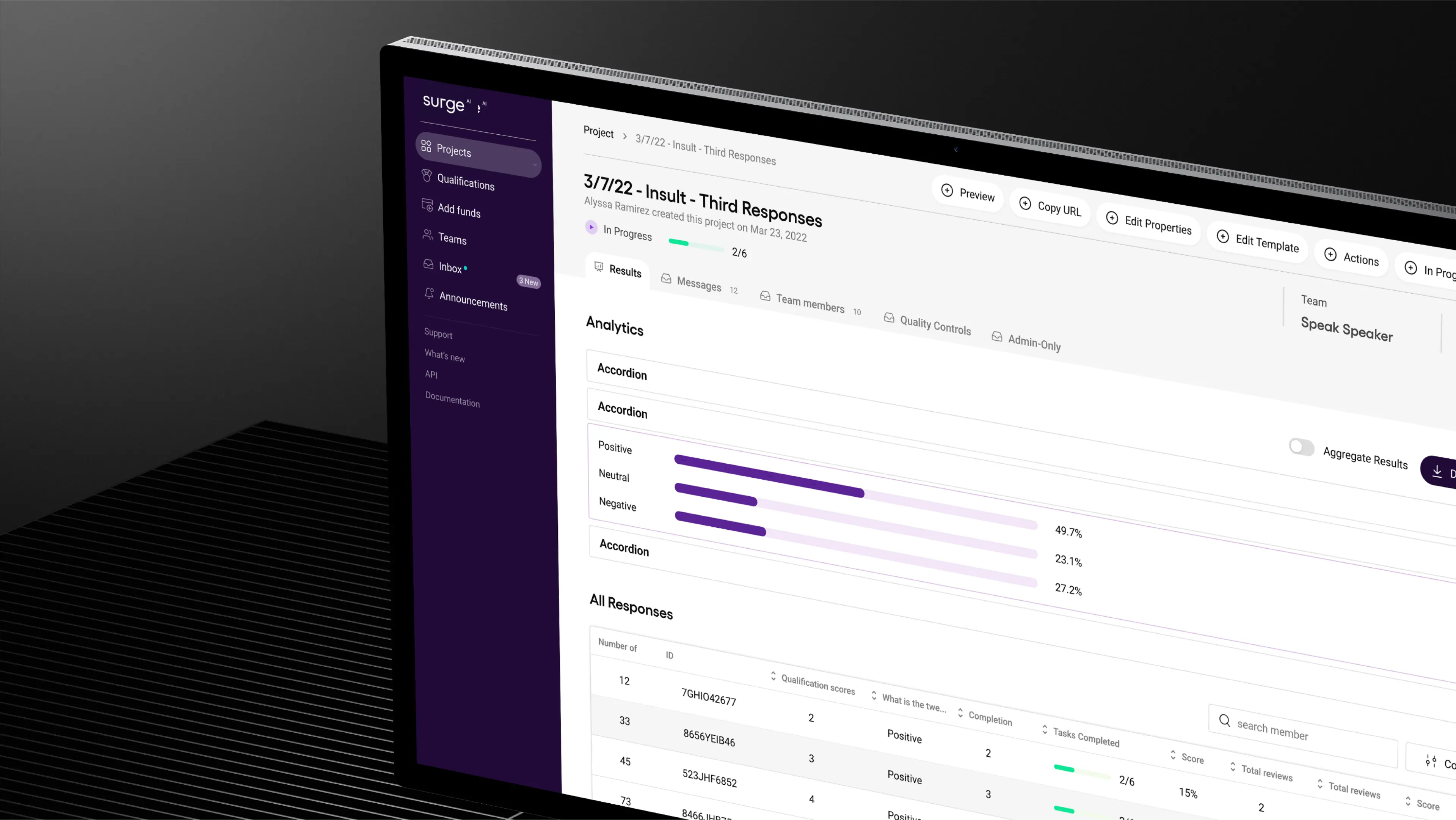
We built a bold, distinctive identity in an industry defined by sameness, designed a product experience that balanced delight with enterprise-grade usability, and crafted a design system to keep them consistent as they scaled.
As Surge now looks to fetch a valuation of over $15 billion in its first capital raise, we’re leading phase two of their branding. The goal: to build a brand that not only wins attention and trust, but one that matches the ambition and credibility of a company operating at that scale.
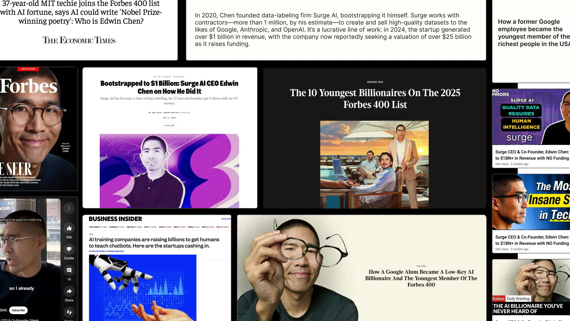
- Founder - Edwin Chen
- Year - 2025
- Industry - Artificial Intelligence
- Scope - Brand · Site · Systems
- Website - www.surgehq.ai

ComPsych needed a rebrand built to win. Younger competitors with sharper, design-driven branding were pulling attention away from the world’s largest provider of employee assistance programs (EAPs), a company supporting over 130 million people across 190 countries. They turned to Konpo to make sure their brand matched their scale and credibility. The mission: win back market share, turn reputation into loyalty, and defend their position at the top.
.webp)
.webp)
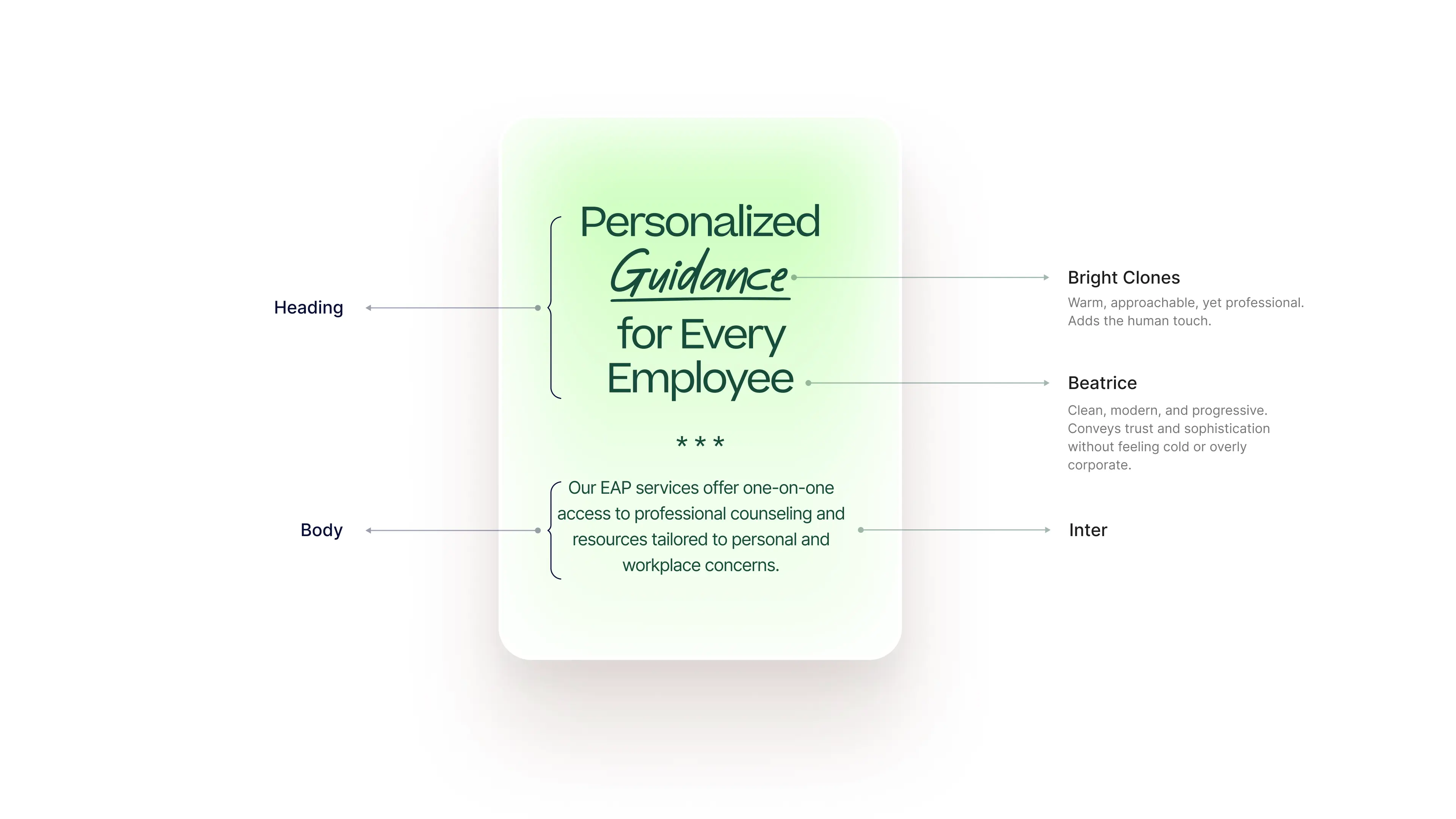

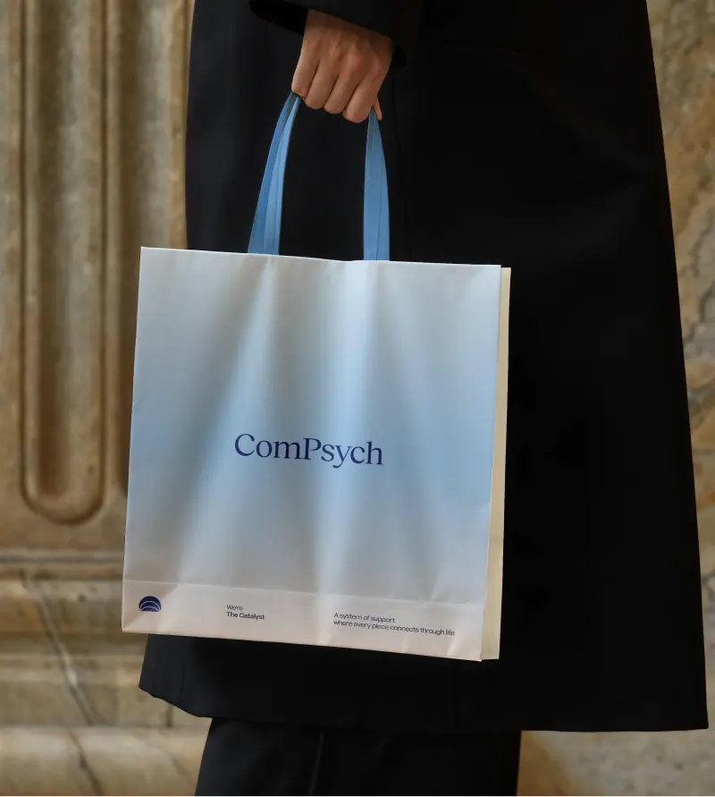
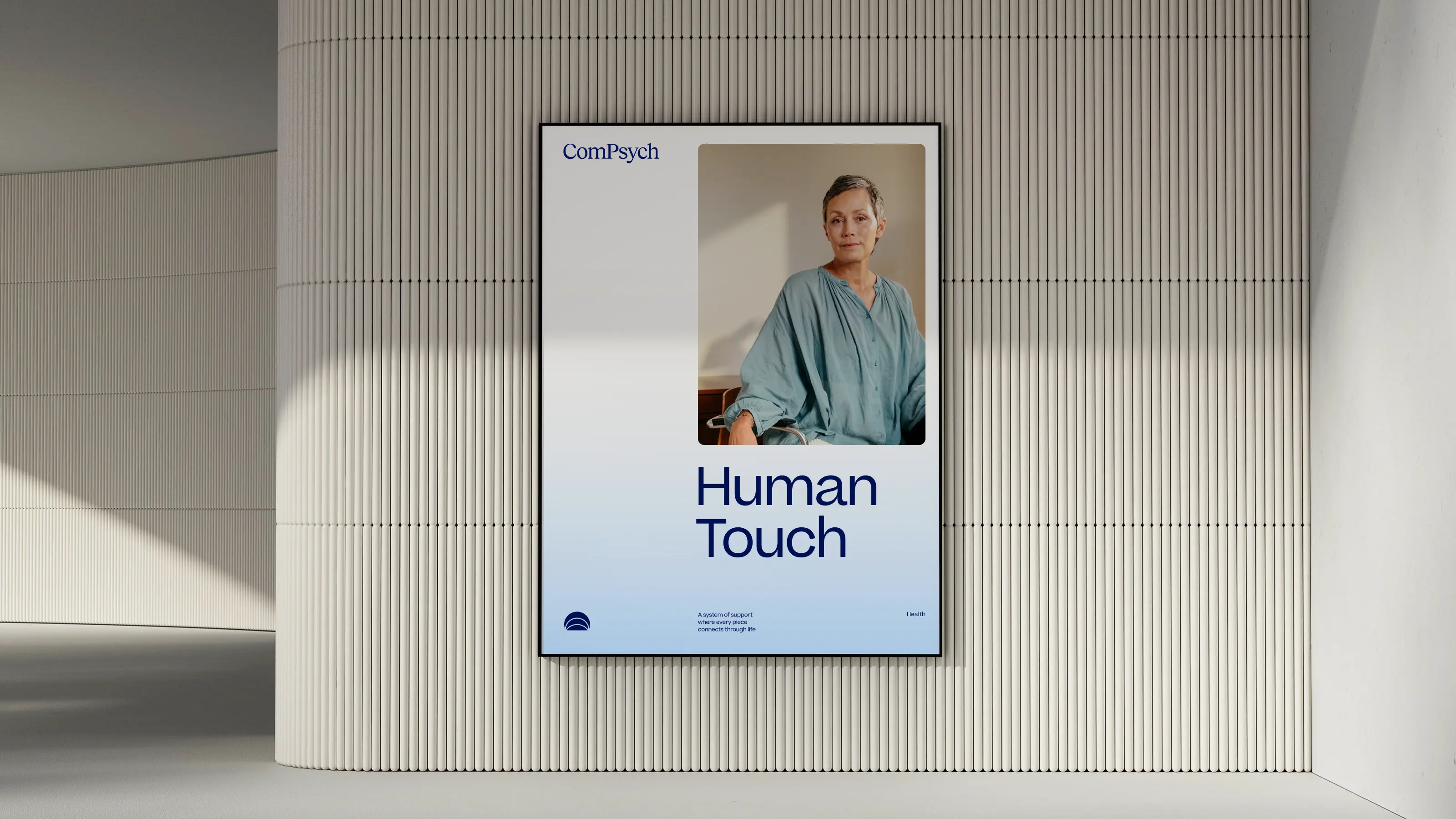
Every element of the ComPsych rebrand was built to show the strength of a category leader, but for today’s market and tomorrow’s. The new logo centers on a glowing core, with expanding ripples signalling growth, support, and scale. Their signature blue was sharpened with a modern palette designed to stand out with confidence, not noise. But what’s a rebrand without discipline to execute it? We built a dedicated brand hub that gave ComPsych everything, from logos to illustrations to voice, to apply their new identity consistently across 75,000+ organizations worldwide. And we delivered it beyond our original scope. The result: a brand that doesn’t just keep up with the competition, but takes back the lead. With a stronger identity and a system to sustain it, ComPsych now has the edge to defend its dominance and keep winning in a design-driven market.
- Industry - Employee Assistance Program (EAP)
- Scope - Brand
- Brand Hub - compsych.konpo.co
- Website - compsych.com
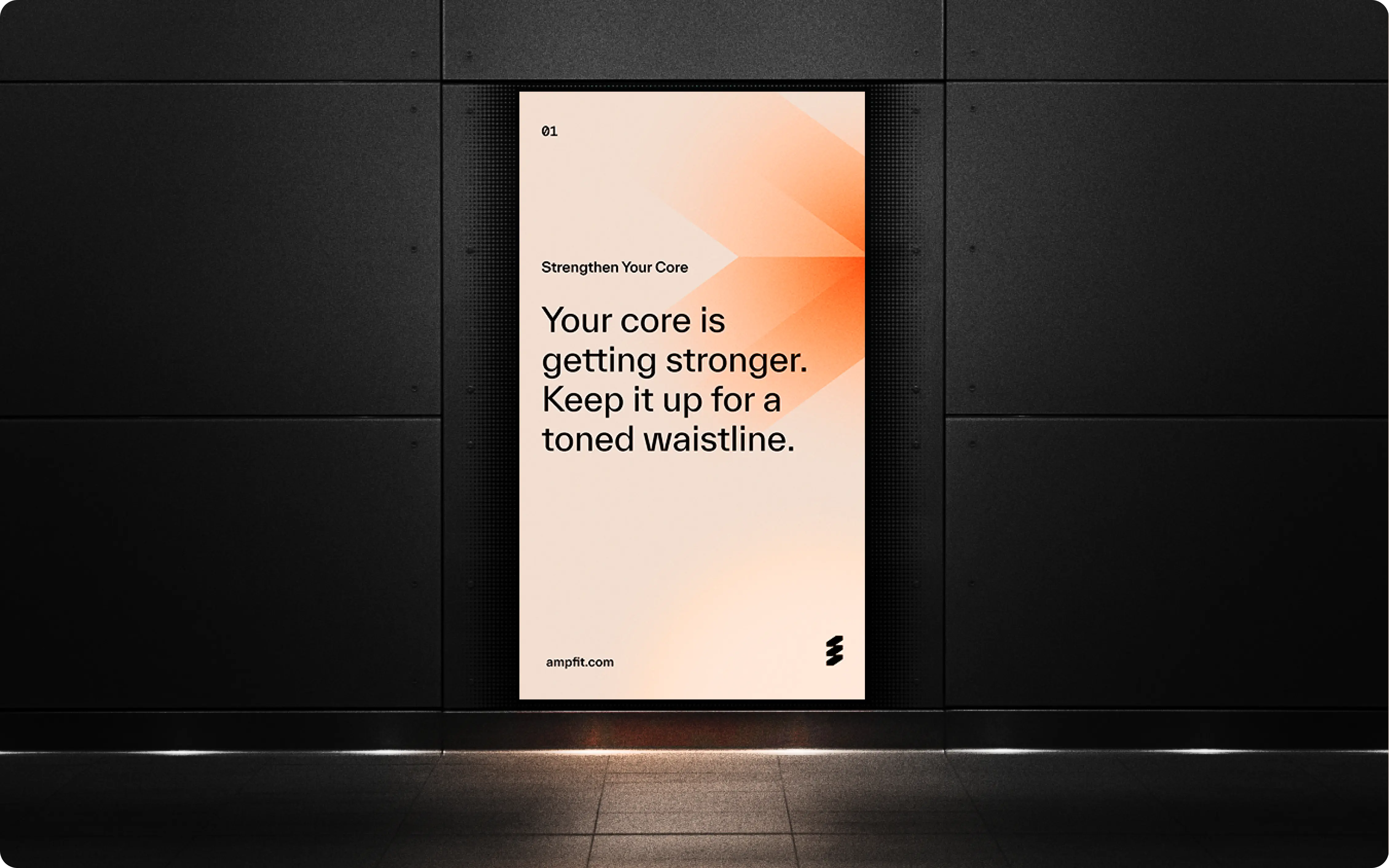
amp Fitness set out to launch its AI-powered strength training system with leadership and talent from Apple, DraftKings, Meta, Nike, and Spotify — people who held the highest design standards. To stand out in a crowded fitness space, they needed a design partner who could move as fast as they did and deliver world-class quality. That’s where Konpo came in. As their plug-and-play design studio, we worked elbow-to-elbow with Amp’s leadership to marry hardware and software into a seamless consumer experience. From product design to scalable design systems, we turned their ambitious vision into award-winning, user-loved reality. When the standards are highest, the right design partner makes all the difference.
.webp)
%201.webp)
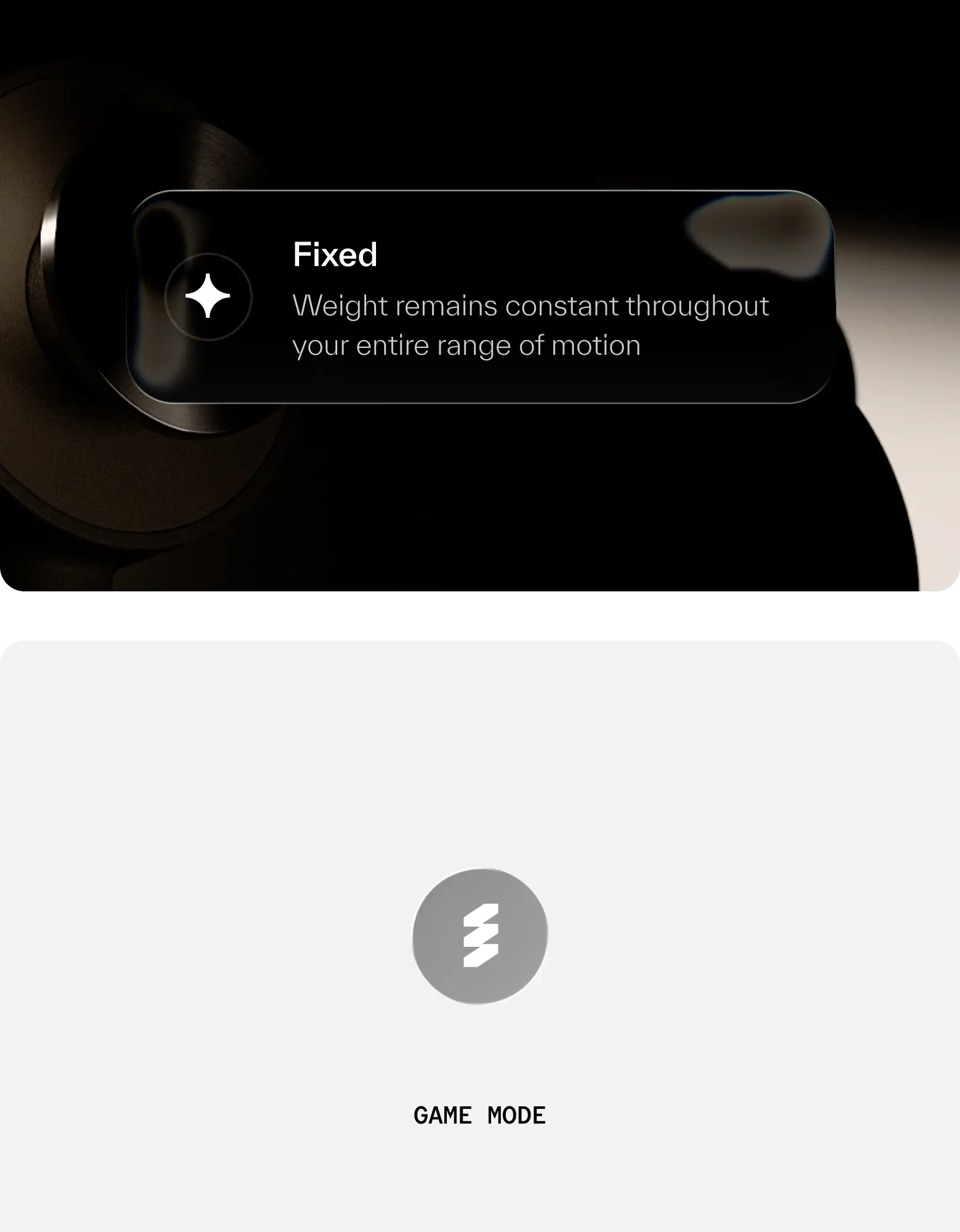
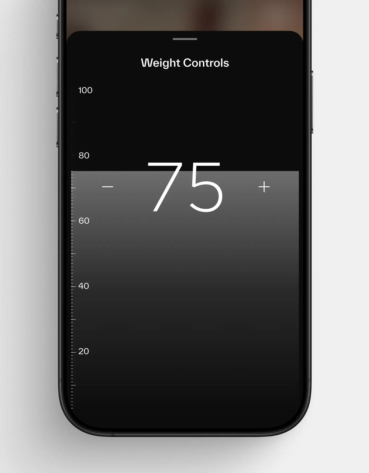
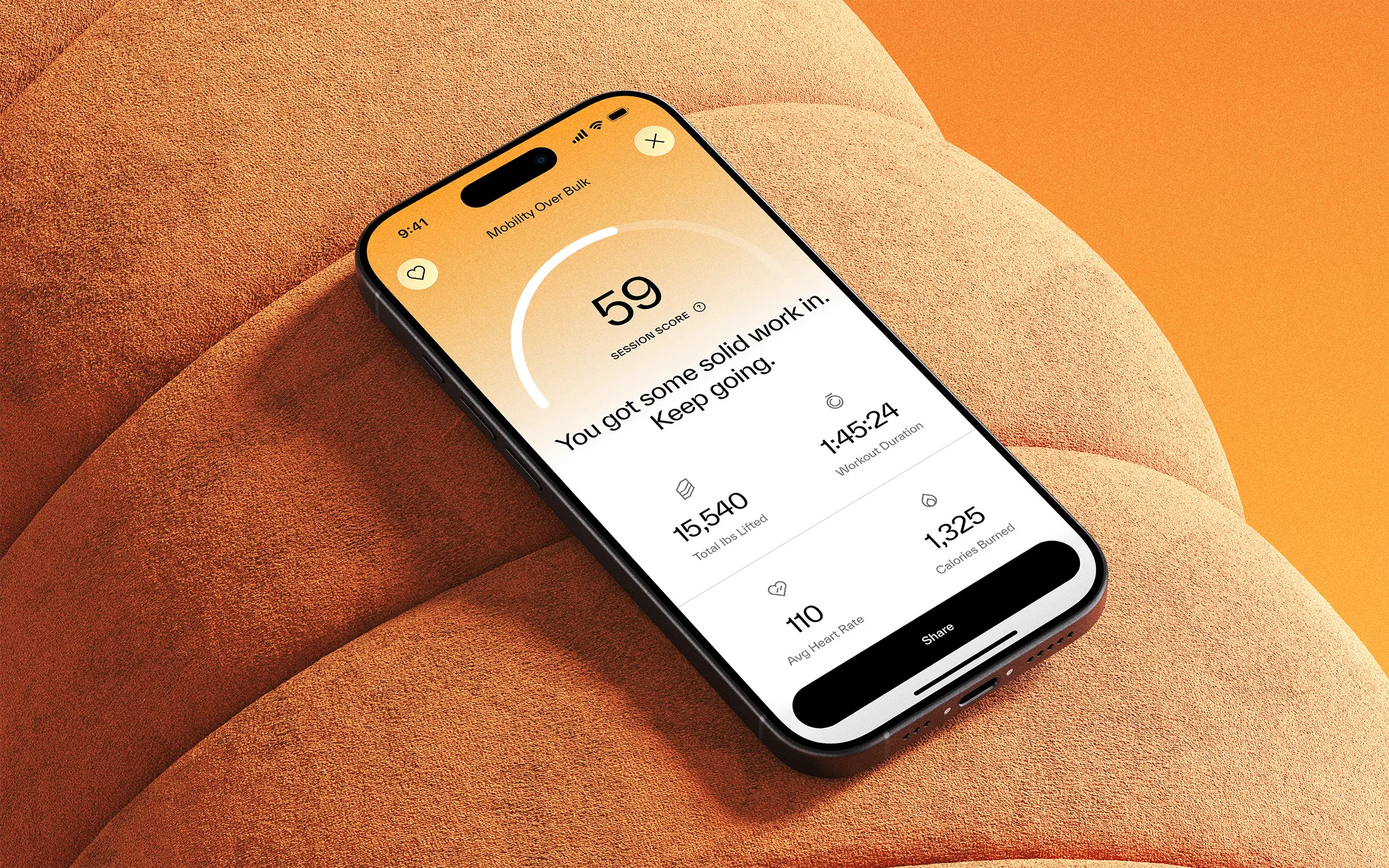
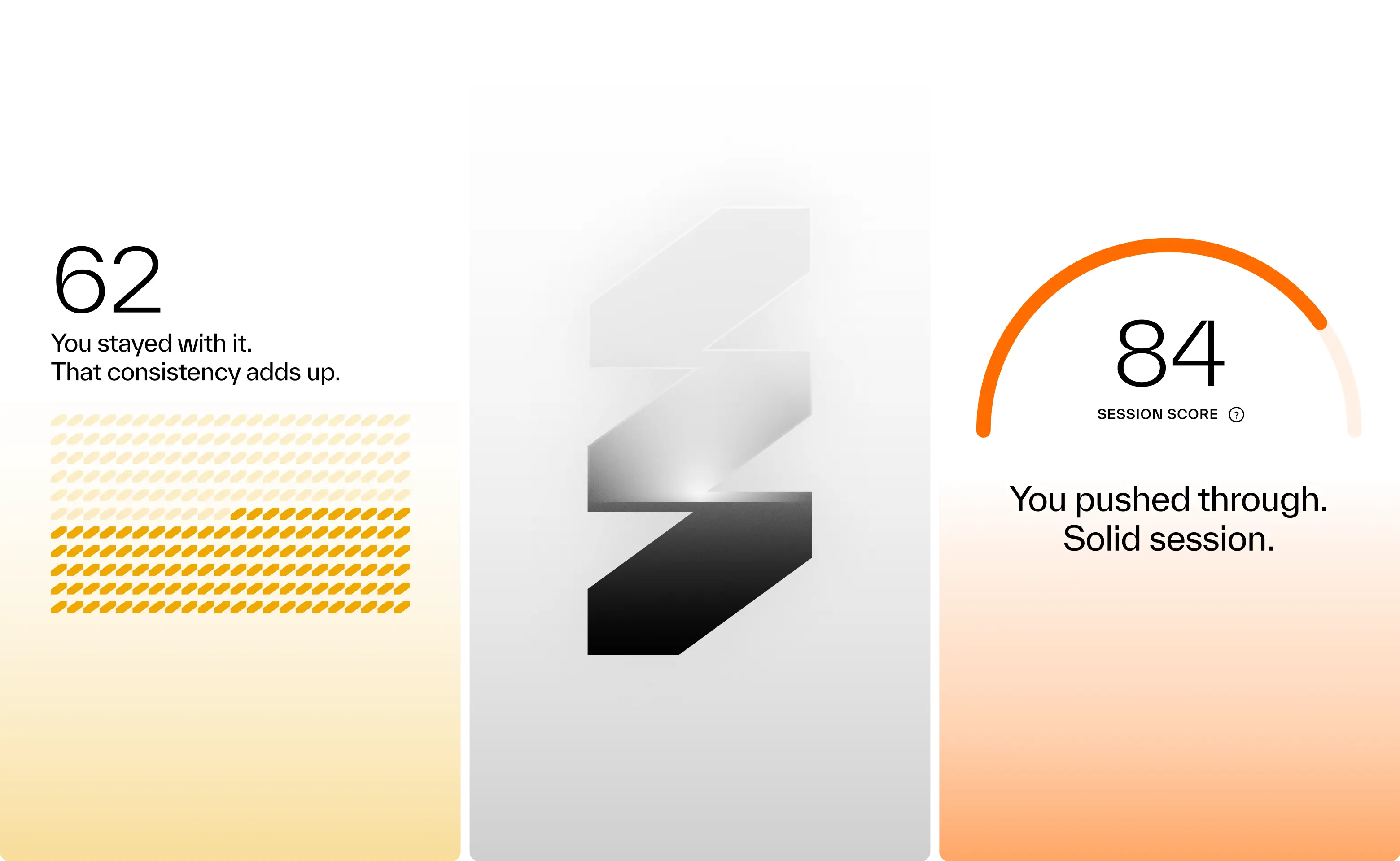

Results so far: 40,000 users, multiple awards, and a sleek wall-mounted system paired with a companion app. Working with amp meant translating adaptive resistance hardware, smart coaching, and modular accessories into a cohesive consumer experience. Add to that a team backed by Sports Science PhDs and leaders from Apple, Meta, and Nike, and the expectations were clear: nothing short of excellence would do. Rising to that challenge not only delivered results for amp, but pushed Konpo to sharpen our own systems and raise the bar. Challenge accepted. Mission accomplished.
- Founder - Shalom Meckenzie
- Year - 2024
- Industry - Fitness · Artificial Intelligence
- Scope - Brand · Product · Systems
- Website - www.ampfit.com
World’s Largest EAP Provider Gets Its Edge Back


ComPsych is the world’s largest provider of employee assistance programs (EAP), supporting over 130 million people across more than 190 countries. But while their scale is unmatched, their 40-year-old brand was starting to show its age, visually outdated, strategically unclear, and vulnerable to younger, more design-savvy competitors carving out space in the market.They came to us to reimagine their brand from the ground up: sharpening their strategy, redefining their identity, and helping them reclaim their position as the true category leader, not just in size, but in clarity, relevance, and trust.
ComPsych is the world’s largest provider of employee assistance programs (EAP), supporting over 130 million people across more than 190 countries. But while their scale is unmatched, their 40-year-old brand was starting to show its age, visually outdated, strategically unclear, and vulnerable to younger, more design-savvy competitors carving out space in the market.
They came to us to reimagine their brand from the ground up: sharpening their strategy, redefining their identity, and helping them reclaim their position as the true category leader, not just in size, but in clarity, relevance, and trust.
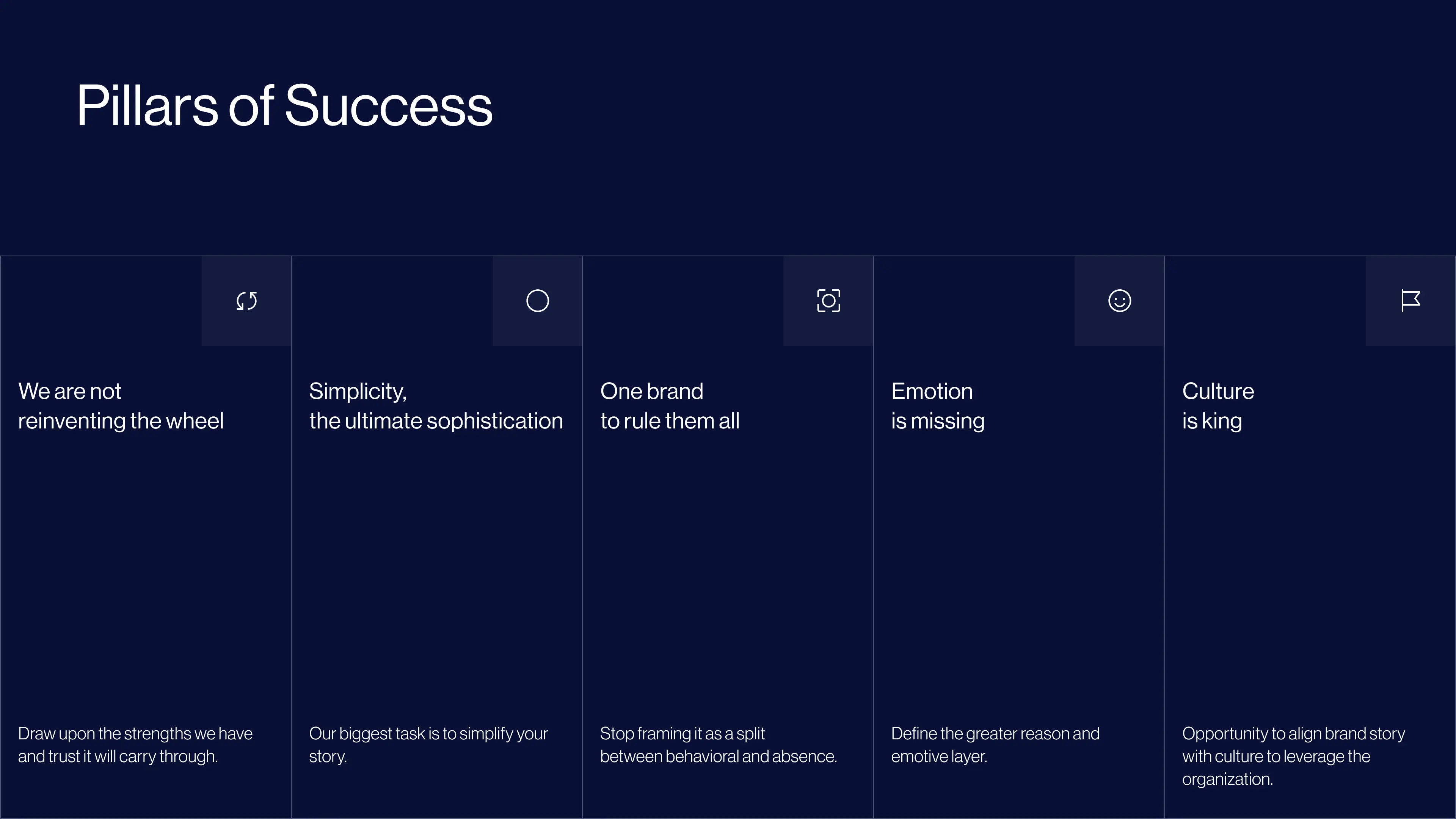
Distilling decades of expertise
With decades of leadership in the space, ComPsych had a wealth of knowledge, but much of it lived across teams, documents, and internal language. Our task was to distill that complexity into a clear strategic framework. We defined their positioning, articulated the core pillars that drive their success, and built a brand model to organize it all. This foundation then informed a comprehensive messaging suite designed to bring clarity, alignment, and consistency to the entire brand.
Designing for a new era
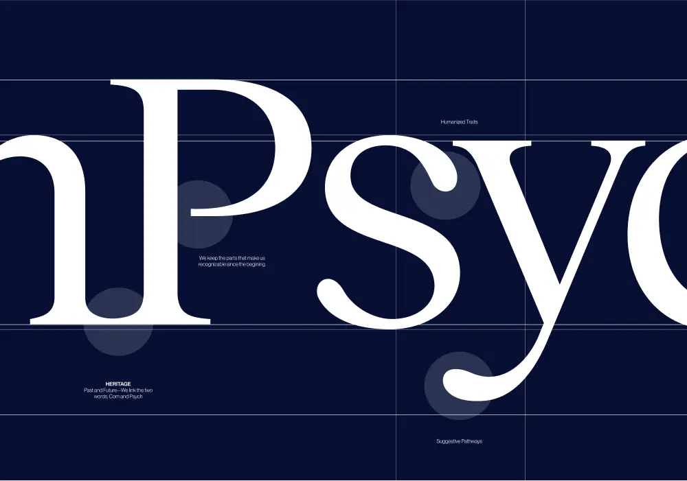
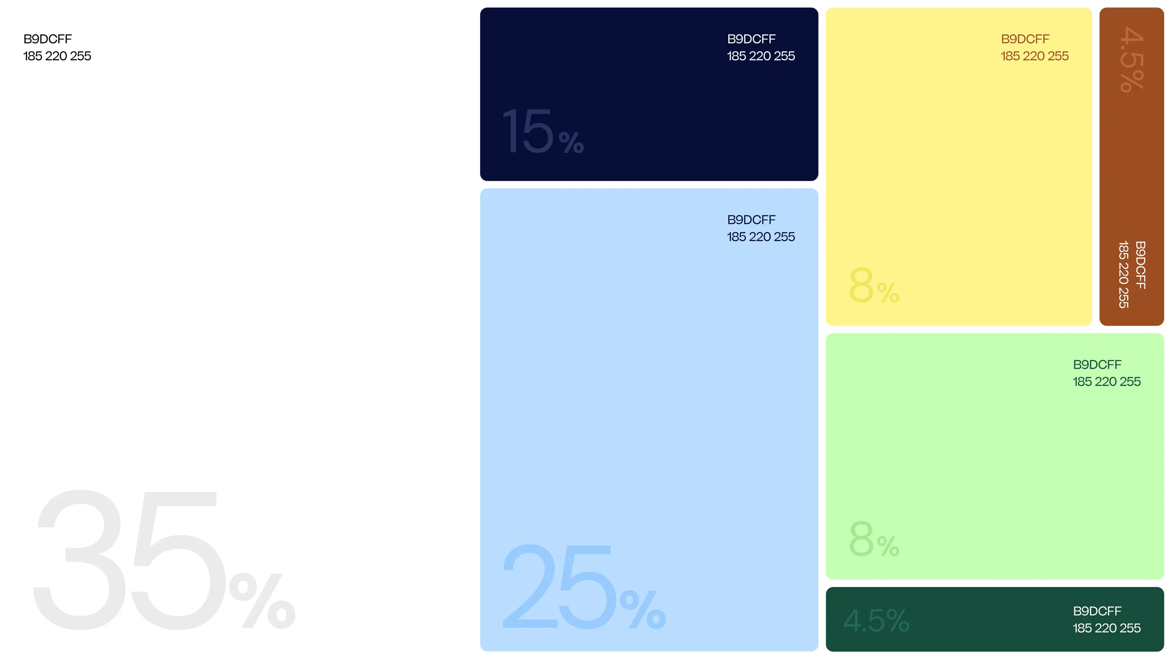
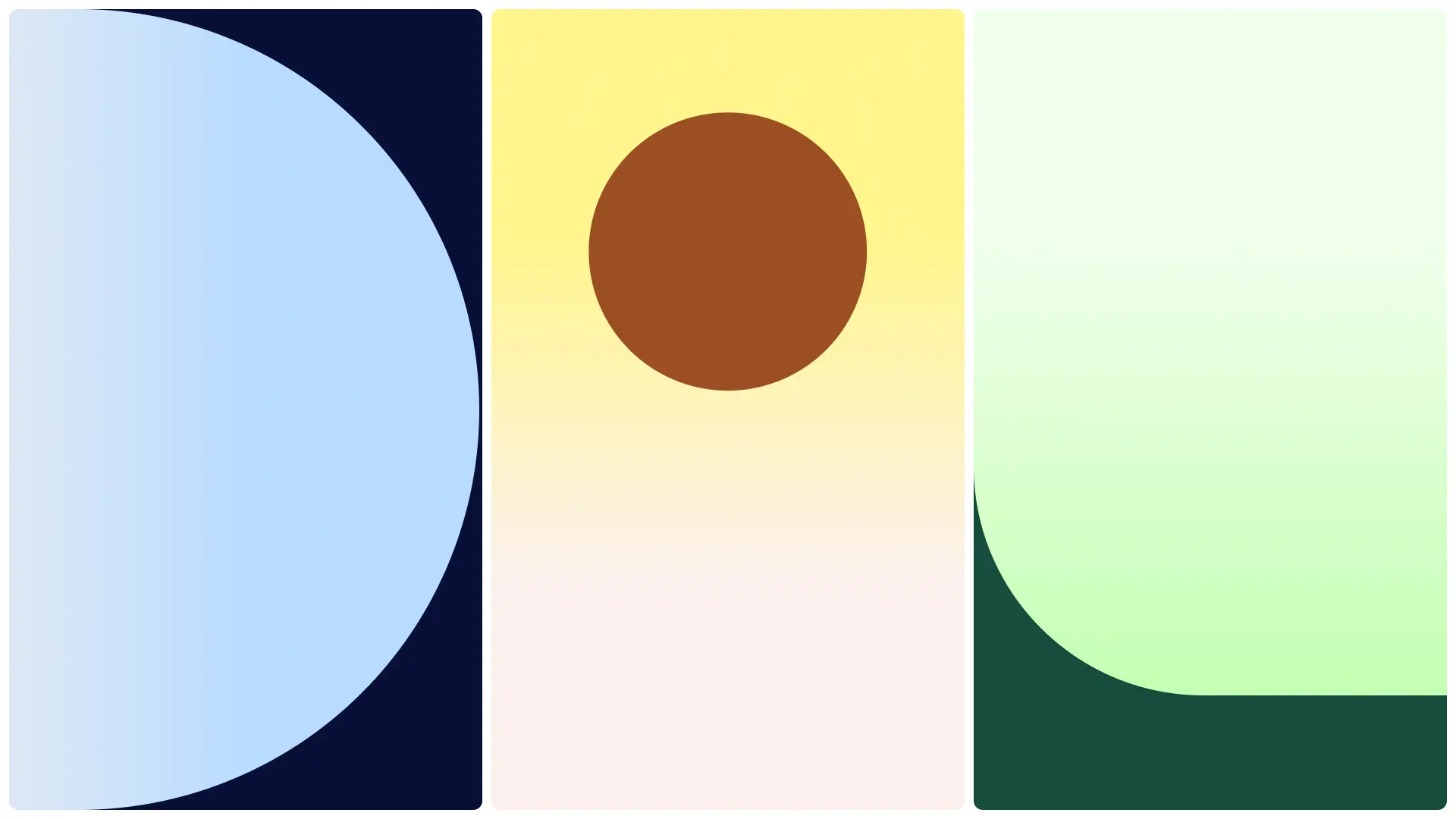
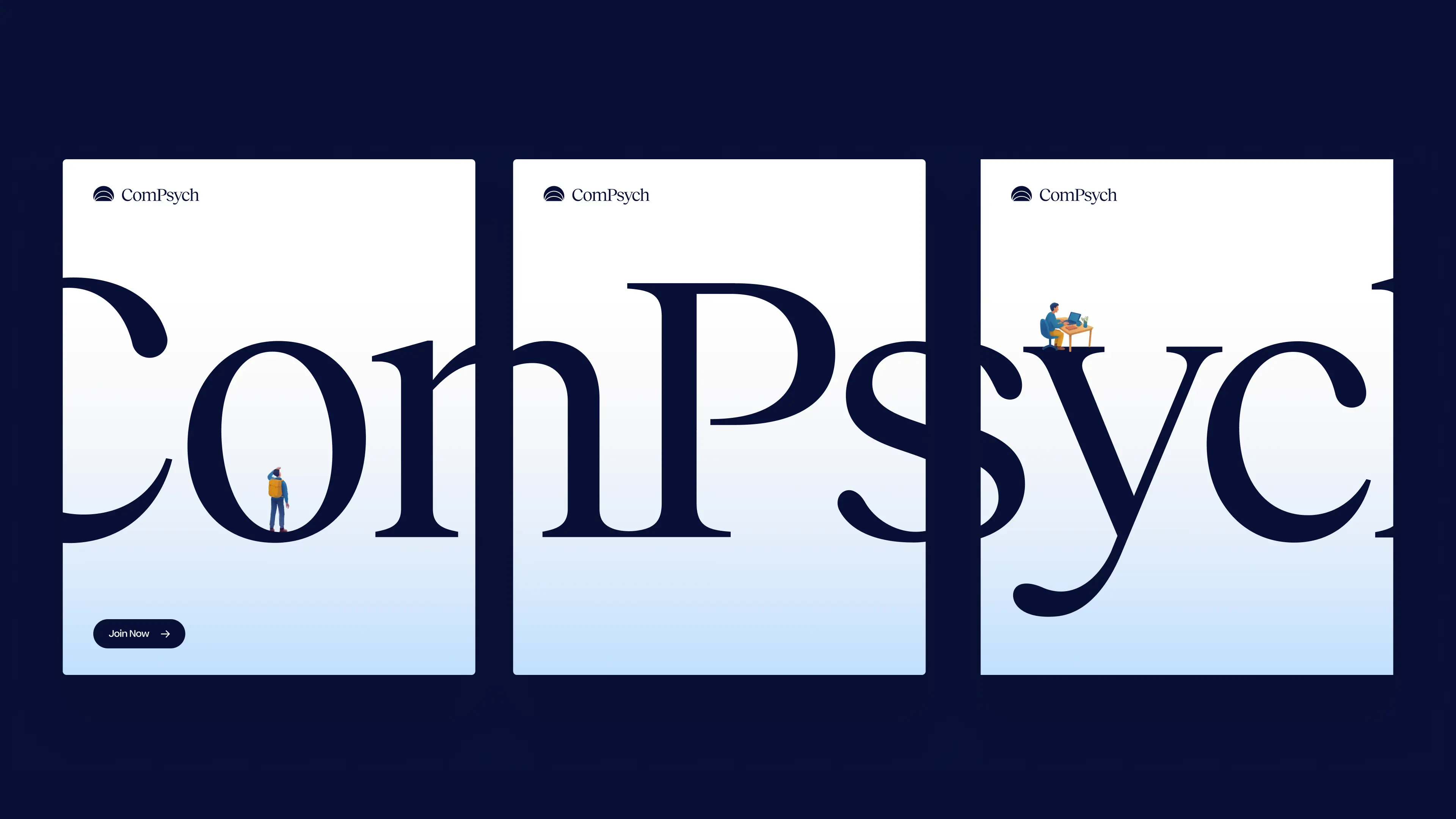
ComPsych’s evolution into a modern brand began with the logo. We refined the wordmark to feel more human and balanced, then introduced a symbol inspired by a rising horizon an expression of progress and guidance. From there, we built a flexible brand system combining a sky-inspired palette, expressive typography, and a clear visual framework designed to bring consistency and warmth across the brand.
Designing for a new era
ComPsych’s evolution into a modern brand began with the logo. We refined the wordmark to feel more human and balanced, then introduced a symbol inspired by a rising horizon an expression of progress and guidance. From there, we built a flexible brand system combining a sky-inspired palette, expressive typography, and a clear visual framework designed to bring consistency and warmth across the brand.


.webp)
A Home, for a Brand
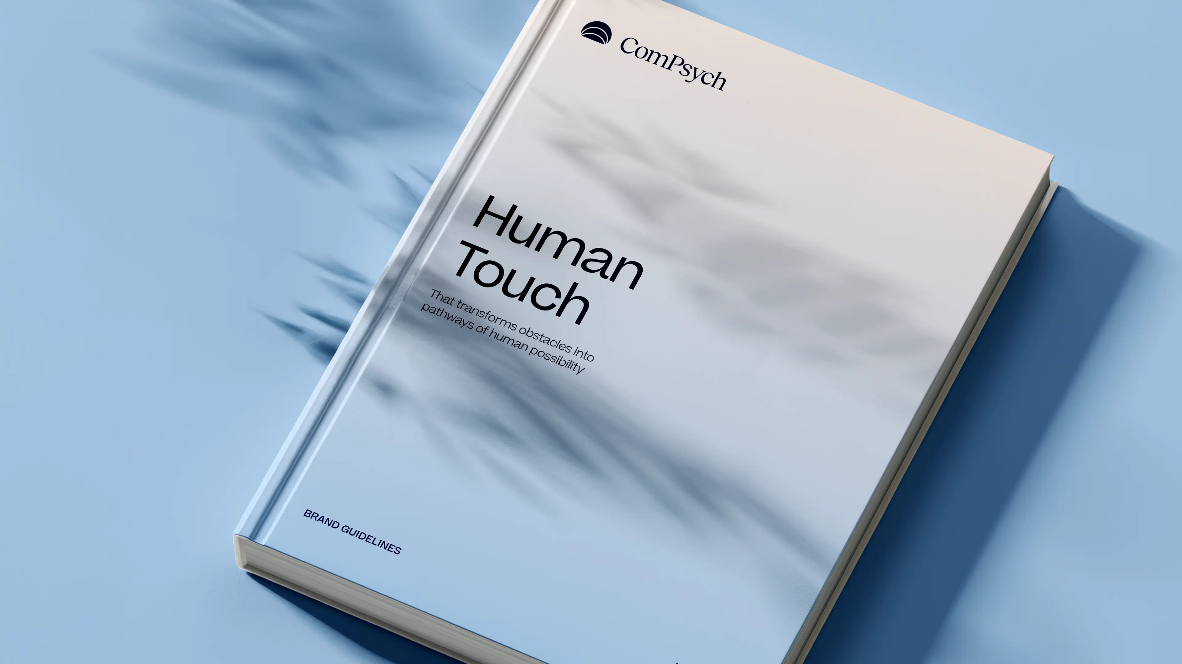
Outside our original scope, we created a dedicated Brand Hub, a website designed to showcase ComPsych’s rebrand in a clear, accessible, and interactive way. Beyond static PDFs, the Hub allows anyone in the organization to explore the full identity and see how all the elements connect. By presenting the brand in this open format, alignment becomes easier, and the rebrand can be fully understood and applied consistently across the organization.
A Home, for a Brand
Outside our original scope, we created a dedicated Brand Hub, a website designed to showcase ComPsych’s rebrand in a clear, accessible, and interactive way. Beyond static PDFs, the Hub allows anyone in the organization to explore the full identity and see how all the elements connect. By presenting the brand in this open format, alignment becomes easier, and the rebrand can be fully understood and applied consistently across the organization.


Working with Konpo on our rebrand and website redesign was a game-changer for ComPsych. They quickly understood our goals and delivered a modern, cohesive brand that speaks directly to our audiences, positioning ComPsych as a forward-thinking leader in employee well-being. They approached our rebrand not just as a visual refresh, but as a strategic evolution.

.webp)

.webp)

.webp)


.jpg)
.webp)


.webp)
.webp)

.webp)