


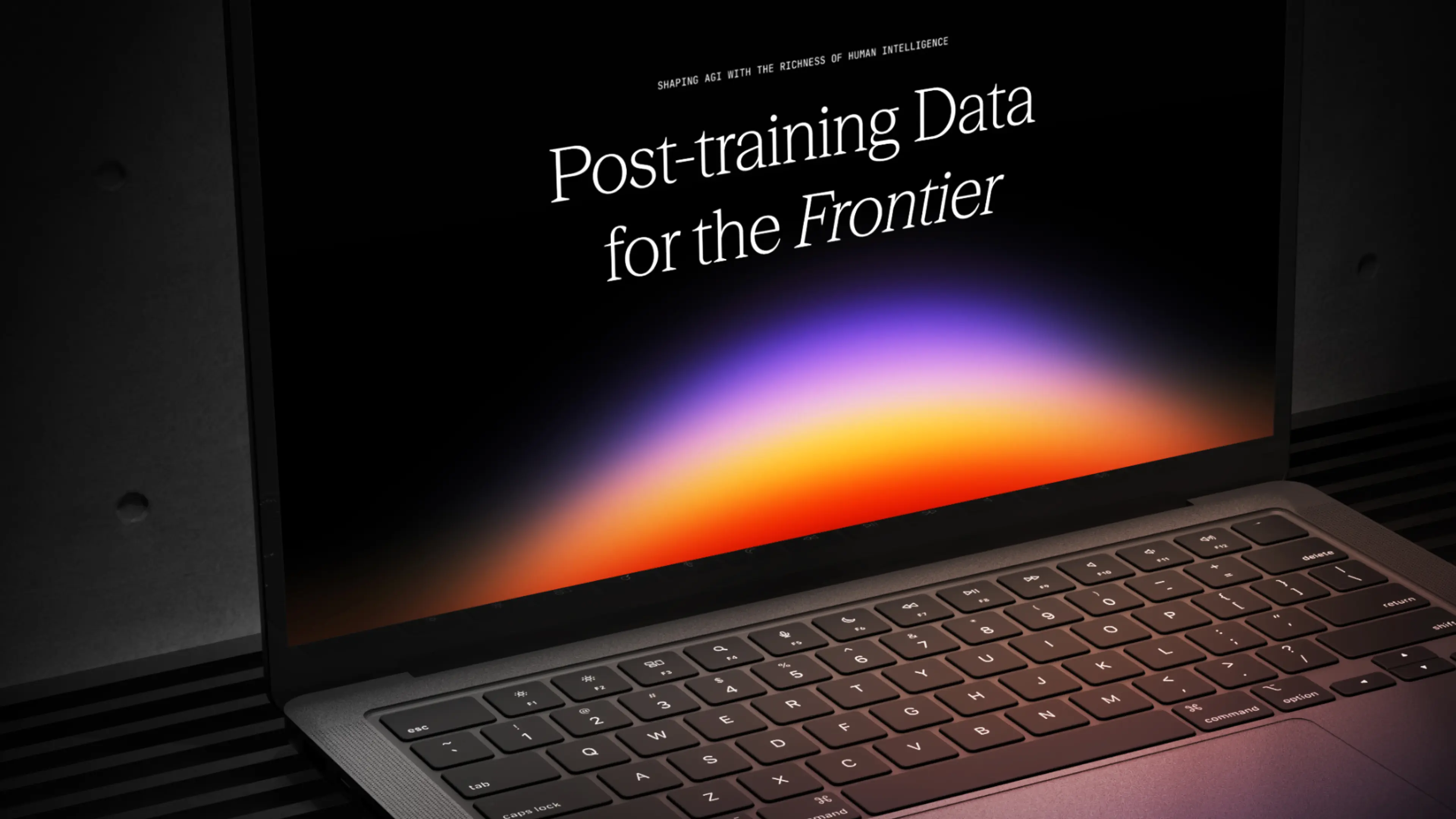
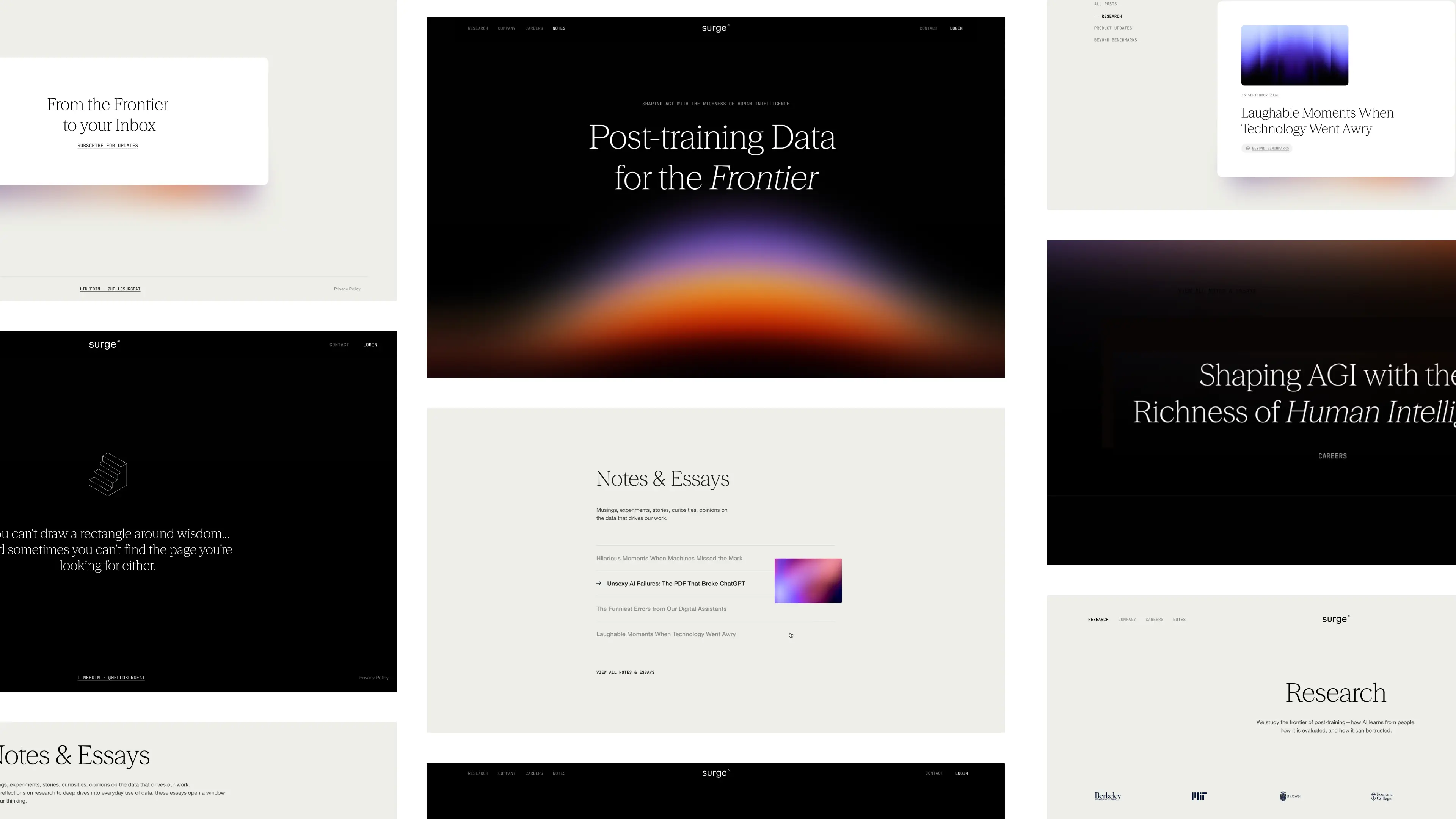
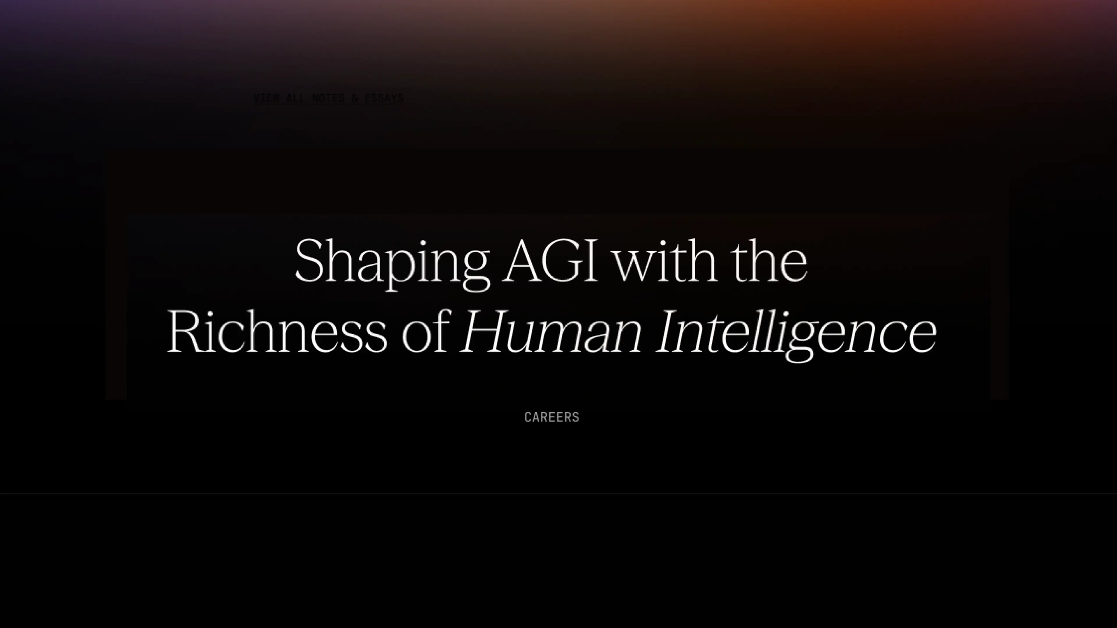
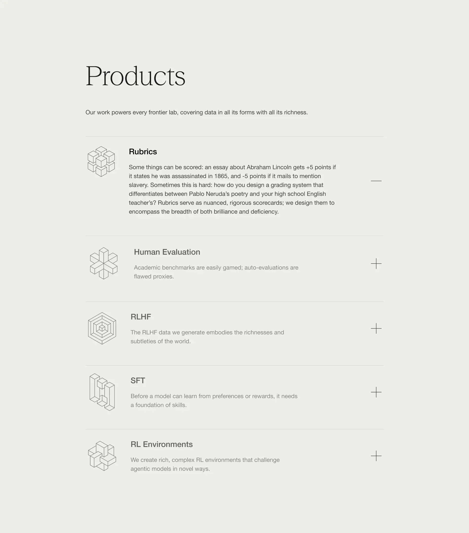
From day one, Surge needed more than a brand that looked good. They needed design that built credibility, earned trust, and scaled with them as they grew. They needed a design partner that ensures they stand out in the crowded world of AI infrastructure.
They chose Konpo. More than a vendor, we became their plug-and-play design team: senior talent embedded alongside leadership, shaping everything from their first identity to their website, product, and systems. At every stage, Surge found in Konpo a partner they could depend on.
.webp)
.webp)


Our collaboration has become a long-term partnership that helped Surge grow from early explorations to a brand adopted by the leading AI and technology companies and a product internationally recognized and awarded.
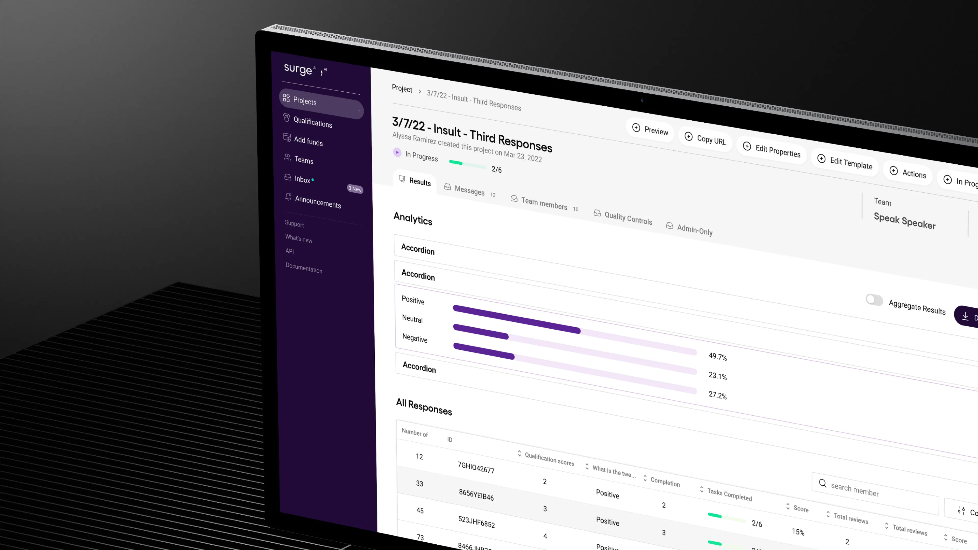
We built a bold, distinctive identity in an industry defined by sameness, designed a product experience that balanced delight with enterprise-grade usability, and crafted a design system to keep them consistent as they scaled.
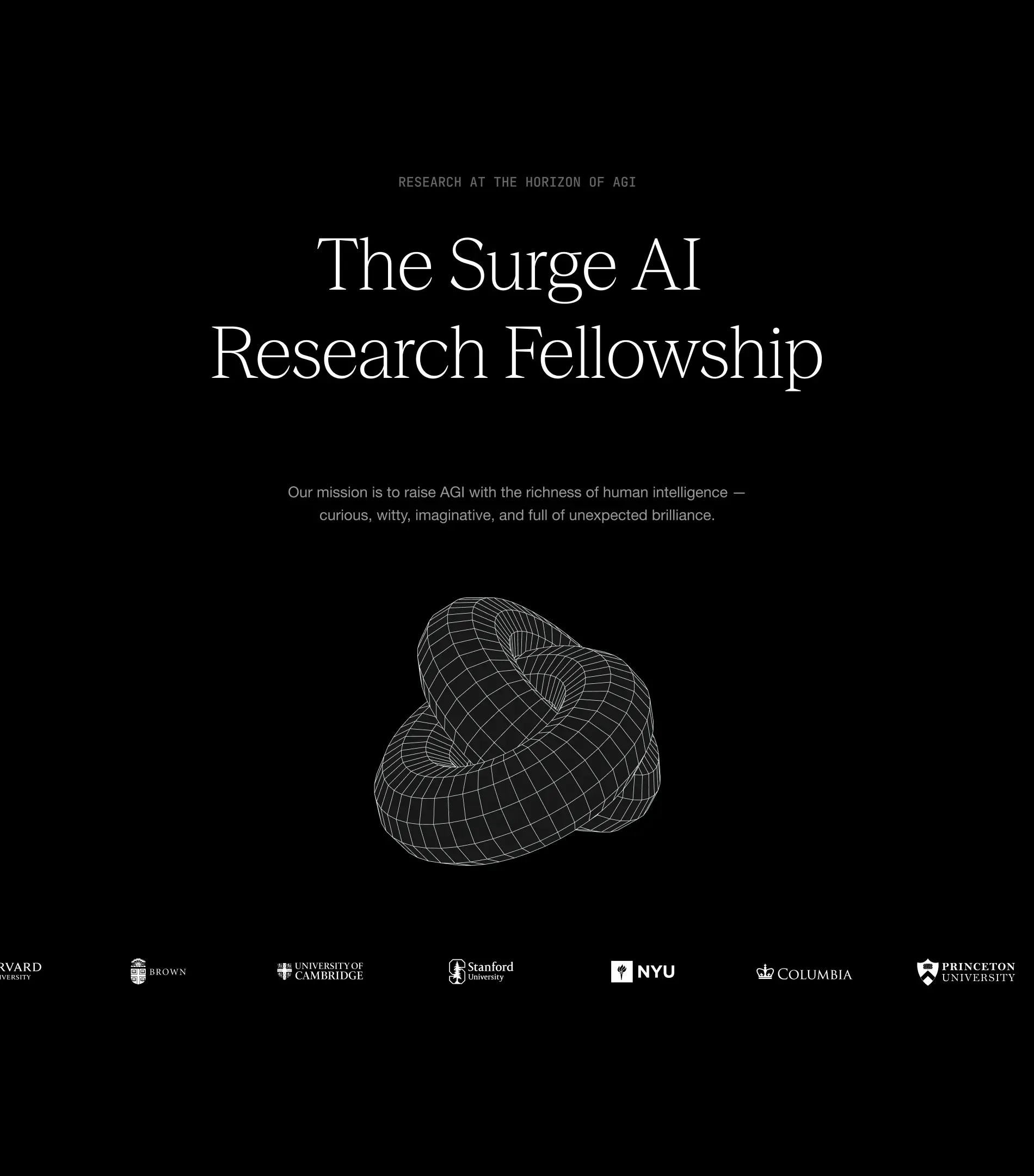
As Surge now looks to fetch a valuation of over $15 billion in its first capital raise, we’re leading phase two of their branding. The goal: to build a brand that not only wins attention and trust, but one that matches the ambition and credibility of a company operating at that scale.
- Founder - Edwin Chen
- Year - 2025
- Industry - Artificial Intelligence
- Scope - Brand · Site · Systems
- Website - www.surgehq.ai

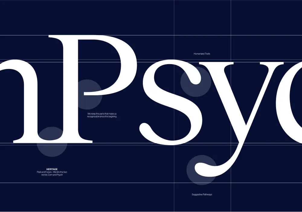
ComPsych needed a rebrand built to win. Younger competitors with sharper, design-driven branding were pulling attention away from the world’s largest provider of employee assistance programs (EAPs), a company supporting over 130 million people across 190 countries. They turned to Konpo to make sure their brand matched their scale and credibility. The mission: win back market share, turn reputation into loyalty, and defend their position at the top.
.webp)
.webp)
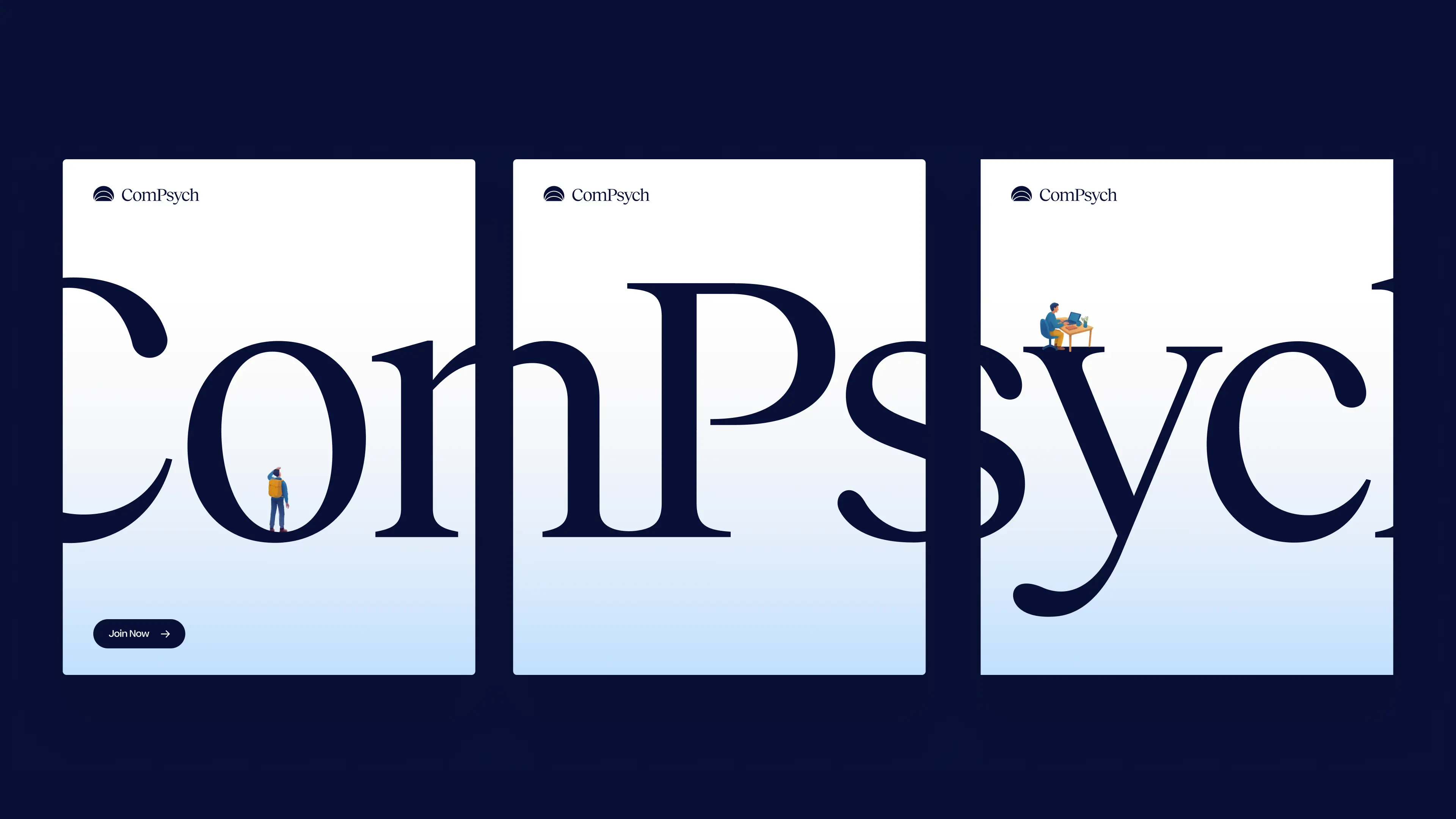
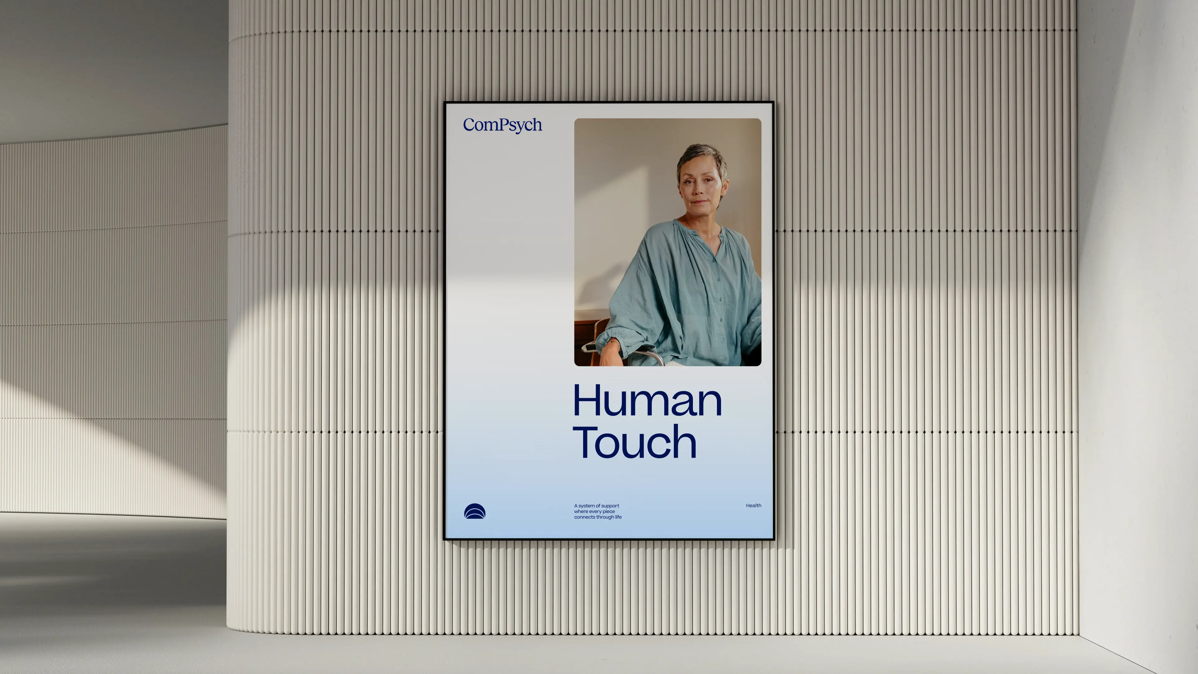
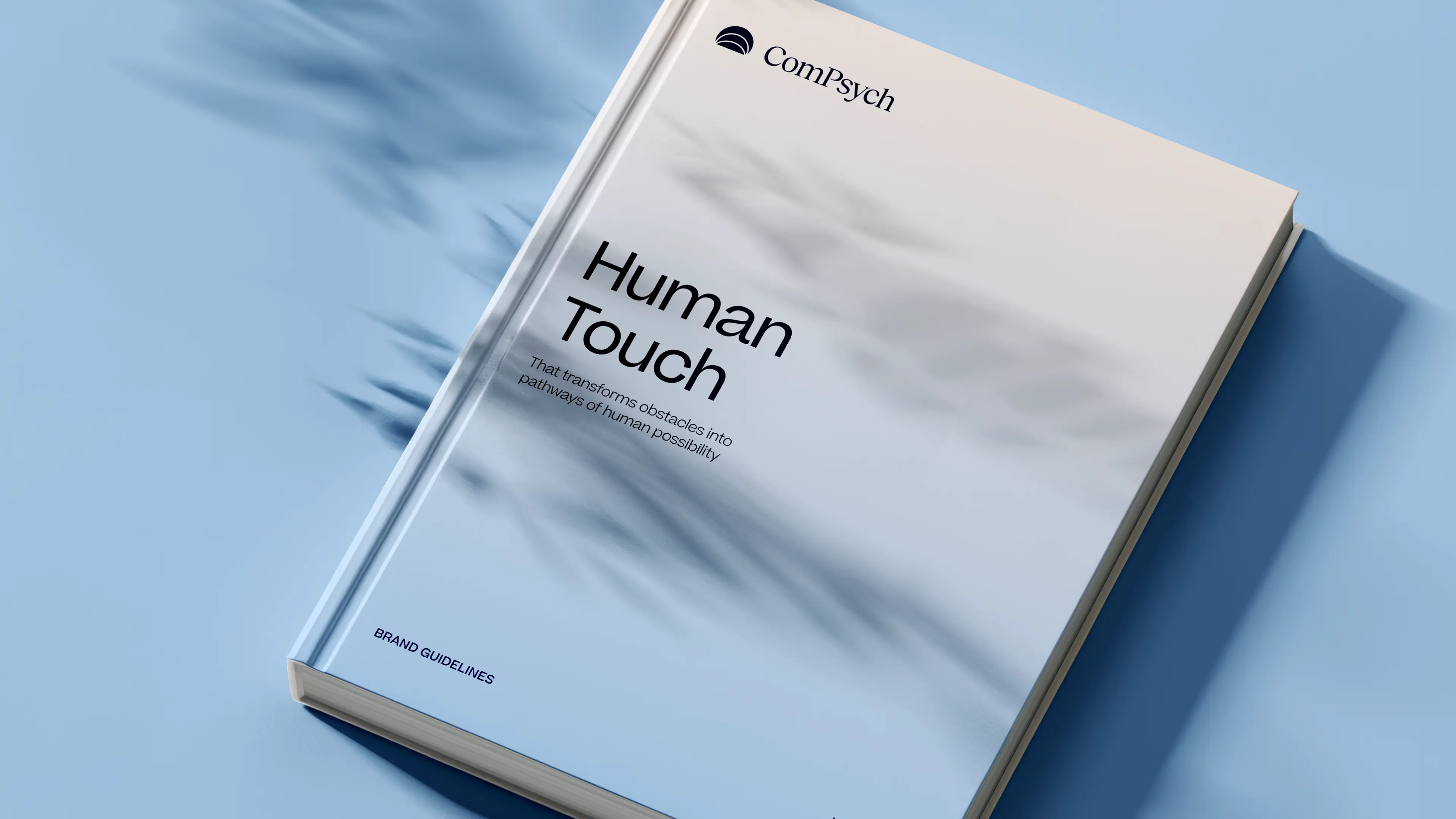
Every element of the ComPsych rebrand was built to show the strength of a category leader, but for today’s market and tomorrow’s. The new logo centers on a glowing core, with expanding ripples signalling growth, support, and scale. Their signature blue was sharpened with a modern palette designed to stand out with confidence, not noise. But what’s a rebrand without discipline to execute it? We built a dedicated brand hub that gave ComPsych everything, from logos to illustrations to voice, to apply their new identity consistently across 75,000+ organizations worldwide. And we delivered it beyond our original scope. The result: a brand that doesn’t just keep up with the competition, but takes back the lead. With a stronger identity and a system to sustain it, ComPsych now has the edge to defend its dominance and keep winning in a design-driven market.
- Industry - Employee Assistance Program (EAP)
- Scope - Brand
- Brand Hub - compsych.konpo.co
- Website - compsych.com
amp Fitness set out to launch its AI-powered strength training system with leadership and talent from Apple, DraftKings, Meta, Nike, and Spotify — people who held the highest design standards. To stand out in a crowded fitness space, they needed a design partner who could move as fast as they did and deliver world-class quality. That’s where Konpo came in. As their plug-and-play design studio, we worked elbow-to-elbow with Amp’s leadership to marry hardware and software into a seamless consumer experience. From product design to scalable design systems, we turned their ambitious vision into award-winning, user-loved reality. When the standards are highest, the right design partner makes all the difference.
.webp)
%201.webp)
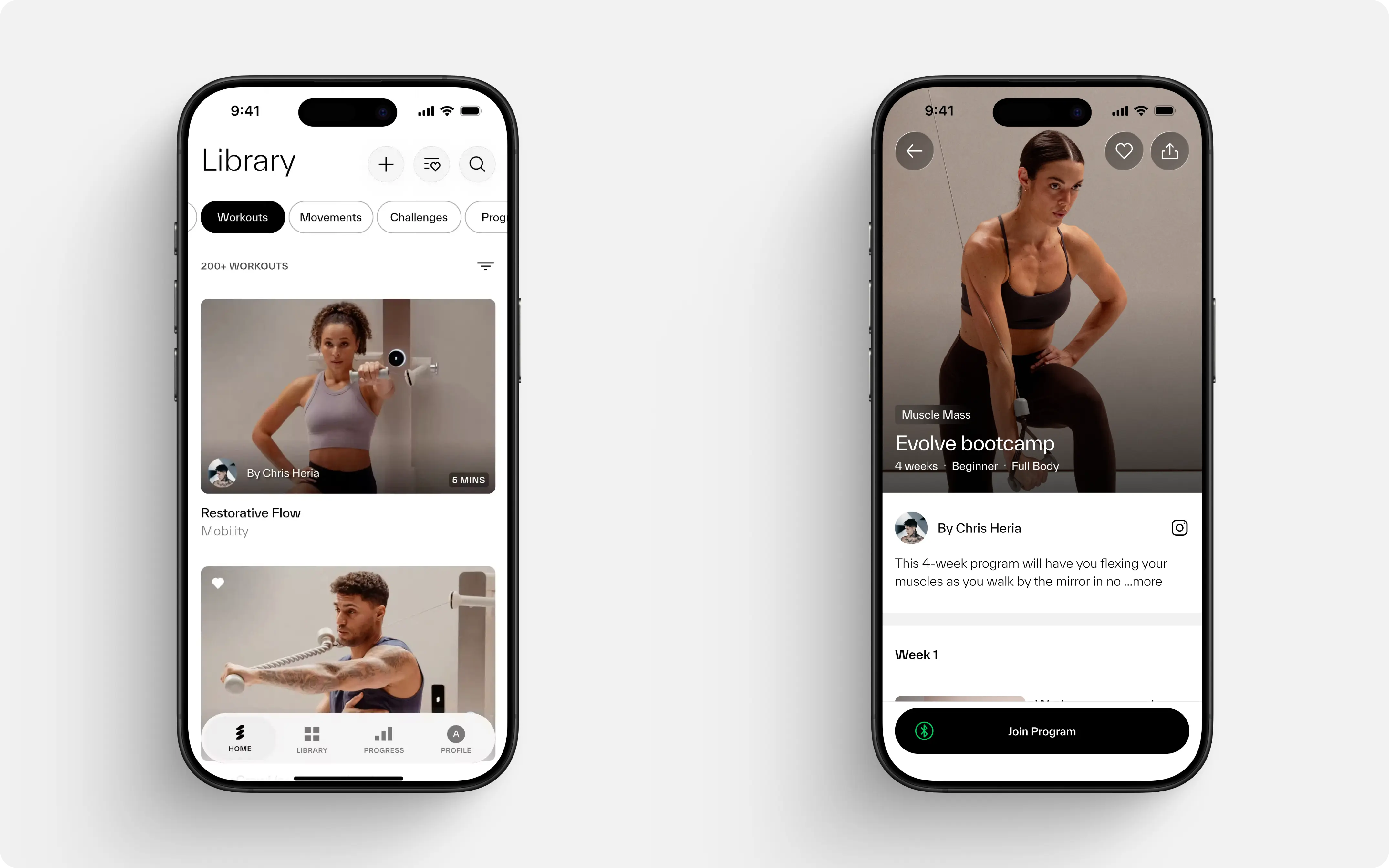
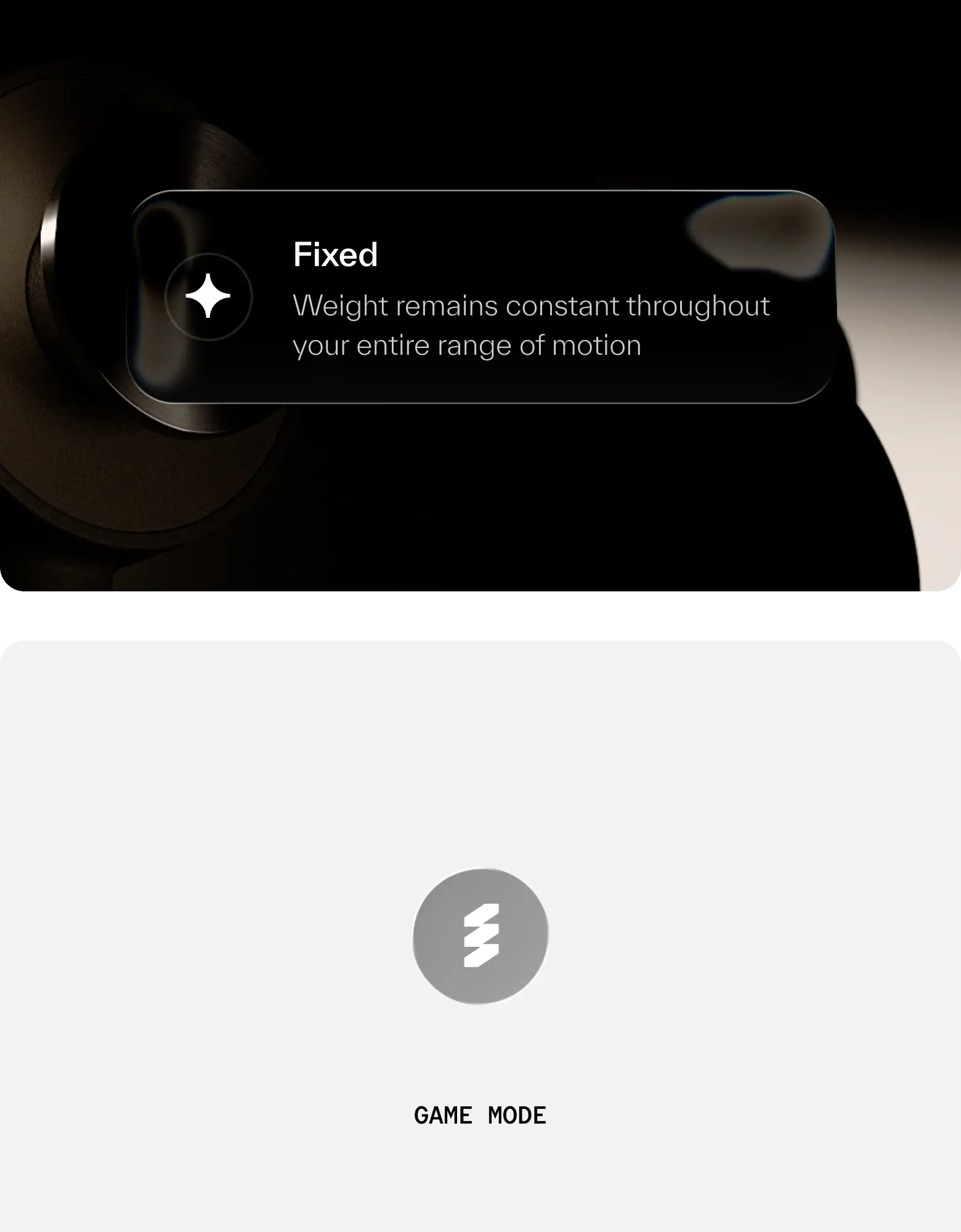
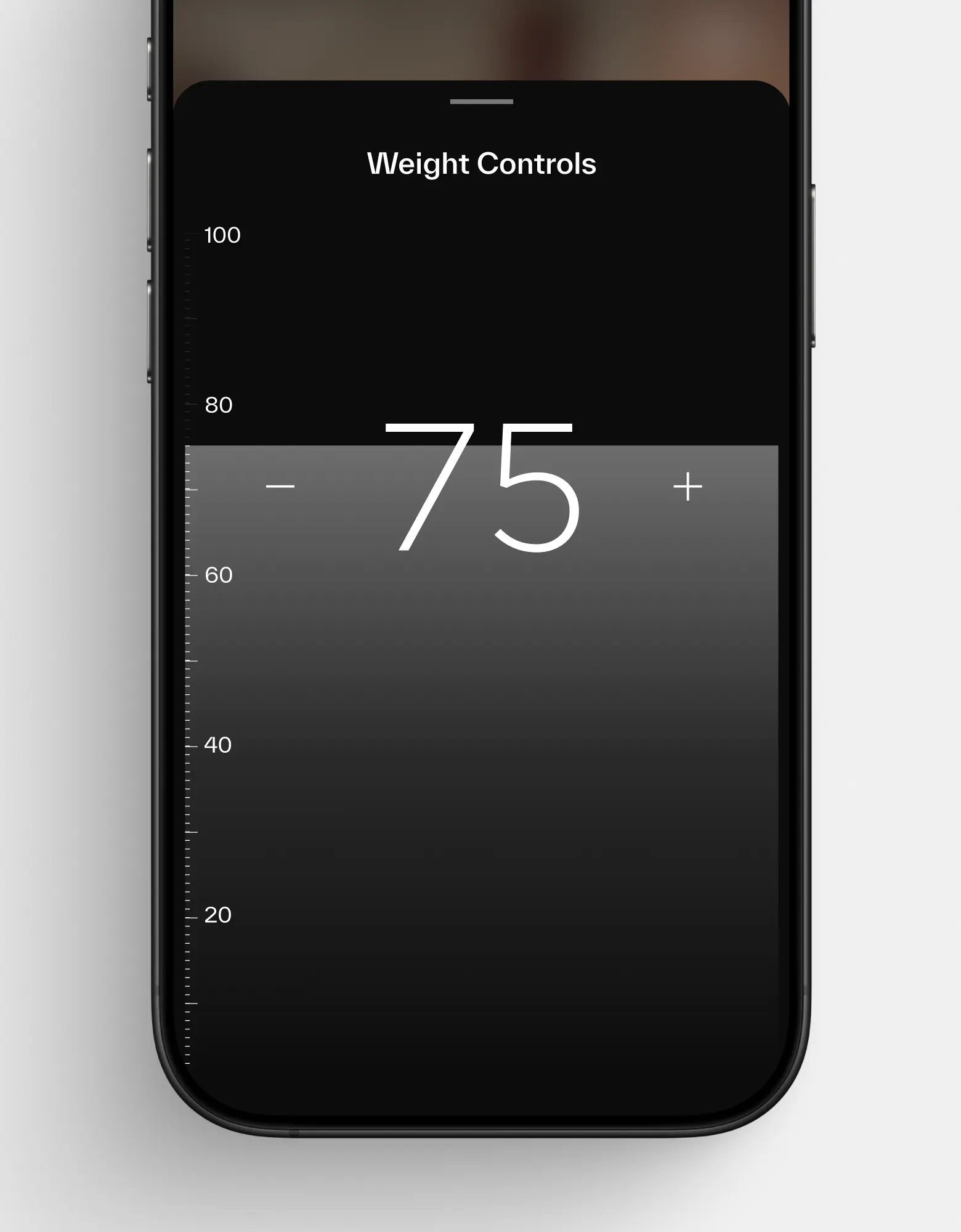
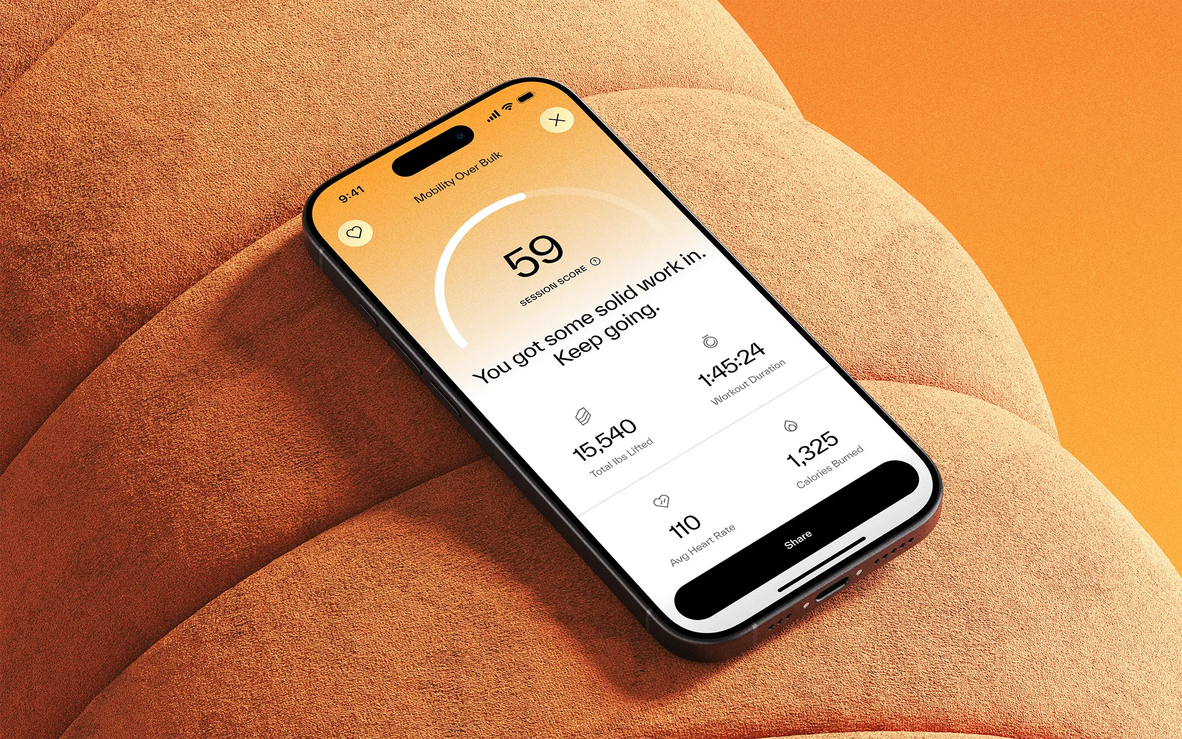
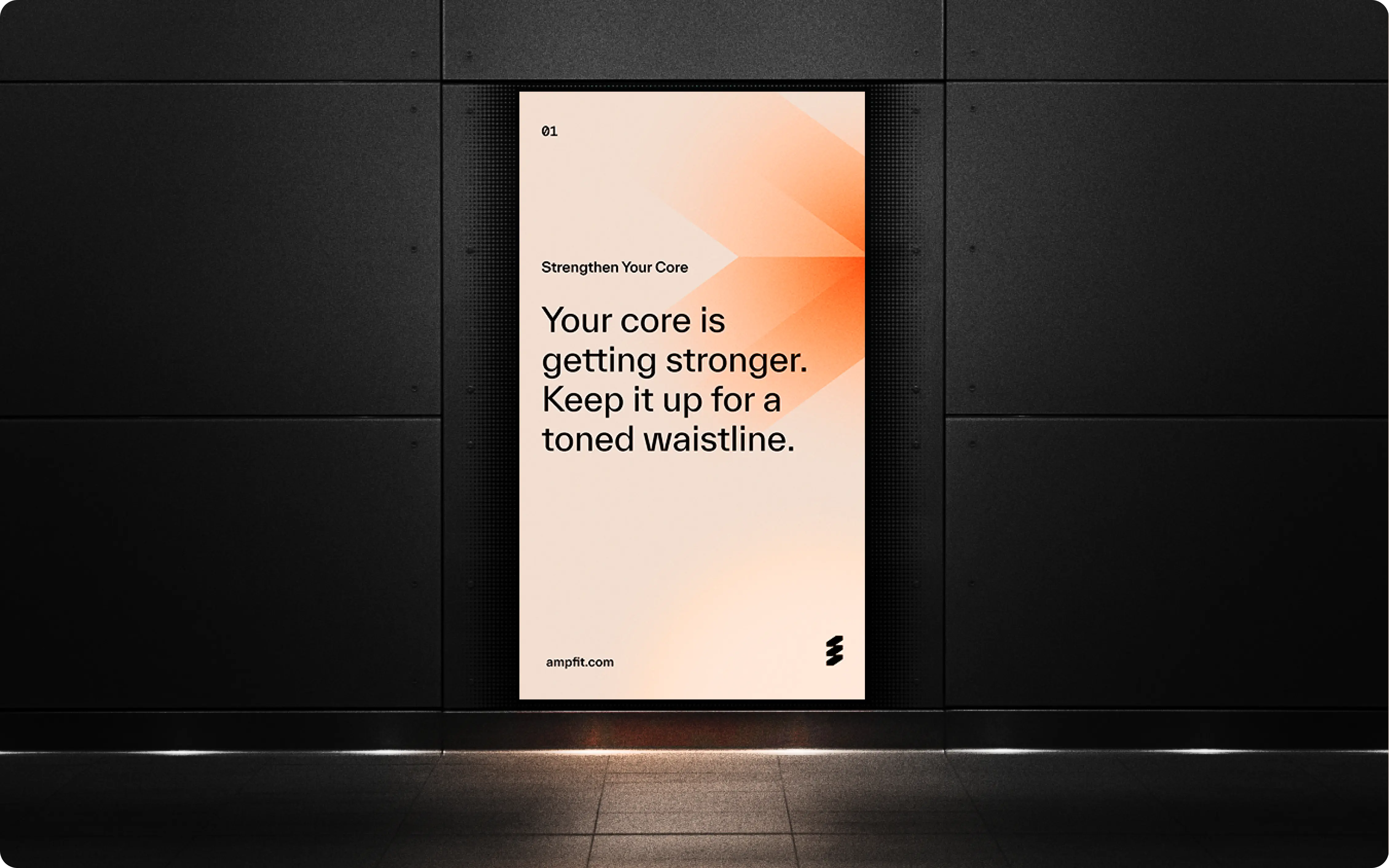
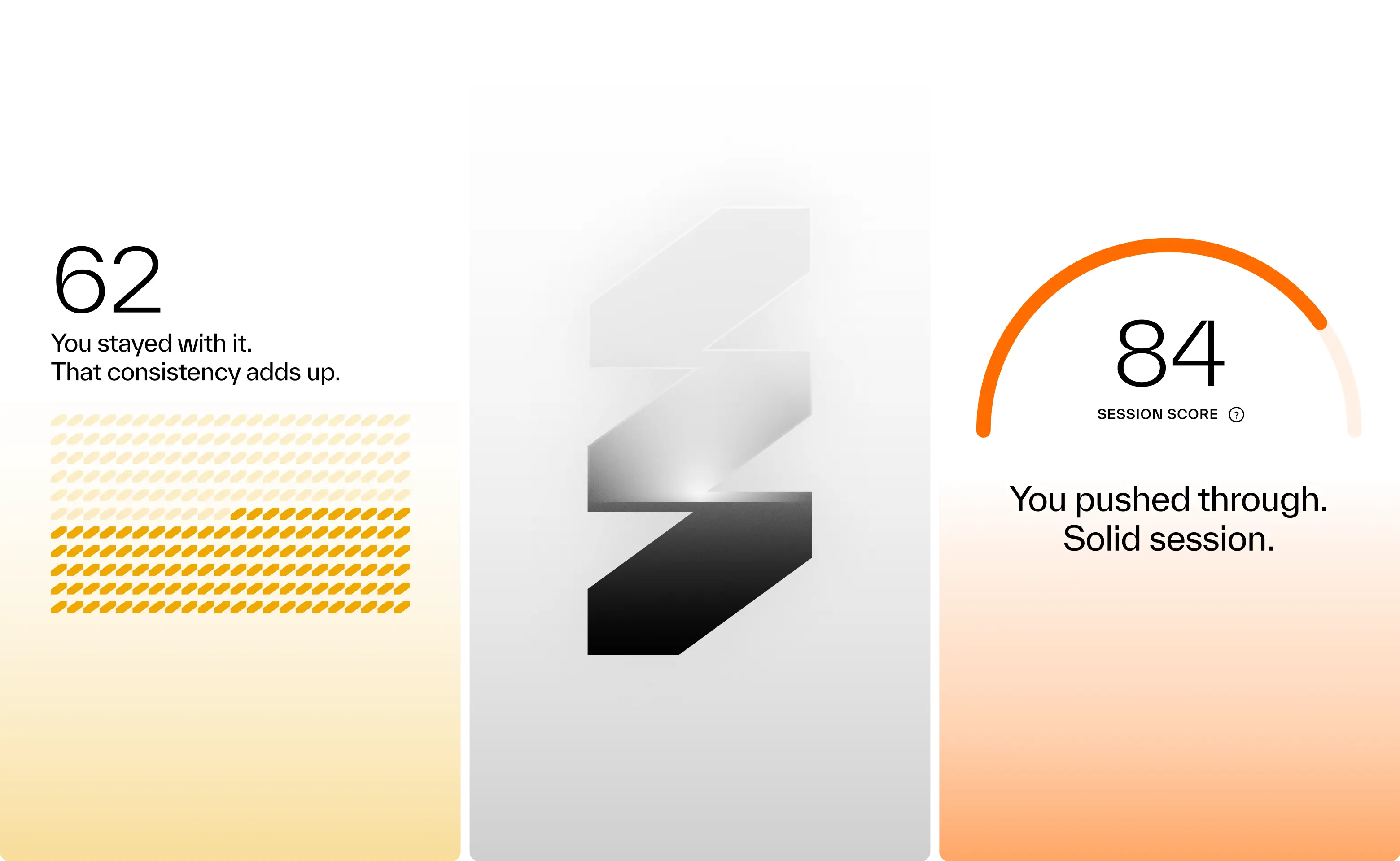

Results so far: 40,000 users, multiple awards, and a sleek wall-mounted system paired with a companion app. Working with amp meant translating adaptive resistance hardware, smart coaching, and modular accessories into a cohesive consumer experience. Add to that a team backed by Sports Science PhDs and leaders from Apple, Meta, and Nike, and the expectations were clear: nothing short of excellence would do. Rising to that challenge not only delivered results for amp, but pushed Konpo to sharpen our own systems and raise the bar. Challenge accepted. Mission accomplished.
- Founder - Shalom Meckenzie
- Year - 2024
- Industry - Fitness · Artificial Intelligence
- Scope - Brand · Product · Systems
- Website - www.ampfit.com
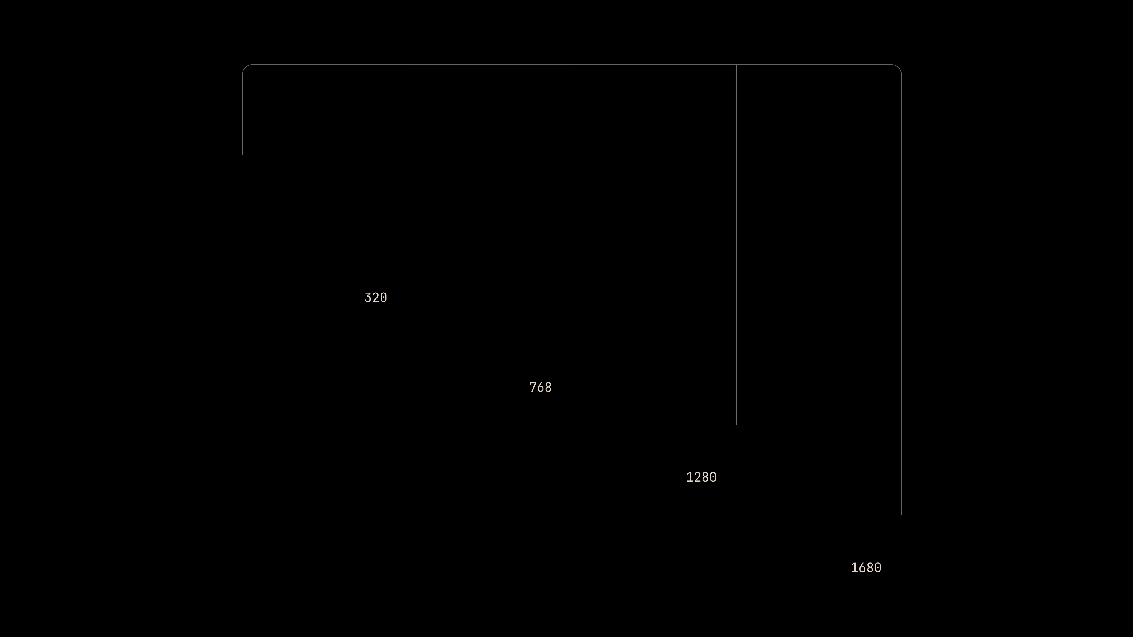
A Search Engine Designed from Right to Left.


Fyler is a search engine made for the Middle East. They deliver truly localized answers to the Arabic world. A thing that the usual suspects can't do well. Their team came to us with a clear goal and an open canvas. In their own words: "We want it look and feel world-class, but it should live and breathe in Arabic” They were eager to hit the ground running. Turned out, in true startup-fashion, they didn't really have a brand. Or a fully defined product, for that matter. So to our own demise, we set out in a desert quest to derive it through product and establish it through the design system. We had 4 weeks. Yalla!
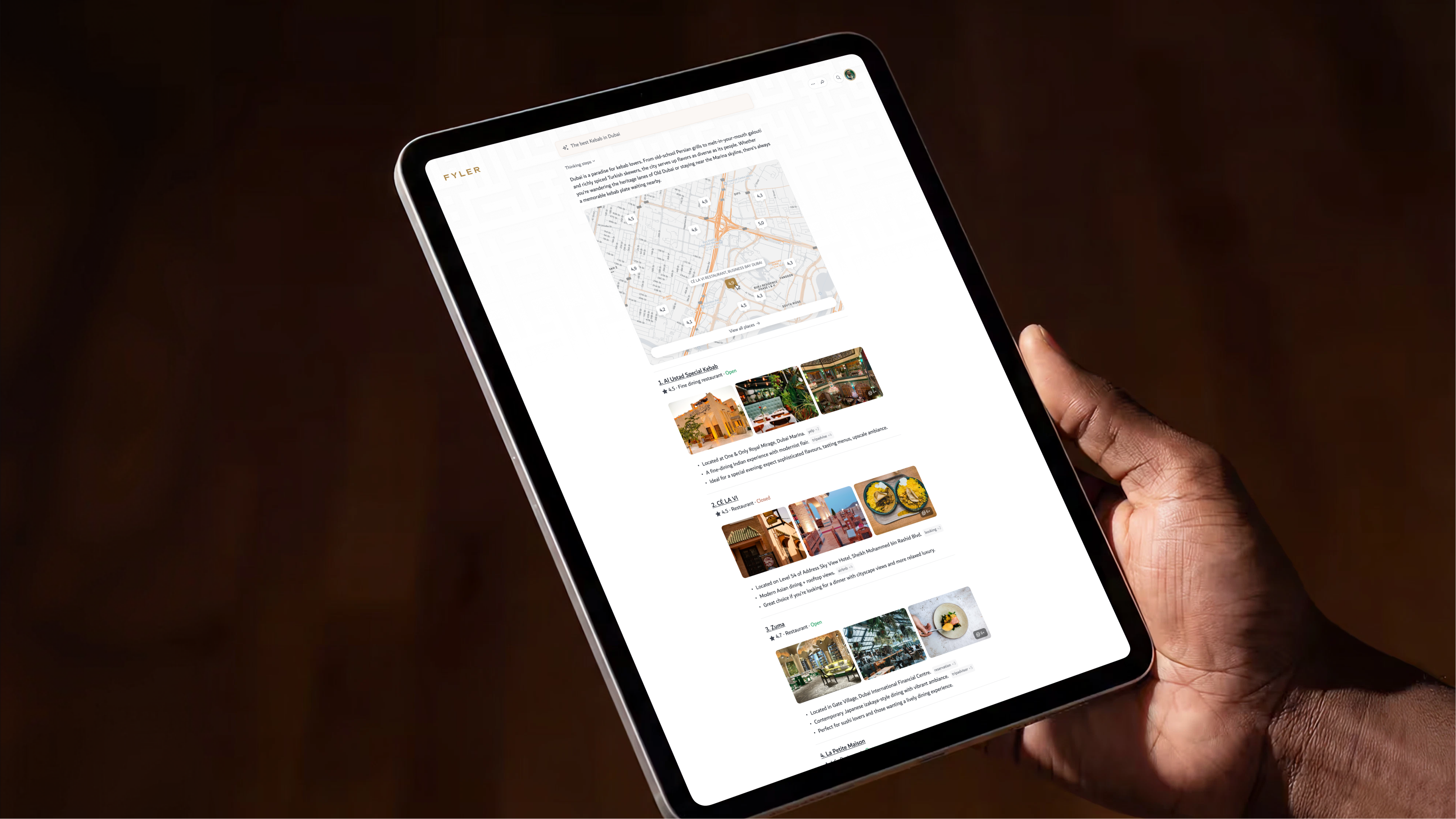
Fyler is a search engine made for the Middle East. They answer truly localized queries like: Where can I find a good فطور spot? Something the big boys don't do very well.
Their team came to us with a clear goal and an open canvas. In their own words: We want it look and feel world-class, but it should live and breathe in Arabic.
Eager to hit the ground running. Turned out, they didn't really have a brand. Or a fully defined product. So we set out to build the plane while flying it.
We had 6 weeks. Yalla!
No Brand.
6 Weeks.
Inshallah.
True startup, moving fast and breaking things. But also...
No colors.
No typography.
A questionable logo.
Before designing a single pixel, we needed to decide what the features we would tackle, and how the whole experience should feel like.
Luckily, their engineering team was using shadcn/ui as their base. Fast, flexible, and just opinionated enough to hit the ground running without locking us into a generic personality.
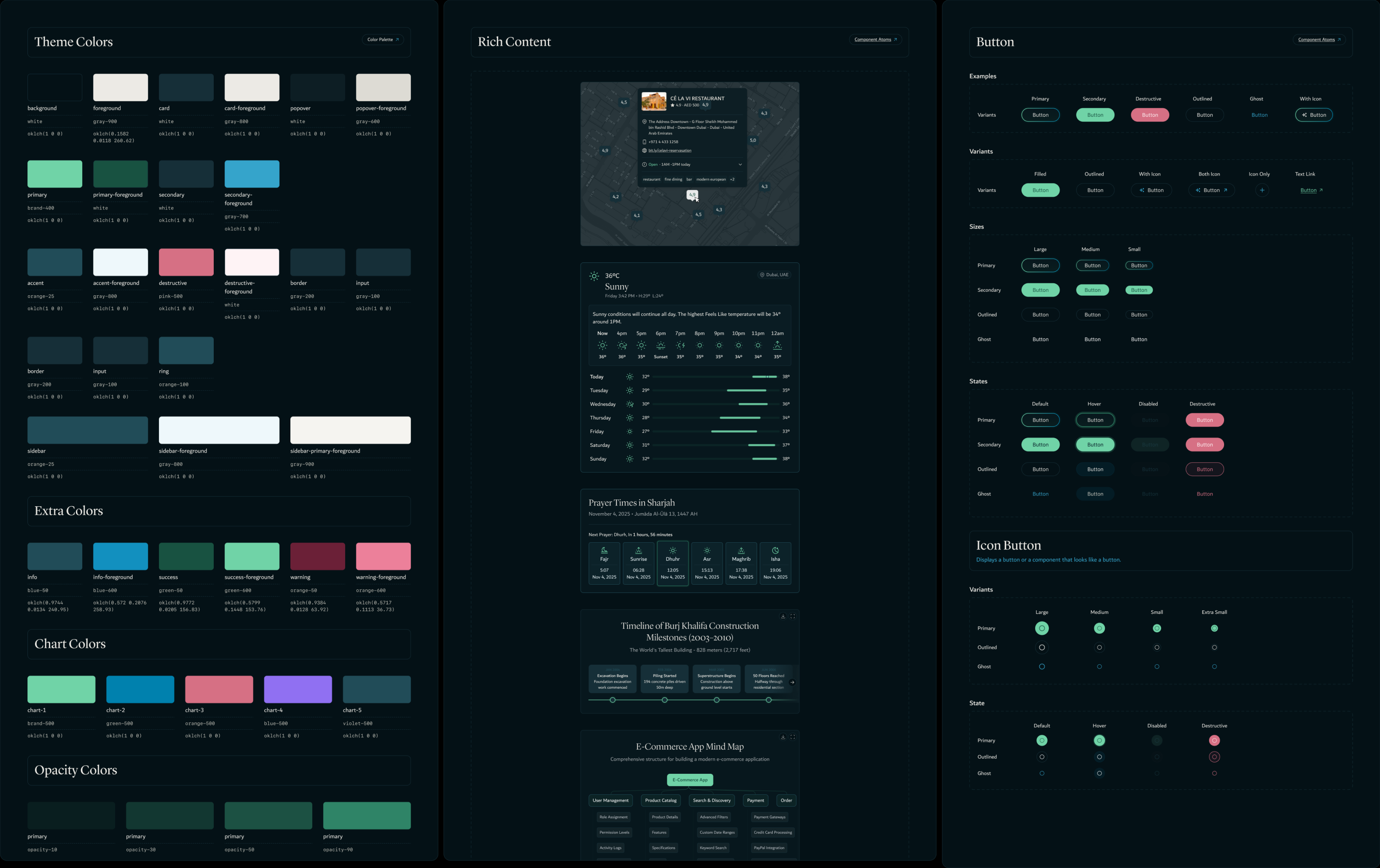
An interface with no face, yet!
First order of business, look around.
We audited every major search engine and LLM to figure out what we would need.
To the surprise of literally nobody, they all look practically the same. But it's for a reason, the status quo works. No need to reinvent that wheel.
With the audit we had our component shopping list. We had shadcn underneath.
How do we make it Arabic?
Prying open the cultural neutrality.
Most software interfaces are culturally neutral. They belong to their industry and niche, but rarely their location.
That couldn't be the case with Fyler. So we went hunting for our Design Principles: elements that could give us a baseline, specific enough to feel like something, restrained enough to hold up across a whole interface.
Colors of cultural relevance.
Iconography from daily life.
Religious patterns.
Arabic caligraphy.
Bringing it all home.
All of this boiled down into several design proposals. One that we all particularly liked and we dove into head-first.
We designed a software that lives and breathes the Gulf. Not too flashy but immediately recognizable. Subtle accents that make you hover over things. Background animations that produce delight but with restaint.
The Fyler team wanted a product that could confidently sit at the adults' table.
And habibi... it now really could sit at that table.
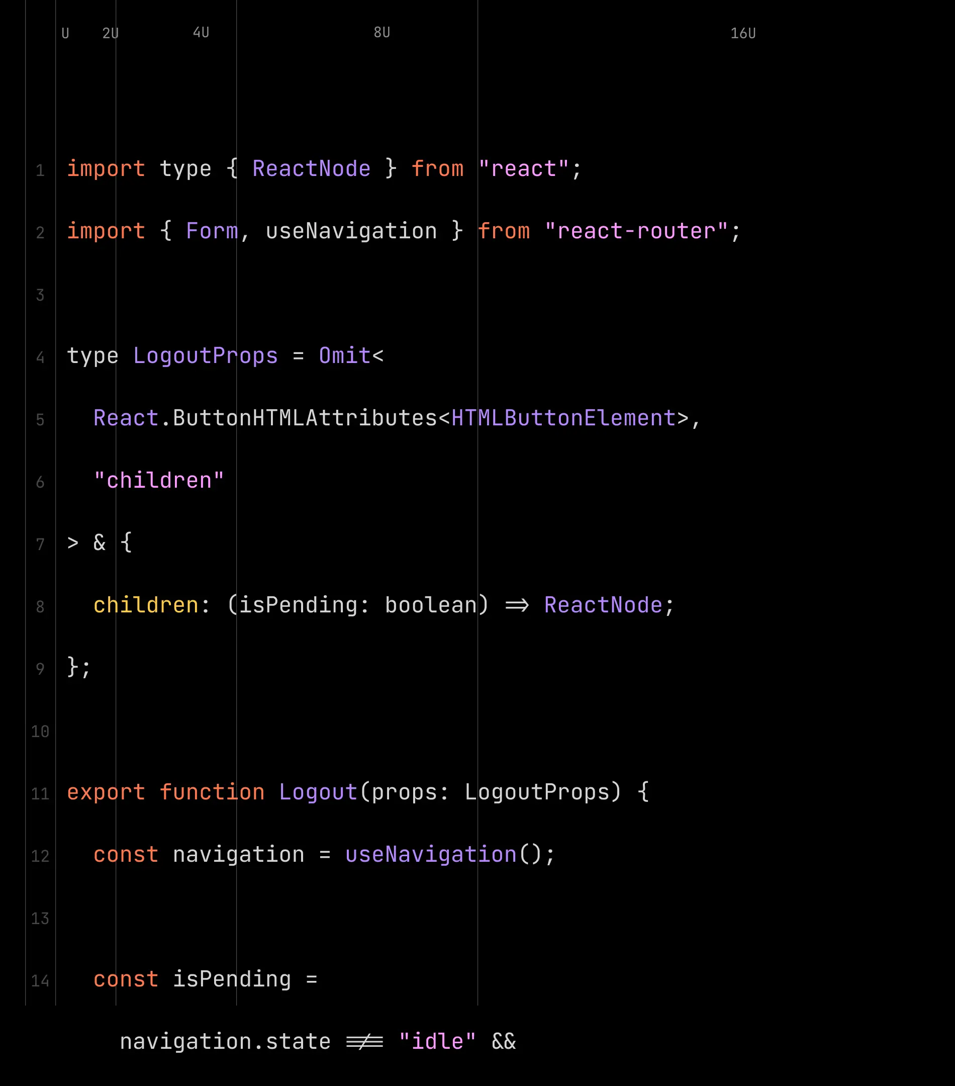
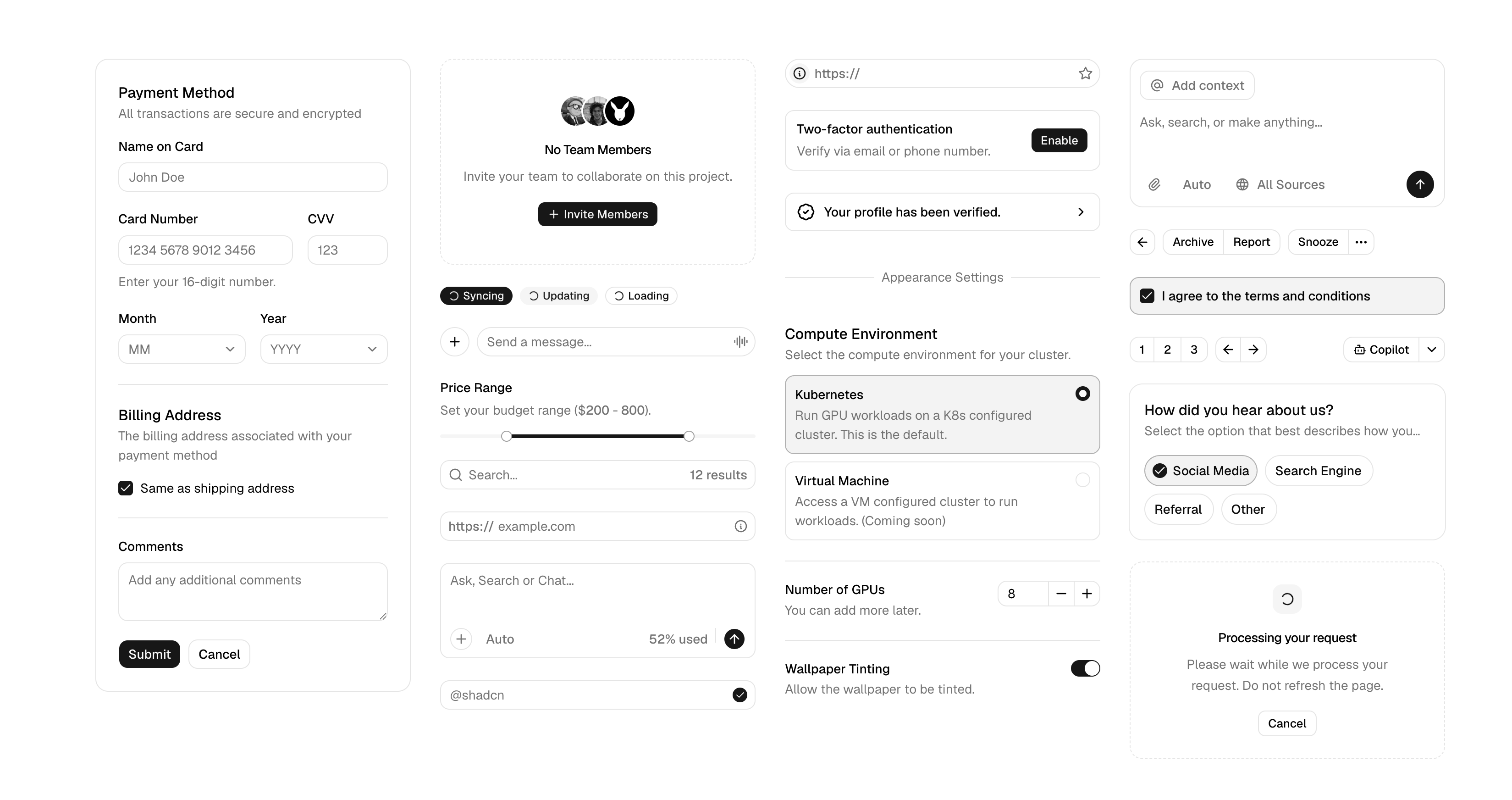
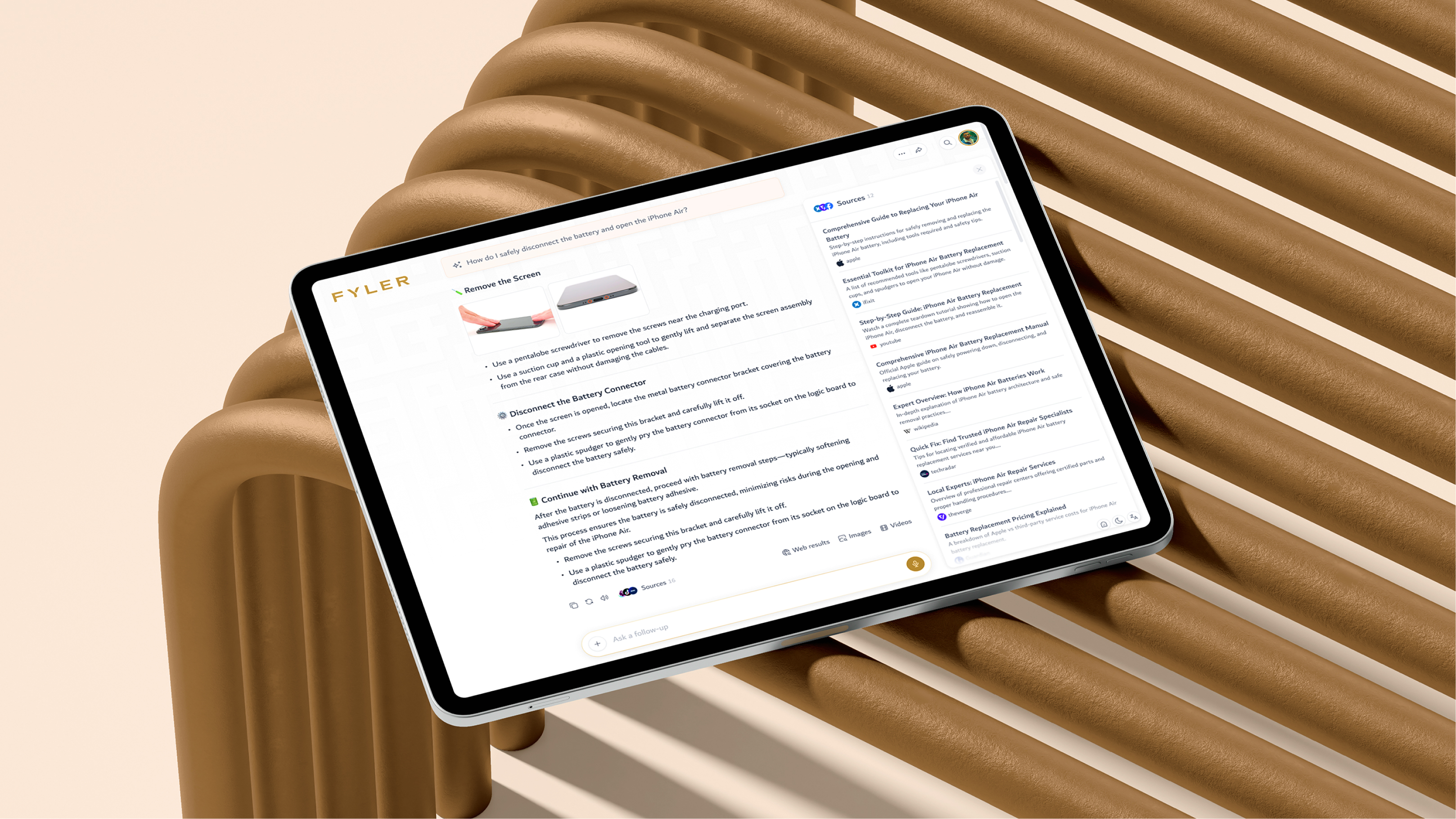
Design is product management.
Good designers can make interfaces shine in Figma. Great ones can carry it through to production.
We worked elbow-to-elbow with their engineers and CTO to define and prioritize the features we wanted to tackle and we all understood had the most value. Both for the company and its users.
.png)
.png)
.png)
.png)
Design is product management.
Good designers can make interfaces shine in Figma. Great ones can carry it through to production.
We worked elbow-to-elbow with their engineers and CTO to define and prioritize the features we wanted to tackle and we all understood had the most value. Both for the company and its users.
Good design thrives at the handoff.
Design is nothing if engineers ignore it at implementation.
We built the system inside their framework, not next to it. Figma variables mapped 1:1 to their tokens. Every component lived where their engineers already lived.
Good for the tense moments of a handoff. Even better as the product scales.
.png)
.png)
.png)
.png)
.png)
.png)
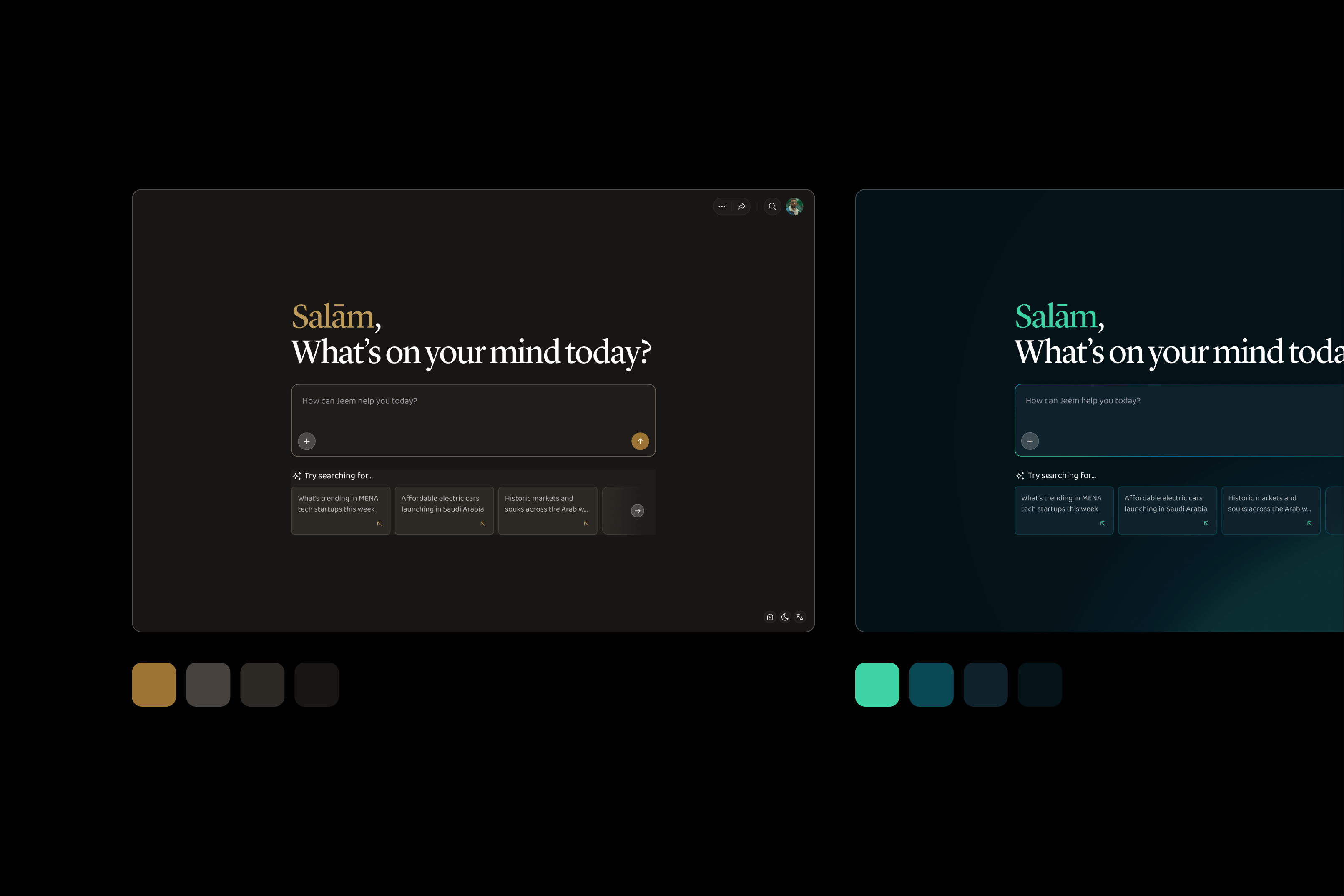
Fast forward...
A new logo joined chat.
.png)
A year after launching, Fyler rebranded: same product we built, new name, new look. Normally, that means manually reworking every screen, one by one.
Except it didn't. The new brand came with just a palette and a symbol, so we worked out how it should behave in product. Once we had that, updating the system's values and components pushed the new look across every screen.
A full product rebrand in a week, instead of the slow, error-prone slog it'd be without one. Build the system right once, and every job after it gets cheaper.
Fast forward...
A new logo joined chat.
A year after launching, Fyler rebranded: same product we built, new name, new look. Normally, that means manually reworking every screen, one by one.
Except it didn't. The new brand came with just a palette and a symbol, so we worked out how it should behave in product. Once we had that, updating the system's values and components pushed the new look across every screen.
A full product rebrand in a week, instead of the slow, error-prone slog it'd be without one. Build the system right once, and every job after it gets cheaper.
.png)
.png)
Shoutouts
Saeed Saif AlGhurair
Ahmed El-Shazly
Mohamed Berrim
Aidar Samerkhanov
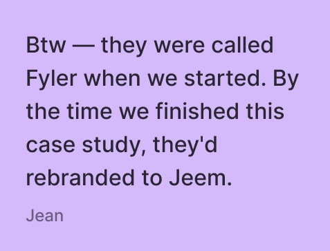
Jean Massad
Javier García
Ga Huy
Shoutouts
Saeed Saif AlGhurair
Ahmed El-Shazly
Mohamed Berrim
Aidar Samerkhanov
Jean Massad
Javier García
Ga Huy
We came to Konpo knowing we wanted to build something ambitious, but not what that meant in design terms. Much of the product was still to be defined. From the first conversations, they found what was missing, brought research and references to the table, and proposed how it should work. They moved the product forward faster than we could have on our own.

.webp)

.webp)

.webp)


.jpg)
.webp)


.webp)
.webp)

.webp)