
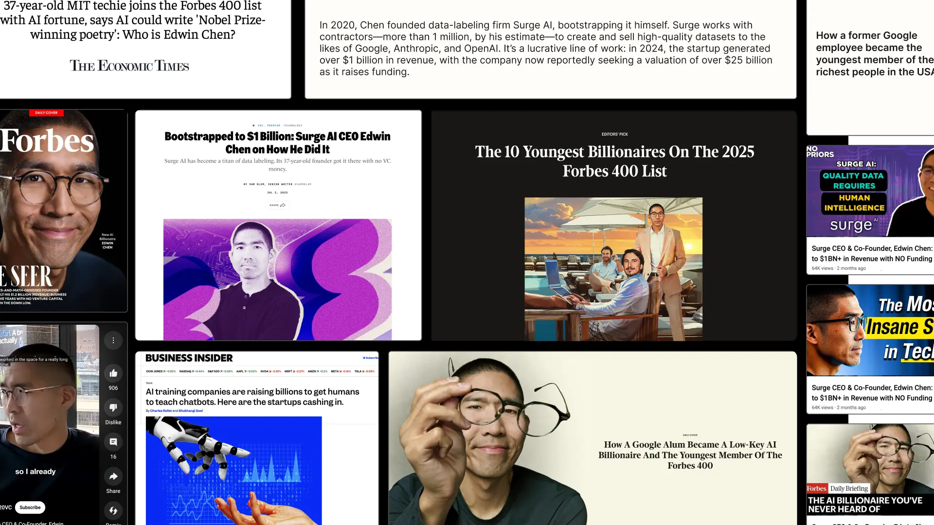
From day one, Surge needed more than a brand that looked good. They needed design that built credibility, earned trust, and scaled with them as they grew. They needed a design partner that ensures they stand out in the crowded world of AI infrastructure.
They chose Konpo. More than a vendor, we became their plug-and-play design team: senior talent embedded alongside leadership, shaping everything from their first identity to their website, product, and systems. At every stage, Surge found in Konpo a partner they could depend on.
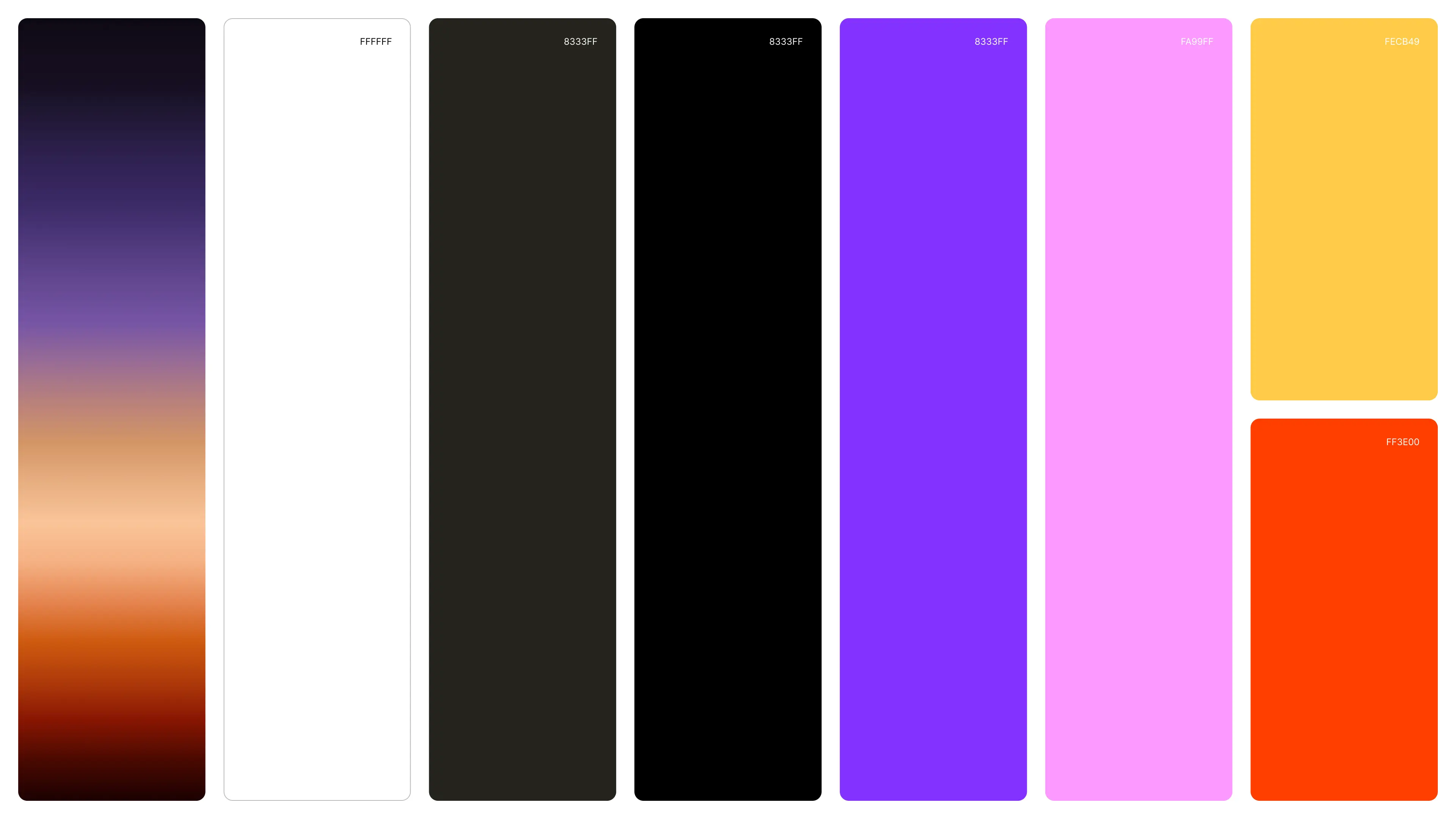
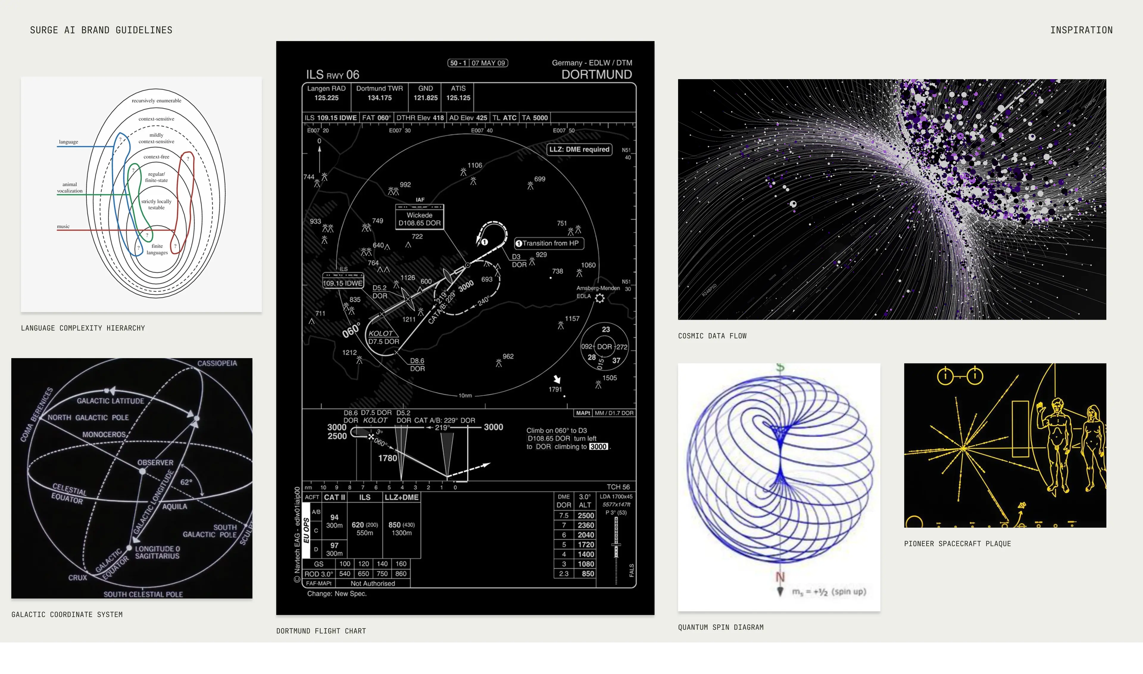

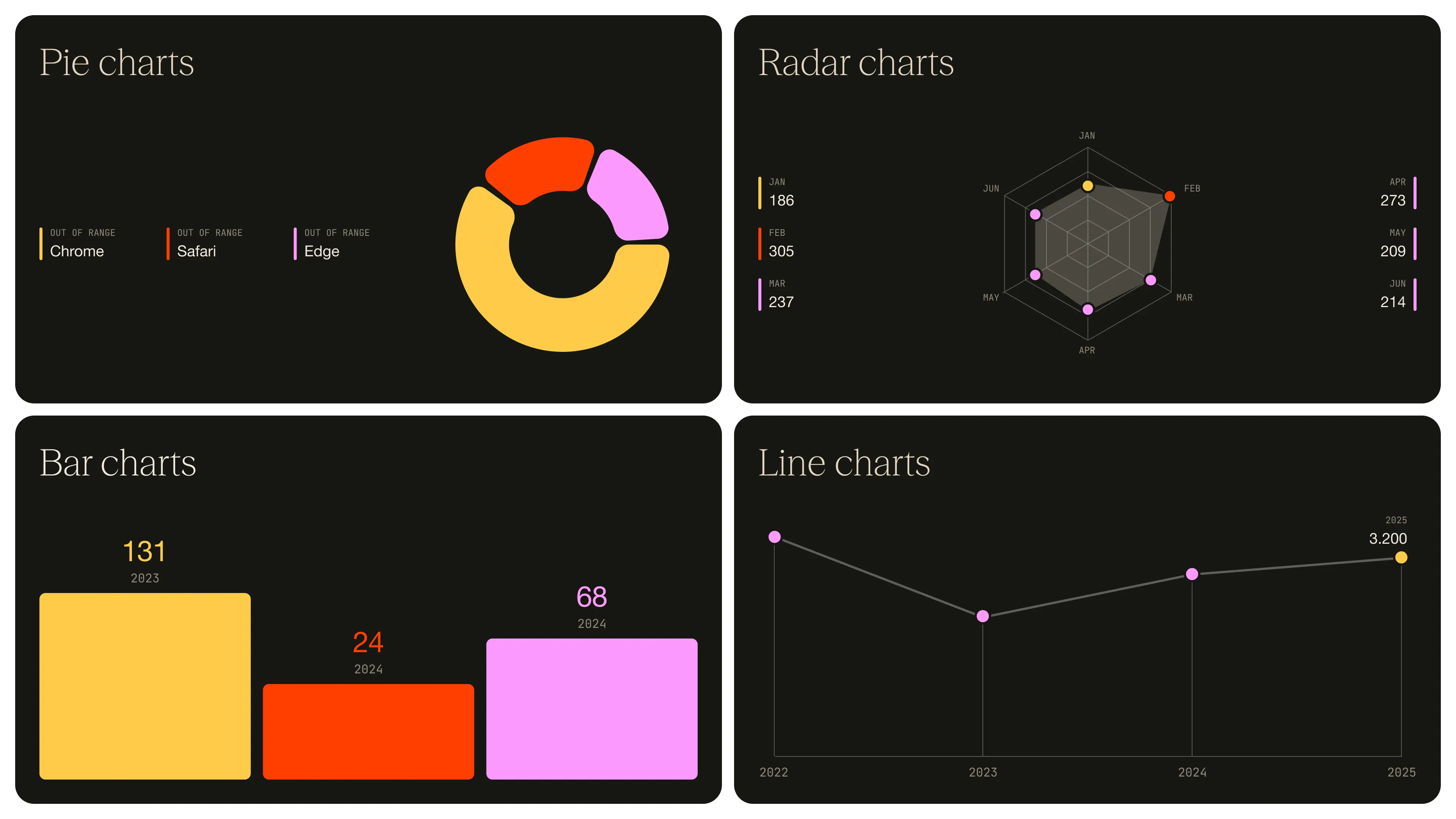
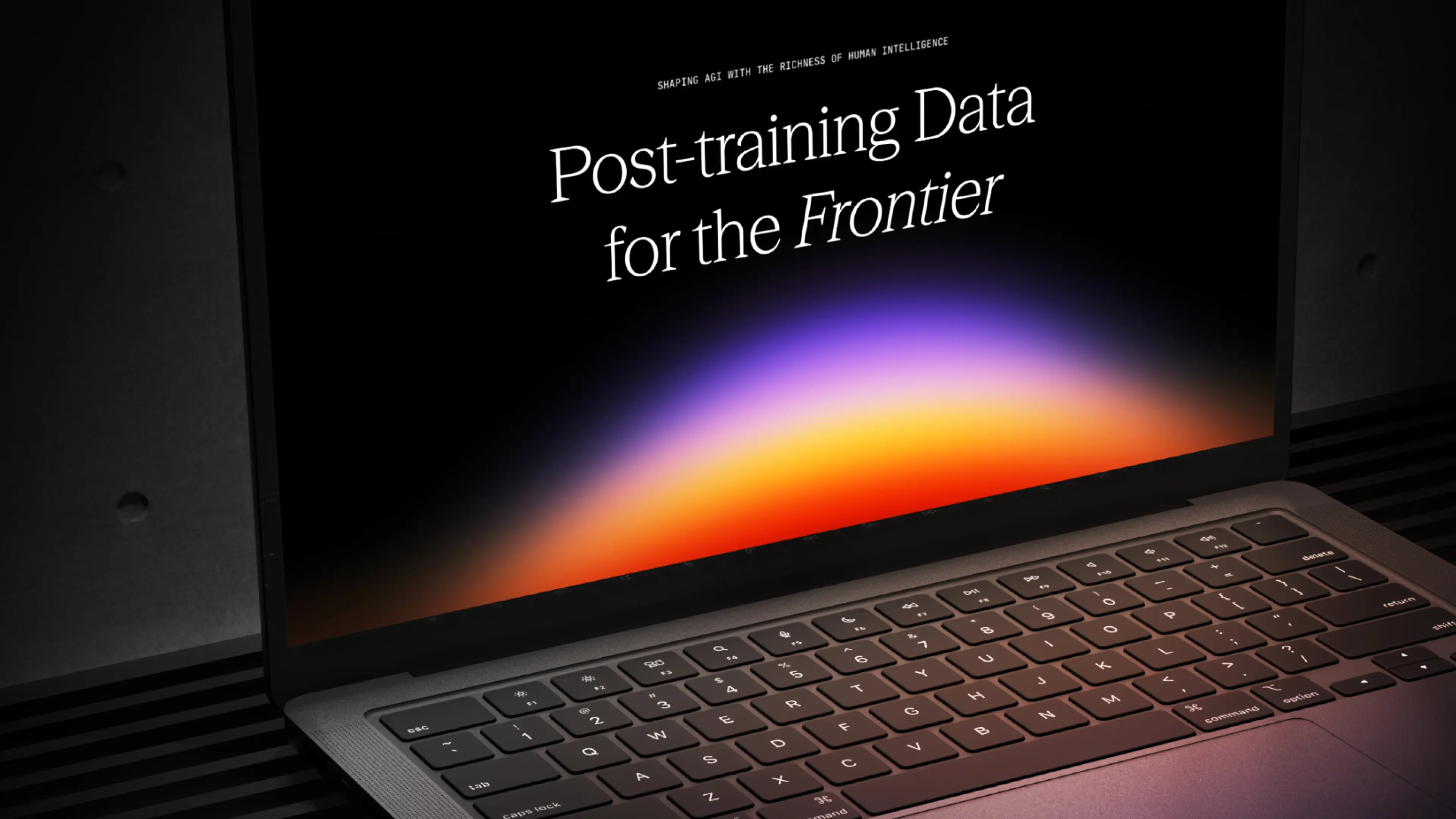
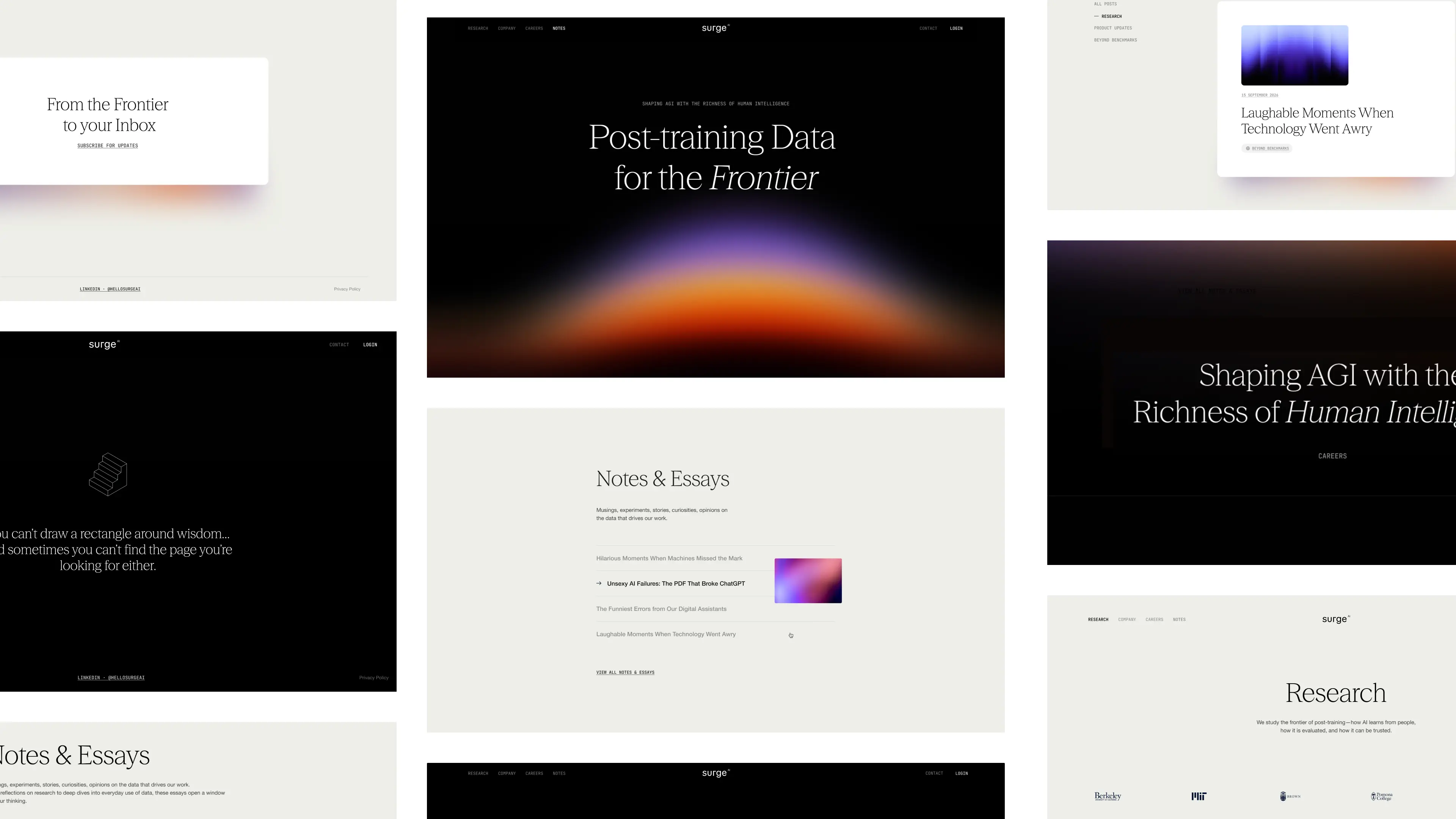
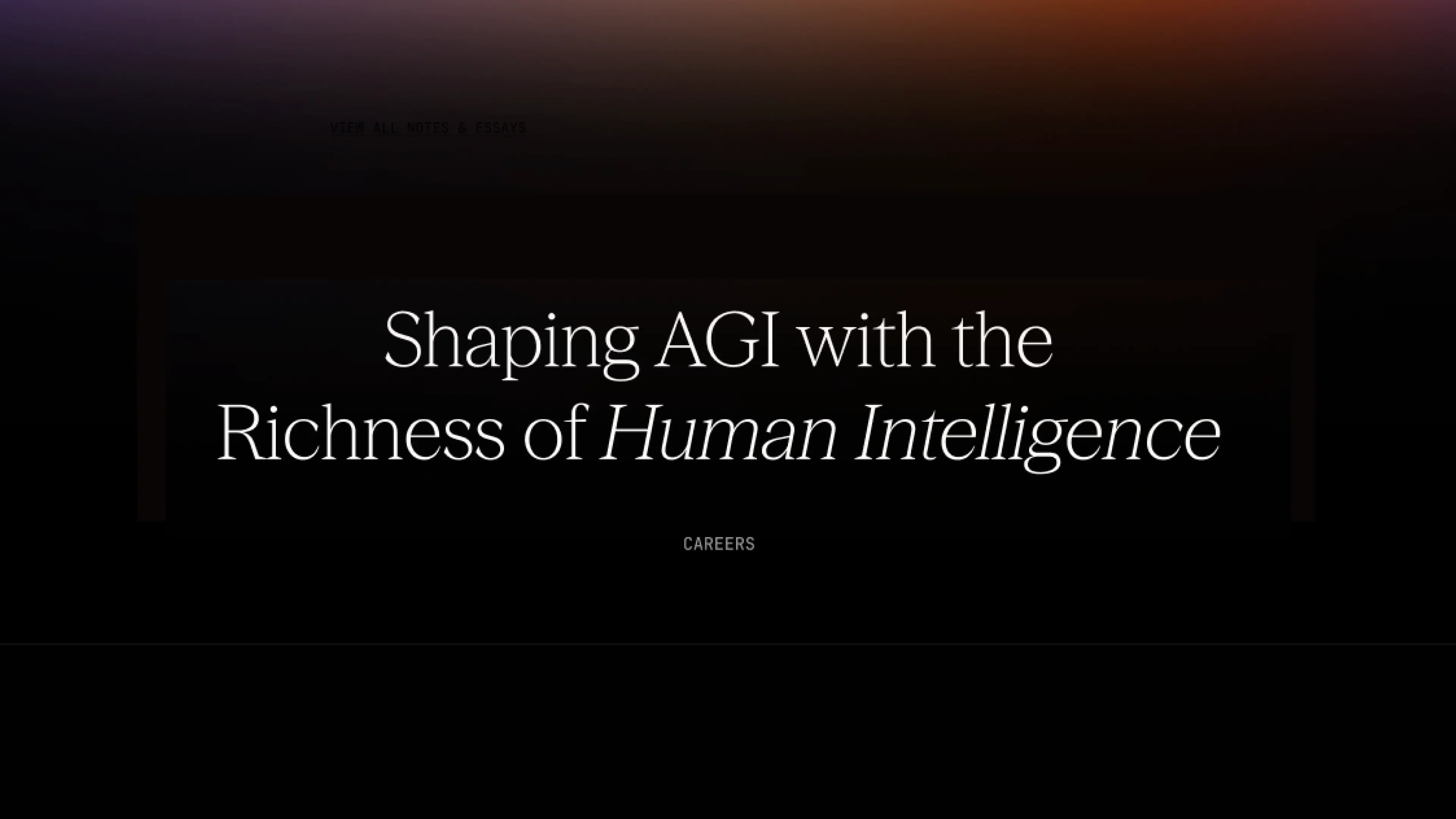
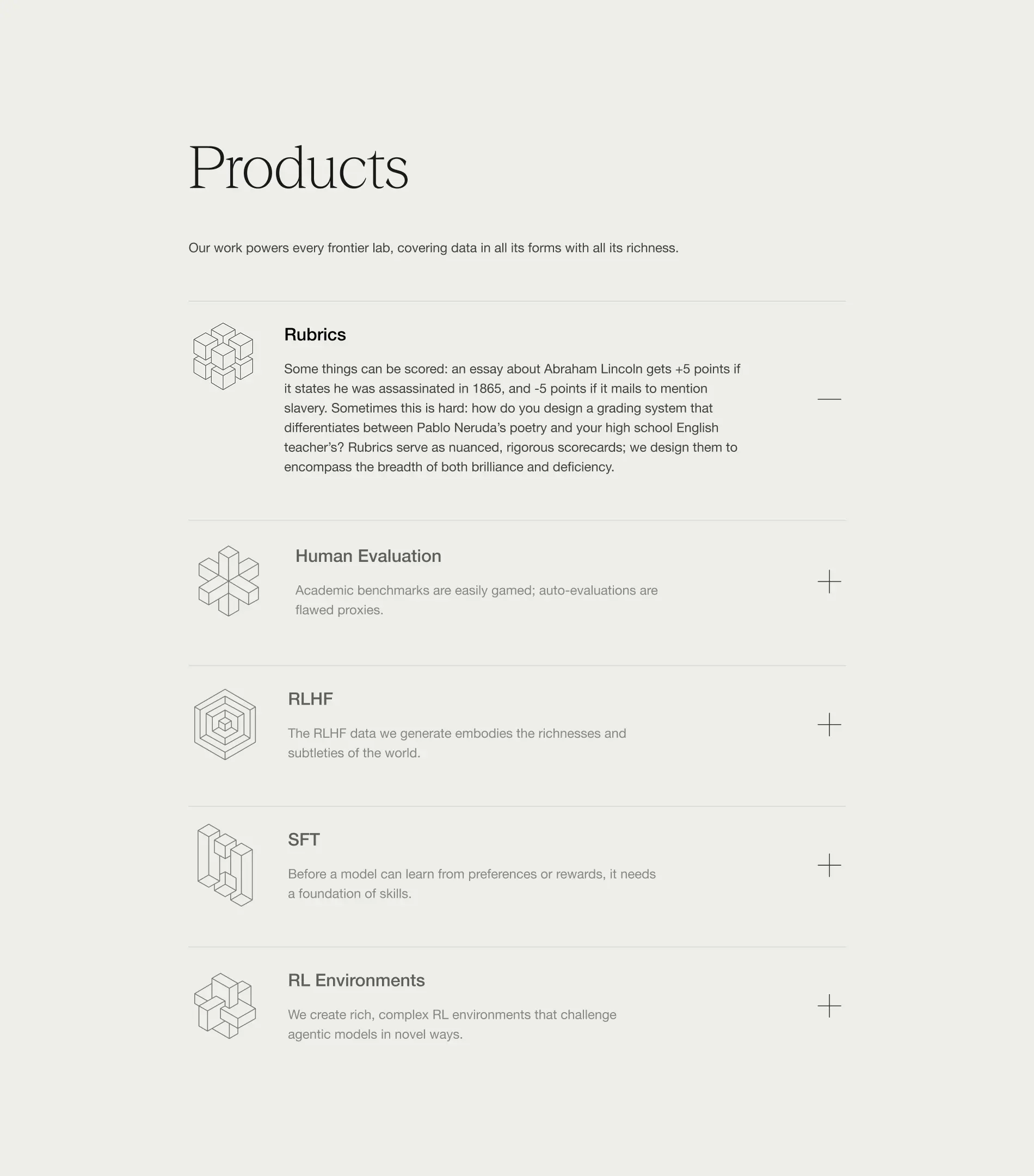
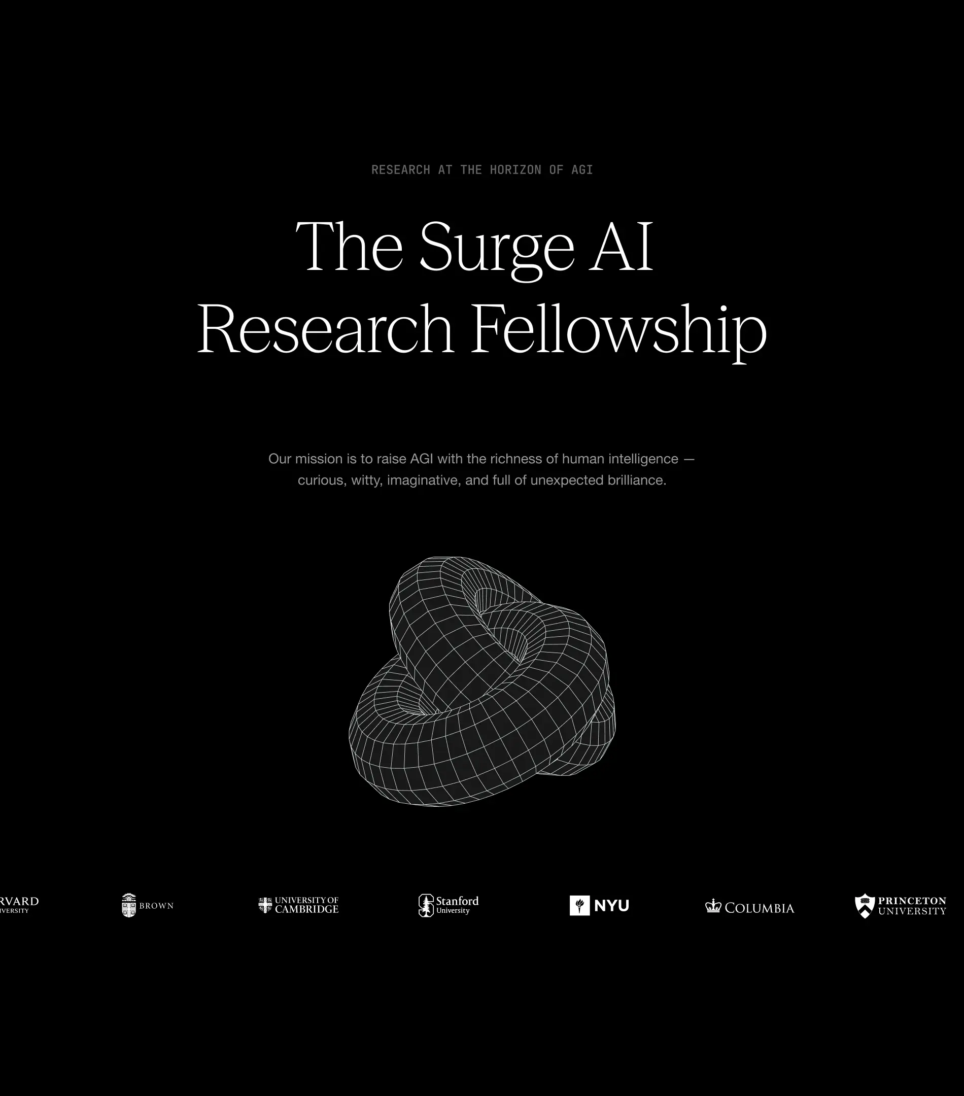
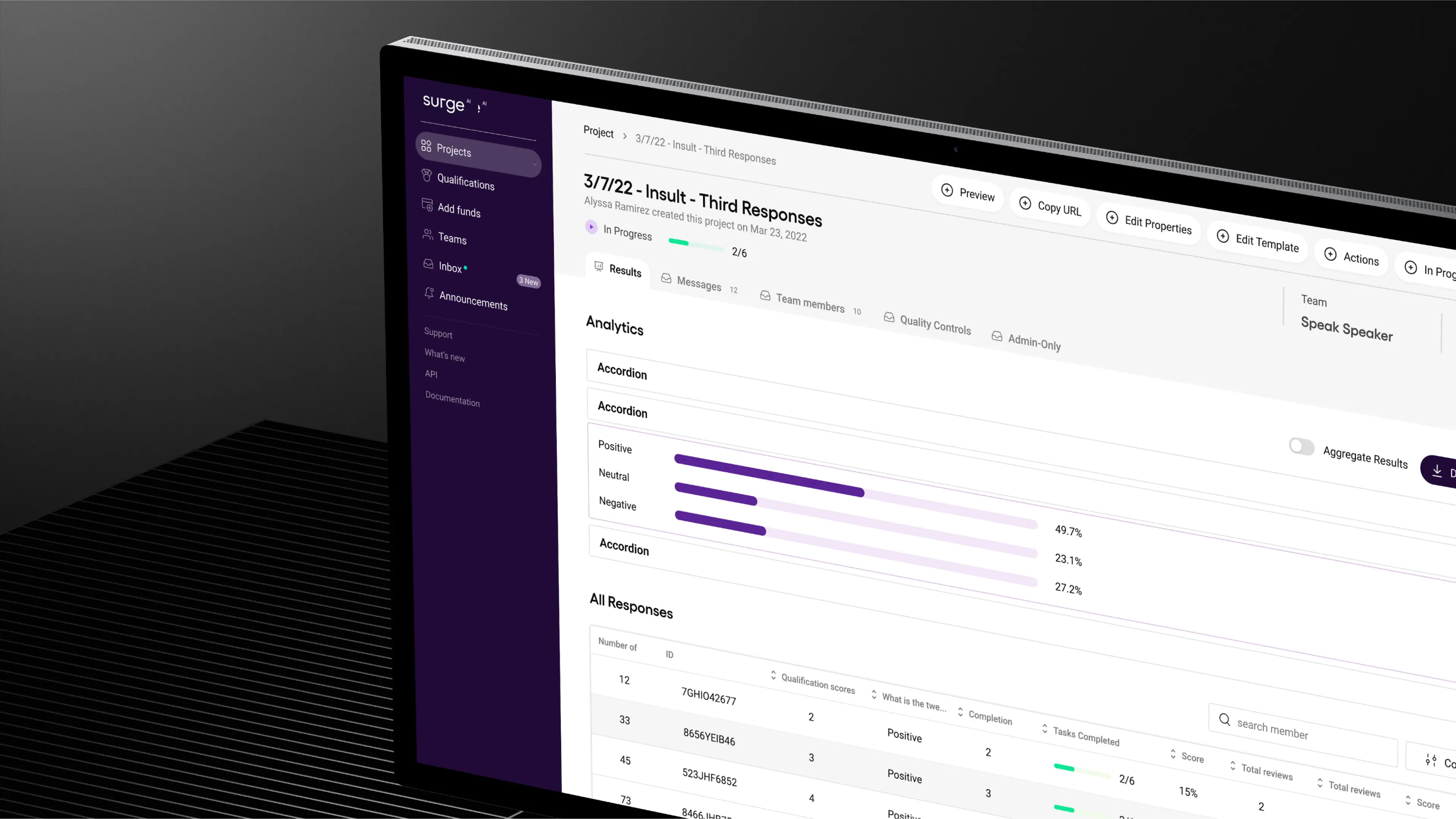



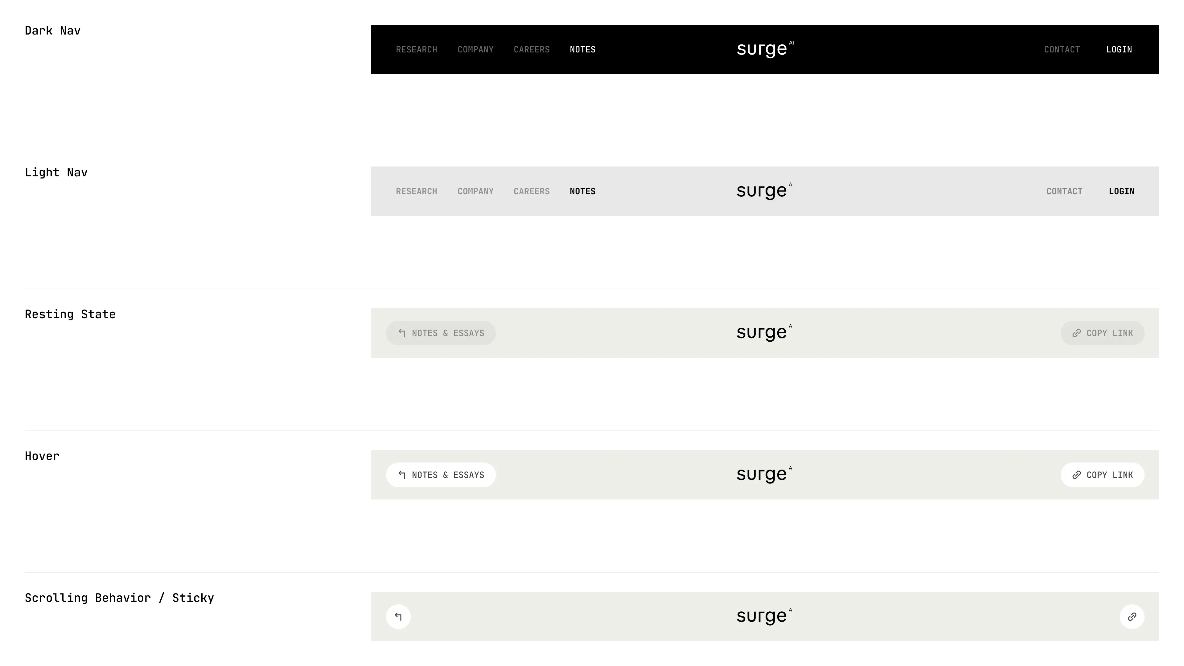
Our collaboration has become a long-term partnership that helped Surge grow from early explorations to a brand adopted by the leading AI and technology companies and a product internationally recognized and awarded.
We built a bold, distinctive identity in an industry defined by sameness, designed a product experience that balanced delight with enterprise-grade usability, and crafted a design system to keep them consistent as they scaled.
As Surge now looks to fetch a valuation of over $15 billion in its first capital raise, we’re leading phase two of their branding. The goal: to build a brand that not only wins attention and trust, but one that matches the ambition and credibility of a company operating at that scale.
- Founder - Edwin Chen
- Year - 2025
- Industry - Artificial Intelligence
- Scope - Brand · Site · Systems
- Website - www.surgehq.ai

ComPsych needed a rebrand built to win. Younger competitors with sharper, design-driven branding were pulling attention away from the world’s largest provider of employee assistance programs (EAPs), a company supporting over 130 million people across 190 countries. They turned to Konpo to make sure their brand matched their scale and credibility. The mission: win back market share, turn reputation into loyalty, and defend their position at the top.

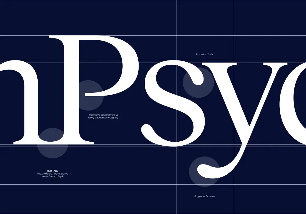

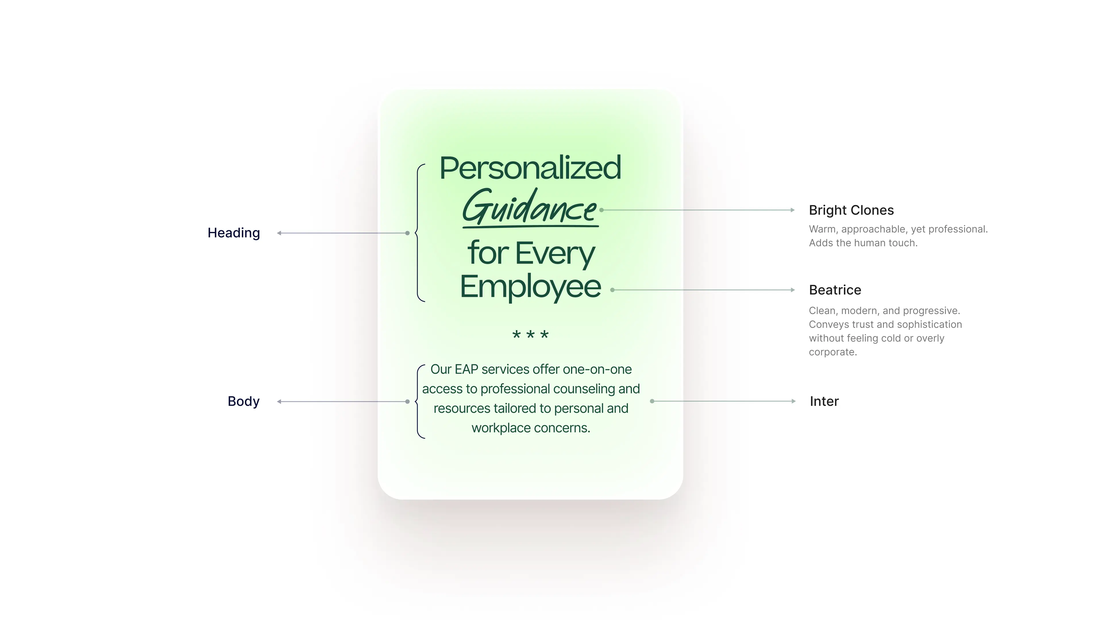
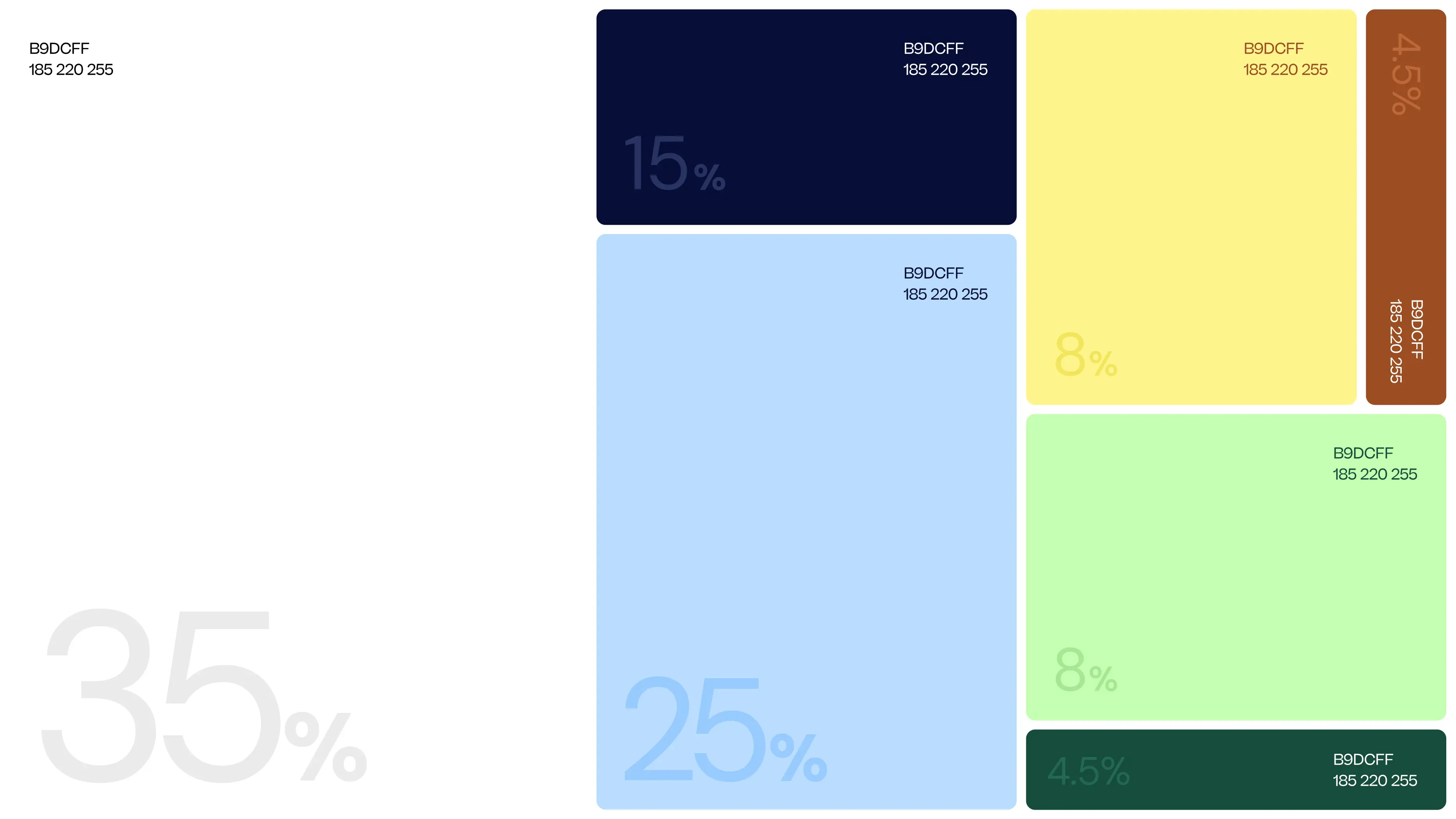

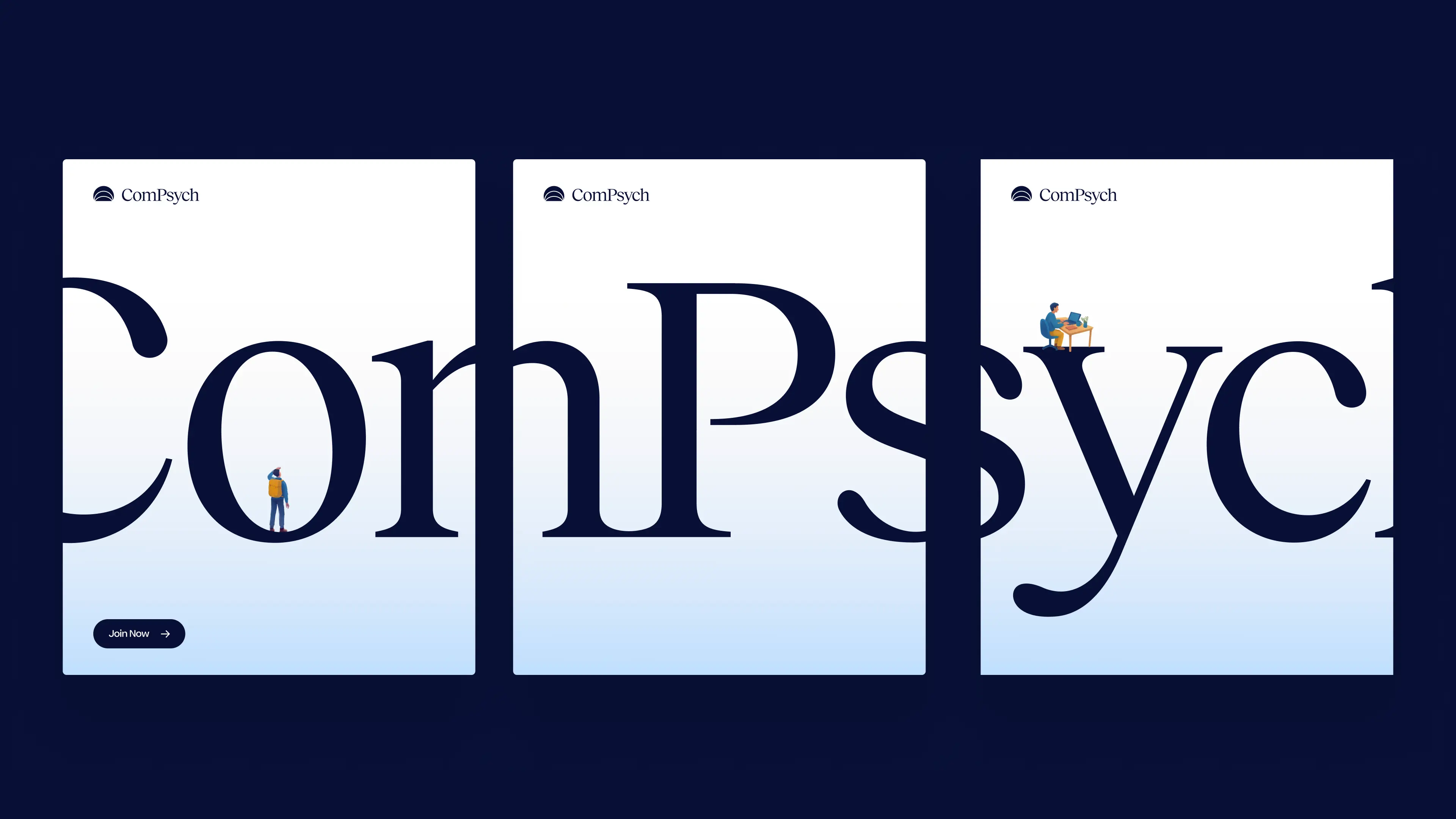
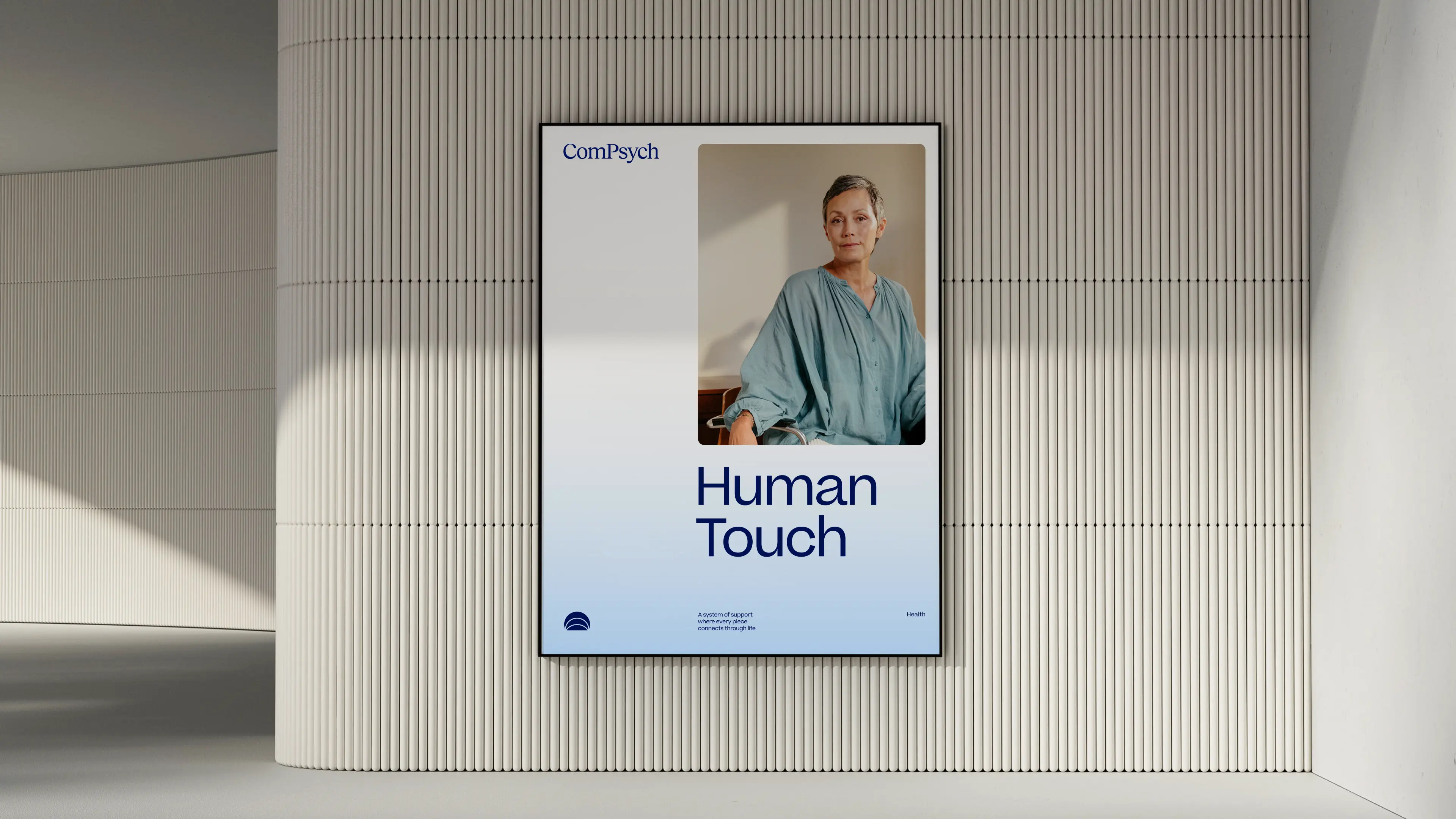
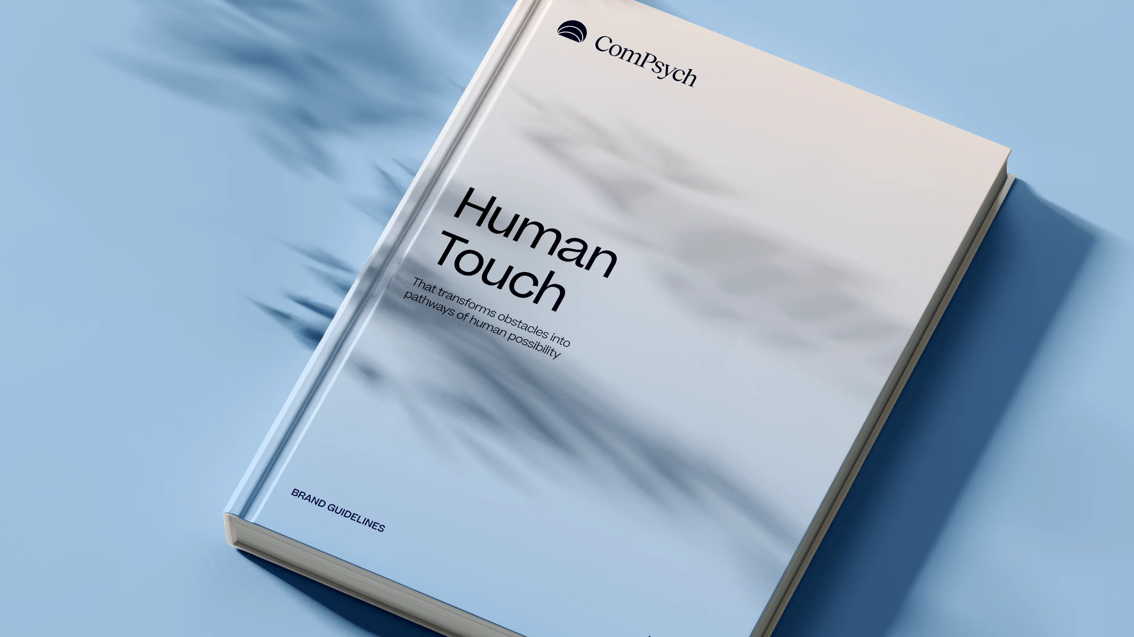
Every element of the ComPsych rebrand was built to show the strength of a category leader, but for today’s market and tomorrow’s. The new logo centers on a glowing core, with expanding ripples signalling growth, support, and scale. Their signature blue was sharpened with a modern palette designed to stand out with confidence, not noise. But what’s a rebrand without discipline to execute it? We built a dedicated brand hub that gave ComPsych everything, from logos to illustrations to voice, to apply their new identity consistently across 75,000+ organizations worldwide. And we delivered it beyond our original scope. The result: a brand that doesn’t just keep up with the competition, but takes back the lead. With a stronger identity and a system to sustain it, ComPsych now has the edge to defend its dominance and keep winning in a design-driven market.
- Industry - Employee Assistance Program (EAP)
- Scope - Brand
- Brand Hub - compsych.konpo.co
- Website - compsych.com
amp Fitness set out to launch its AI-powered strength training system with leadership and talent from Apple, DraftKings, Meta, Nike, and Spotify — people who held the highest design standards. To stand out in a crowded fitness space, they needed a design partner who could move as fast as they did and deliver world-class quality. That’s where Konpo came in. As their plug-and-play design studio, we worked elbow-to-elbow with Amp’s leadership to marry hardware and software into a seamless consumer experience. From product design to scalable design systems, we turned their ambitious vision into award-winning, user-loved reality. When the standards are highest, the right design partner makes all the difference.


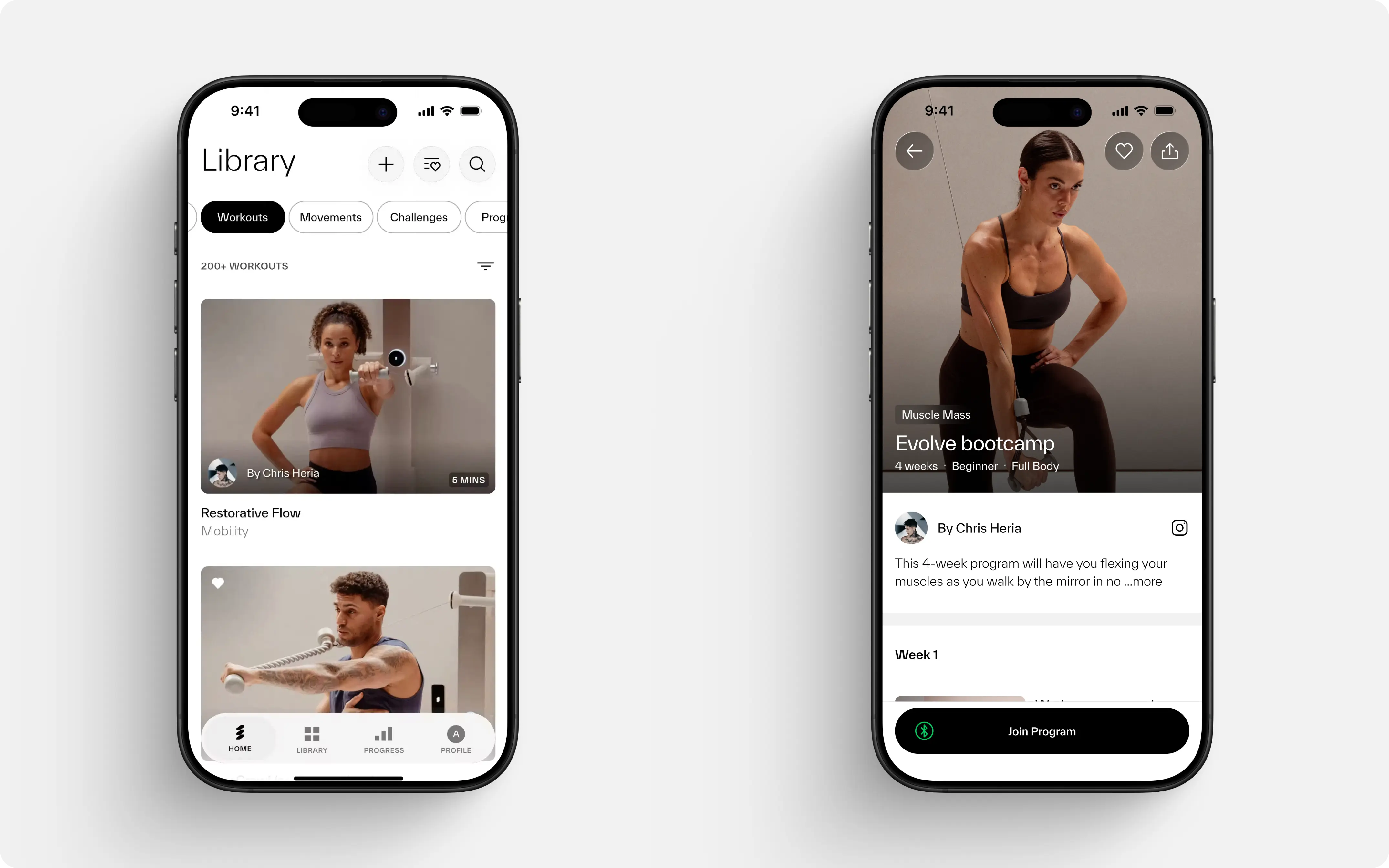
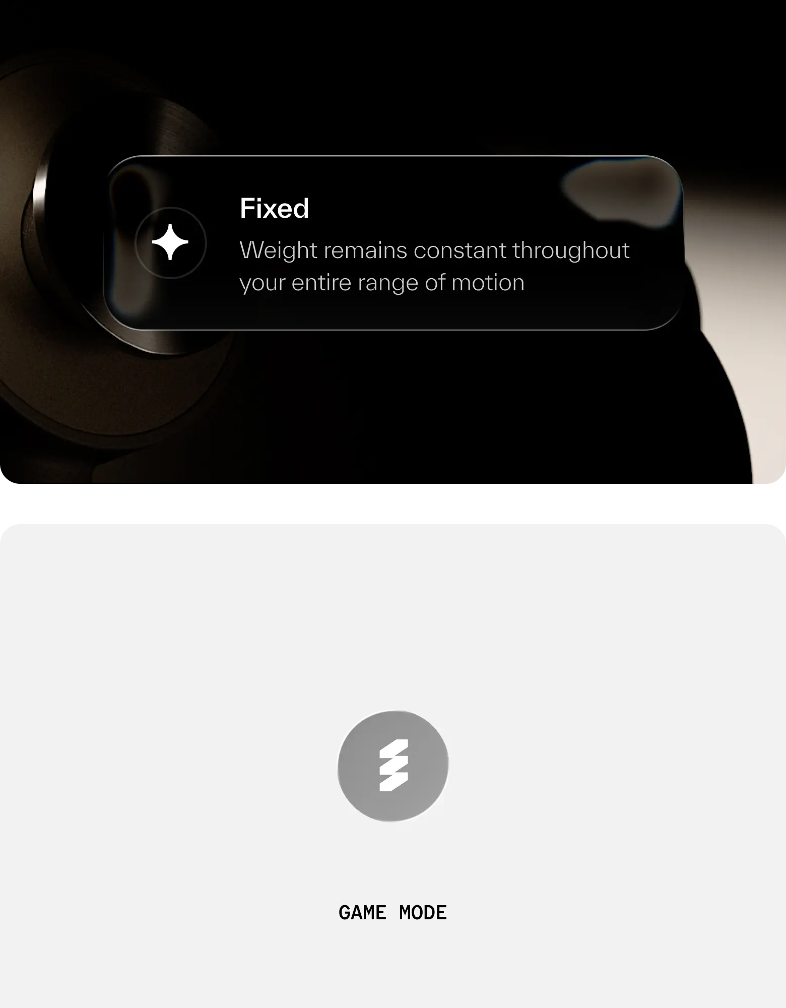
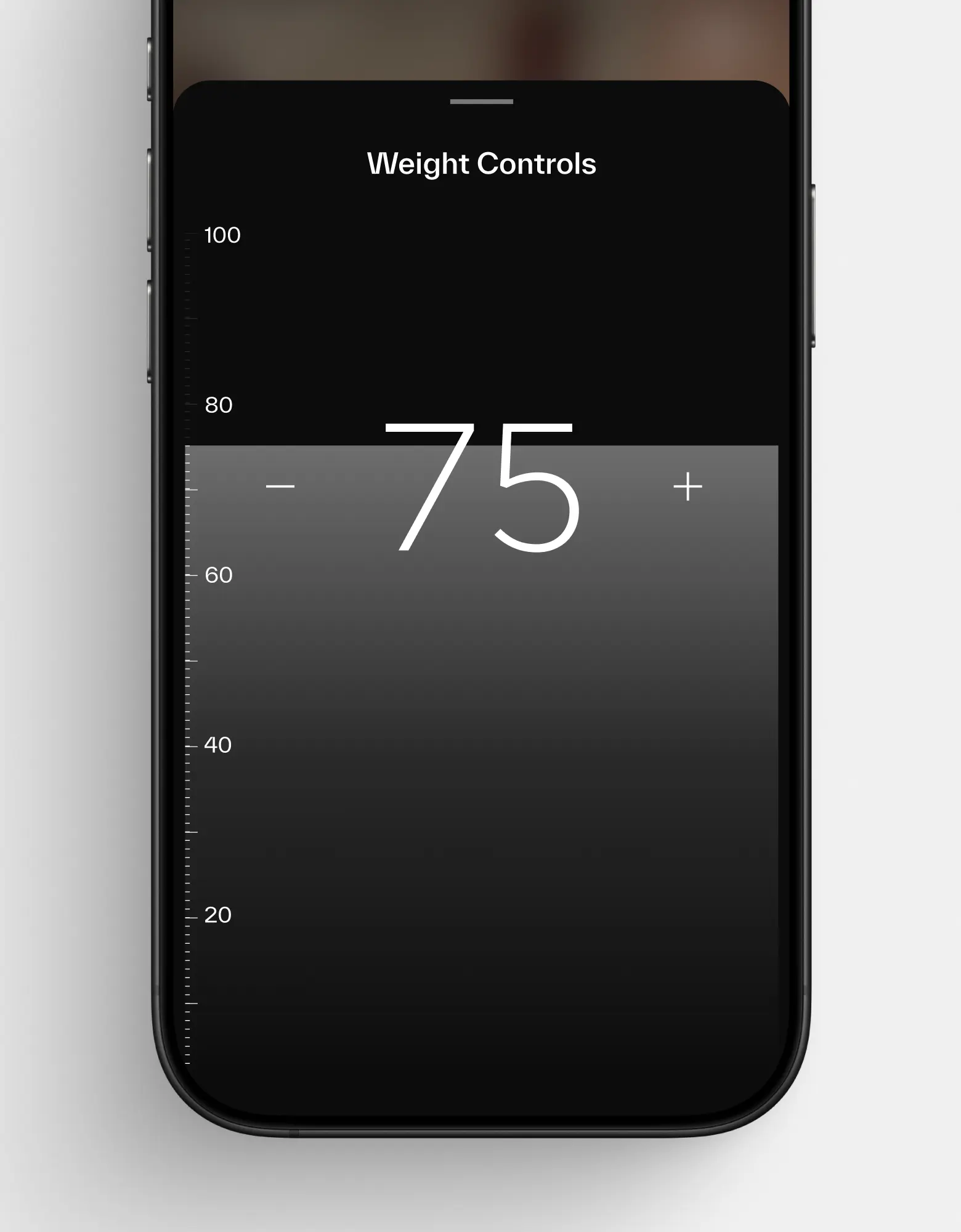
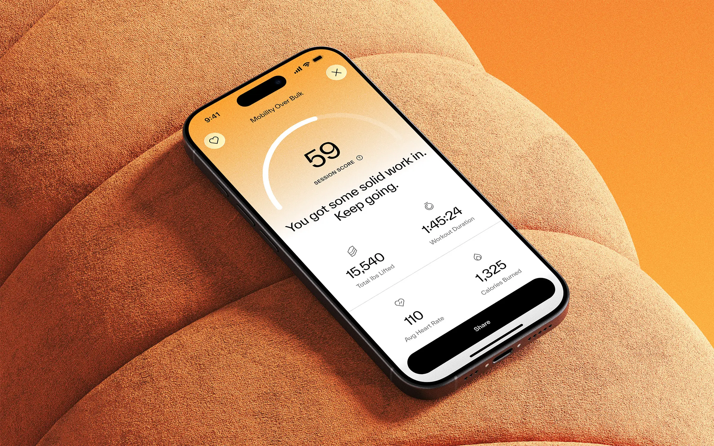
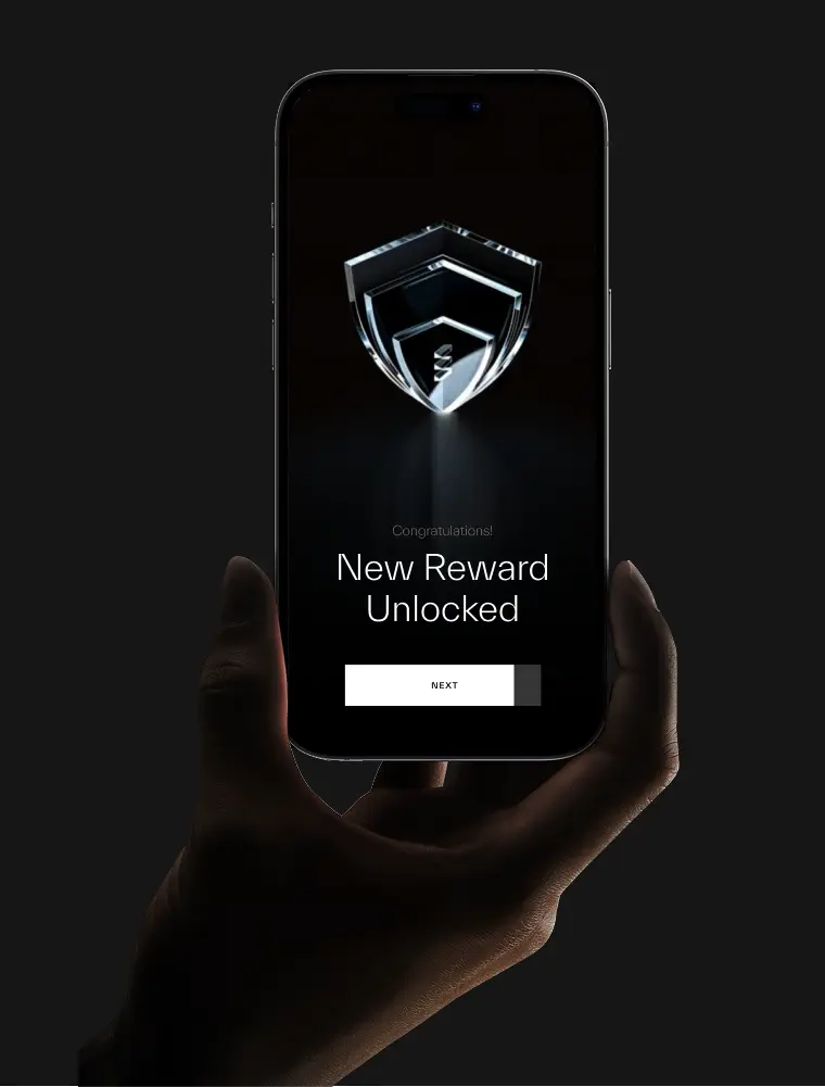
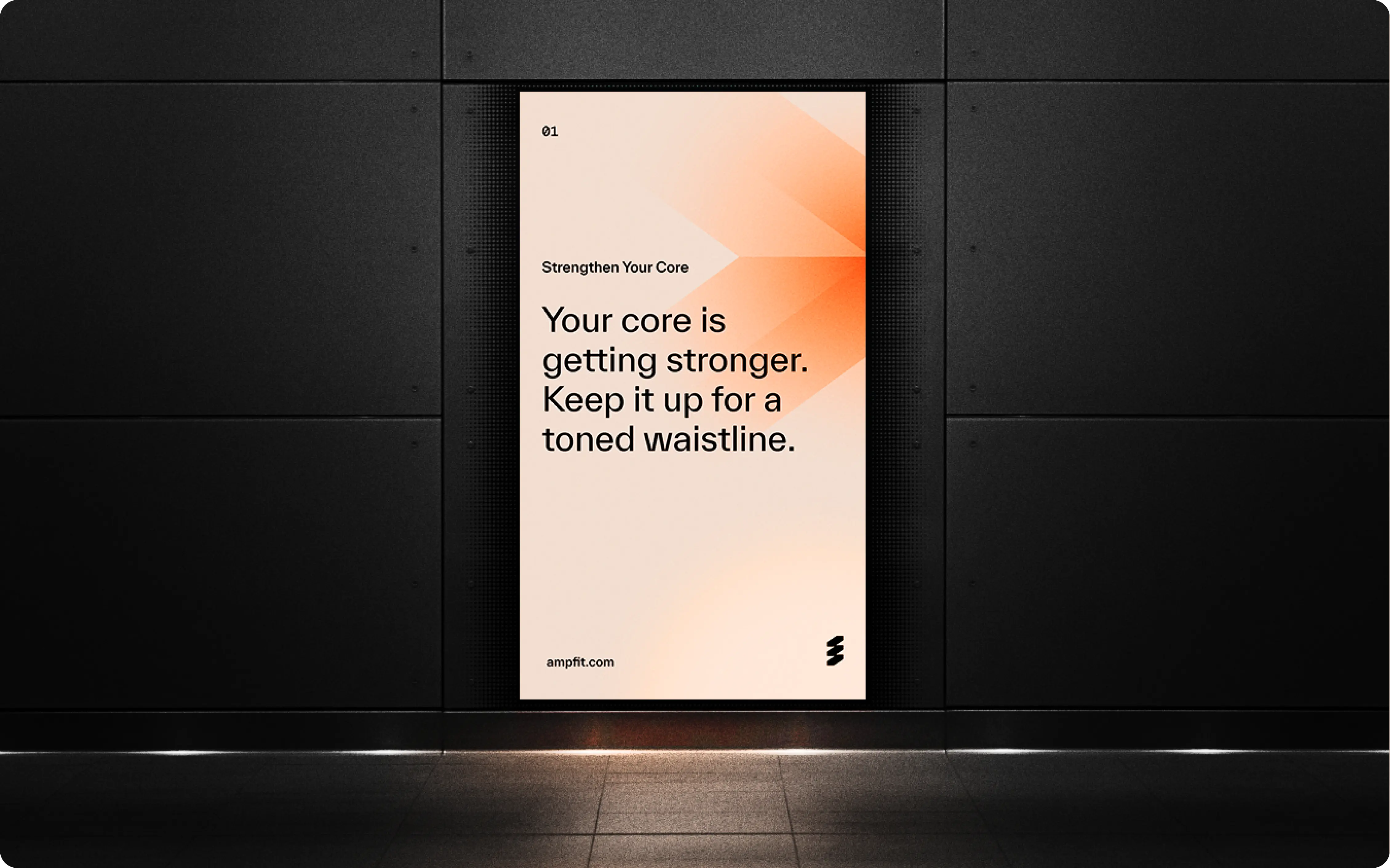
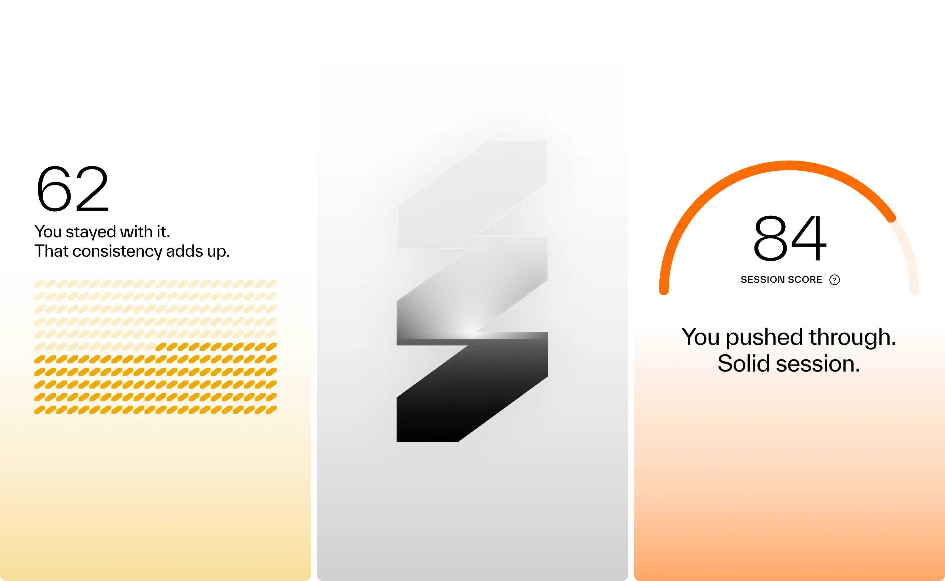

Results so far: 40,000 users, multiple awards, and a sleek wall-mounted system paired with a companion app. Working with amp meant translating adaptive resistance hardware, smart coaching, and modular accessories into a cohesive consumer experience. Add to that a team backed by Sports Science PhDs and leaders from Apple, Meta, and Nike, and the expectations were clear: nothing short of excellence would do. Rising to that challenge not only delivered results for amp, but pushed Konpo to sharpen our own systems and raise the bar. Challenge accepted. Mission accomplished.
- Founder - Shalom Meckenzie
- Year - 2024
- Industry - Fitness · Artificial Intelligence
- Scope - Brand · Product · Systems
- Website - www.ampfit.com
An unbreakable identity for global executive protection.

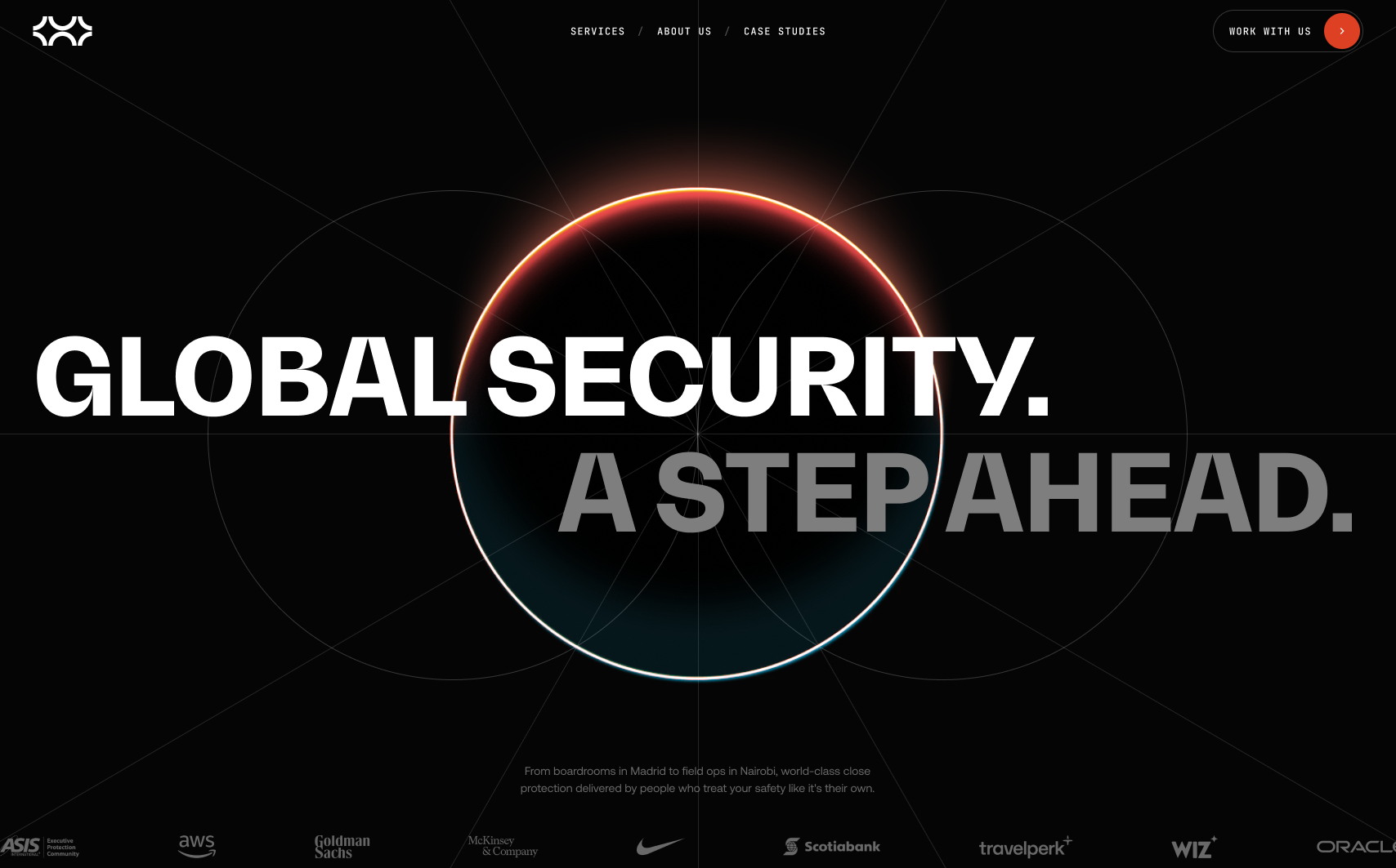
We partnered with Security Crisis Solutions (SCS), an executive protection and security company with in-house teams in more than 30 countries, to build a brand and website that match how they work in the field: calm, precise and a step ahead.
SCS had grown on referrals alone, and the big global risk firms already trusted them as the team on the ground. The challenge was to express that authority in an industry that usually sells fear. We started from the three values the team kept coming back to: trust, loyalty and creativity. We drew three circles, one for each, into a single mark. The result was a star fortress structure built to remove blind spots and protect what sits at its core.
We delivered brand strategy, narrative and tone of voice, the logo system, a gradient palette where red stands for creativity and blue for trust, a type system, photography direction, a grid system and complete brand guidelines. We then designed and built the SCS website in Webflow, carrying the same calm system online, and refreshed their business cards, challenge coin, pins and several digital templates.

Konpo designed the brand and website for Security Crisis Solutions (SCS), from strategy, narrative and tone of voice to the logo, colors, typography, photography direction, brand guidelines and the site itself, for an executive protection company with in-house teams in 30+ countries.
It started as three circles for trust, loyalty and creativity. Drawn together into one form, it echoes a star fortress, a defensive structure designed to remove blind spots and protect what sits at its core. Every curve defends the center, so there is no weak side and no single point of failure.
Calm, not fear. People hiring close protection want to feel the situation is already handled, so the brand has to read as composed and competent before it reads as tough. For SCS that meant a quieter palette, restrained typography and a mark built around protection rather than force. More on our branding design.
Executives who travel, but mostly the people responsible for keeping them safe: security managers who set travel policy for large companies, and global risk firms that need a trusted team on the ground. SCS runs its own teams in the field instead of subcontracting, which is a big part of why those firms bring them in.
SCS had grown for more than a decade on referrals alone and had never done any marketing. As demand kept rising, the goal became turning a trusted but under-the-radar operator into a globally recognized executive protection brand, without losing the quiet confidence that made clients trust them in the first place.
Yes. We designed the site and built it in Webflow, with scroll-driven motion that keeps the brand moving the way SCS does, a step ahead. The finished site was handed over to the SCS team in April 2026.